It’s finally here, folks. The Motorola Xoom has officially been launched and we’ve got some time to put Honeycomb through its paces. The tablet-optimized version of Android improves upon many strengths of the OS, and offers up some new features that may be described as a geek’s wet dream. But is Honeycomb a fluid experience that can easily go toe-to-toe with existing and upcoming competition? Read on to find out!
User Interface
 The most notable difference between Honeycomb, and any other version of Android, is the user interface. It’s been completely revamped to suit larger displays, and just looks plain sexy. The holographic UI is quite a step above almost anything we’ve ever seen on a tablet, and from an aesthetics point of view, can easily challenge any tablet on the market today.
Honeycomb offers the familiar five homescreen panels that you can customize with applications and widgets, only this time around, it’s done with style. The panels are all done up in 3D, and the entire UI is smooth as butter – at least on the Motorola Xoom, which has the NVIDIA Tegra 2 dual-core processors to thank for its graphics prowess. The graphical enhancements throughout Honeycomb are stunning, and make a truly immersive experience when using the tablet. Honeycomb has a slight learning curve, but just like Android phones, once you get it, you get it. Still, that may not be simple enough for some people.
In contrast, iOS is so painfully easy to use, that anyone could pick it up and get going. However, it seems as if Apple is so concerned about making their OS stupid-proof that it lacks certain functionality. Android 3.0 oozes power at the OS level, and iOS leaves it to the applications to make it powerful. This isn’t a bad thing, but more functionality within the OS itself makes for a more complex layout of how you use it.
That said, Honeycomb isn’t hard to use, and you’ll learn all the ins and outs in no time. Also, this is not to say that iOS as a whole is inferior in any way (It’s only dominating the market right now), it’s just more about preference.
Navigation, Action Bar, Notifications, and Multitasking

Honeycomb’s UI has jumbled around a few of the Android buttons that we know and love, and brings new features that virtually eliminate the need for previous features in past versions of the OS – ahem, menu button, we’re looking at you.
On the bottom left of the screen, you’ll find three soft buttons for Back, Home, and the Multitasking panel that will adjust the screen’s orientation. Menu options are now application specific, and can be found on the new Action bar. The Action bar can be found at the top of the screen in applications, and gives users options that they would usually find by hitting the menu button on an Android phone. If needed, you may also find a drop-down menu within the Action bar to access extra options.
Android 3.0 does away with the launcher button at the bottom of the screen and moves it to the top right. Tapping this button will bring up all your applications, but you can also view just the applications you’ve downloaded from the Market if you so choose. When the app launcher is opened, on the right side of the opened windows, a dedicated option to go straight to the Android Market is presented. While tapping the “+” button will reveal all of your homescreens at once, I miss the simple gesture of pinching a homescreen to show them all, like HTC Sense and ADW Launcher.
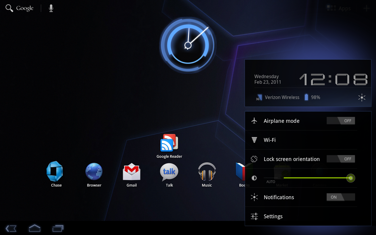
 Another major change within Honeycomb is how notifications are handled, and they are now found on the bottom right of the screen. We’ve always been a fan of the notification bar located at along the top edge of the screen in previous versions of Android OS, and we’re sad to see it go, but Honeycomb’s implementation does a great job of helping us forget about the “old ways.” Contact photos now appear next to the notification, and just like any other version of Android, you can choose to deal with them on your own time. The revamped notification bar also gives you a quick settings to WiFi, screen brightness, Bluetooth, etc. This alleviates the need to dig through your settings application to do the most simple of tasks.
Small enhancements make the new notification panel very nice to use. Say you start playing some music, and you hit the Home button to start surfing the web. You’ll find a notification of the music playing that gives you the options to skip tracks or pause the music playing; all without leaving the web browser.
Multitasking also gets a major overhaul, and may be the best implementation we’ve seen so far. Google kept it simple, and gives you a dedication soft button for multitasking, which not only shows you the past five applications you’ve accessed, but screenshots of the applications in their current state. This makes multitasking a breeze, but we do wish that the panel was scrollable to make way for more applications. Nonetheless, the new way to multitask certainly beats long-pressing on the home button.
Widgets
 One of my favorite features about Android is its support for widgets. Android 3.0 makes widgets scrollable; something many people have been waiting for to be officially supported. Google does a good job of providing some decent widgets, but more could have been done.
The widget menu is right next to the application drawer button, and shows a “+” sign. When tapped, all screens are revealed on the top portion of the screen, and widgets, along with app shortcuts, and wallpapers can be found below. Adding a widget is easy enough; just tap the widget you want, and it’ll appear on the middle homescreen, or you can press and hold the widget to bring it to another screen.
Google should have done one thing to make the widget experience better – they should have made widgets resizable, or condense an application’s available widgets in a folder of some sort (like CyanogenMod). If you were to download Beautiful Widgets from the Android Market, which has about 10 to choose from, you’ll have to scroll through each and every one to get to the widget of your choice. If Honeycomb allowed widgets to be resizable, the widget menu would look less cluttered, and allow you to get to the widget you wanted faster.
The provided Gmail widget is way too small for my taste, and there are no other size options to speak of, so you’re stuck with the one you have if you want to see your email at a glance. This issue won’t be that big of a deal to many people, but for someone who prefers their homescreens to be dominated by widgets, options are a must.
Applications
 Google packages some great new applications with Honeycomb that other operating systems just can’t touch. That said, when it comes to tablet-optimized applications in the Android Market, it’s a sad story. This will only improve over time, and Big G has provided some great tools for developers to help bring phone applications to the big screen.
- Google Maps remains largely the same as the phone version, with only a couple of tweaks here and there to eliminate menu-based options, and put them up into the Action bar. When pressed, a fragment pops up with the selected content. It looks like a small window rather than a large pane, and we like the look of it. Google Maps for Android is still the best of its kind.
- Gmail has seen a nice update as well, and the use of fragments really shines. You can drag emails to folders easily, and get more content at once. It’s nice and simple, with nothing bad to say about it.
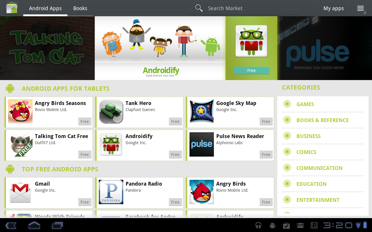
 The Android Market has been significantly redesigned, and looks more like the Webstore than any other version of the Market we’ve seen prior. The new version of the Market has a very small tablet application section, but that will only change as time goes by. The Market also offers parental controls, and allows you to set a password so that others can’t change application availability options. We’re glad to see that Google has tackled this issue, as it may have been a significant reason some parents haven’t bought Android devices for their children.
- The Android Market also has a dedicated tab for purchasing e-books, and the selection is plentiful. While nothing is completely confirmed, we may see an additional option to purchase music and movies in the near future as well.
- YouTube and Google Books shine with their super slick 3D carousal design. Created in the new graphics engine, Renderscript, these applications offer an extremely rich 3D experience that looks just plain sexy.
 The Honeycomb music application looks similar to the leaked version we saw some time ago, but with a spin of its own. The app also shares a 3D carousal-esque way of navigating through your music, but it’s tweaked a bit to show the album covers coming toward and away from you.
- The Camera software has been significantly improved upon, and almost every setting available is just a tap away.
- Movie Studio is very nice to use, and you’ll likely be able to produce some decent videos from it. I didn’t spend enough time with it as I’d have liked to, but the potential is there, and future updates to Movie Studio could make it a force to be reckoned with.
- Honeycomb’s web browser is hands down the best experience you’ll find on the market today, even without Flash (for now). Tabbed browsing is a dream, and the overall look and feel of the browser is clean and simple. The only small issue that I ran into is that multitouch can be a bit too sensitive at times, but I didn’t experience this every time.
 There are plenty more great applications that Google has provided, but what about applications from the Android Market that have yet to be optimized for the big screen?
I tried a couple of different games on the Xoom, and for the most part, a lot of phone-based Android apps scale up to larger displays beautifully. However, there are a lot that don’t scale well. At all. I downloaded Prism 3D, a good time-killing game, and not only did it scale horribly, the accelerometer took a shitter and always threw me off the ledge, making the application unusable no matter what orientation the tablet was in.
Also, applications not built for Honeycomb will gain a menu soft button next to the Back, Home, and Multitasking buttons. While it’s not the best work-around, it should be suitable enough until more applications are supported for Android 3.0. These small inconsistencies are bound to happen with an OS version that hasn’t been around that long, but it just makes one feel that Android 3.0 could stand to be put back in the oven a little longer.
Wrap-Up : Just how sweet is Honeycomb?
 So does Android 3.0 Honeycomb have what it takes to dethrone iOS on the iPad? Yes. Today? Not so much.
Honeycomb has the potential to kick so much ass, and it does for the most part, but small quirks throughout give it a “rushed” kind of feel. Honeycomb offers many features that its competitors lack, but it lacks the fluidity that some competitors are great at providing. These quirks need to be ironed out before it can become the powerhouse it is under the surface.
That said, I believe Honeycomb is usable enough to be an enjoyable experience, especially if you have an Android phone in your pocket. Those looking for an iPad competitor that’s just as easy to use, look elsewhere, although you still may not find an alternative as easy to use as Apple’s tablet. That said, if you’re looking for one of the best Android experiences on market today, jump to the front of the line, as you’ll certainly be in love with Honeycomb.
Just as Android for phones has evolved, so too with the Honeycomb branch, and only then will Android 3.0’s colors begin to truly shine. Google’s betting big on tablets, and I wouldn’t be surprised if we began to see updates soon for the tablet-optimized version of the mobile OS. Plus, Honeycomb is about to infiltrate the market in many different shapes and sizes.
In the end, Honeycomb is sweet, but just a tad sour as well. It could be worse, though. It could have Blur on it.