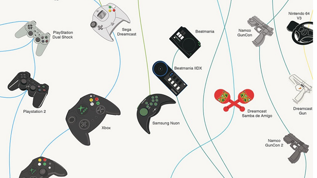
Everybody stop what you’re doing and check out this amazing infographic on controllers through the years, and their branching evolutionary paths. I can’t get enough of this beautiful and meticulously thorough print! It’s both eye-catching and informative, and really nicely designed. It would look as good on the wall of your gaming cave as it…
Here’s how and where smartphone incidents occur [infographic]
Gadget insurance company Protect Your Bubble came up with a cool infographic to illustrate how and where smartphone incidents occur, as well as to identify who the responsible person are. Here are the highlights: 18-24 year olds are 16% more likely to damage their smartphone. Women are 42% more likely to have their phone stolen…
Infographic Reveals How Google Glass Functions
An awesome infographic comes to us today thanks to Martin Missfeldt, which shows us what’s under the hood (err, plastic casing) of Google’s mysterious Google Glass. The infographic reveals a revolutionary design, which utilizes a mini-projector to display images on the prism display. The device achieves its augmented reality layer by projecting data and images…
Annoying texts that drive us crazy
We all know of a few texting habits that drive us absolutely crazy. There’s always that one friend that has to send extremely long texts no one wants to read, and another that can’t be bothered with sending a long enough response. Then we have that crazy couple that keeps texting each other 24/7 come…
Samsung Galaxy S evolution chart – take 4
Another Galaxy, another chart. So what has changed since the previous 3 releases? A lot, as you’re about to see from the following graphic. Sammy’s flagship grew from a 4-inch WVGA to a 5-inch full HD screen, getting a couple of additional cores along the way. There are no doubts in my mind we’re looking…
Infographic Highlights Samsung Galaxy S4 Hardware Specs
Tired of reading about the Samsung Galaxy S4 yet? No? Good! A new infographic showcasing some of the unit’s hardware specs has been released, beautifully showing the off just what is crammed in that super thin device. This sleek piece comes from us via Samsung’s Samsung Tomorrow page, which wanted to provide a clear and look at…
Smartphones: The past, present and the future [infographic]
The folks of Waypharer prepared a neat infographic to illustrate the long road modern smartphones has crossed from AT&T’s first mobile network established in 1946. to the latest smartphones like iPhone 5, HTC One and Samsung Galaxy S IV. Some of the more interesting dates include: 1994. IBM combines a cell phone and PDA to…
Mobile power users rule the day
A company called SessionM prepared two infographic to show us mobile user behavior and trends. Their focus is on the most active mobile user group that is also known as power users. The research looks to answer questions like where they are from, what days they are most likely to use apps, how much they…
iOS is more popular on planes than Android
In-flight wireless provider GoGo put together an infographic that details device usage at 36,000 feet. According to its metrics, travelers are more likely to use tablets (35 percent) than laptops (33 percent) or smartphones (32 percent) while flying. A whopping 84 percent of devices used on their service run iOS, while only 16 percent are…
Solving the battery life challenge infographic
Samsung Semiconductor released a neat infographic titled “Resolving the Battery Challenge in Mobile Devices” to show how modern mobile memory solutions (made by Samsung and other companies) help solving the battery life challenge in mobile devices. Even though battery technology has improved 300% in the past 20 years, mobile technology has advanced more than a…


