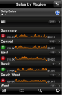
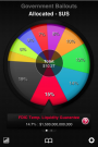
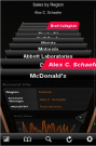
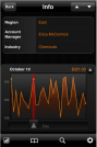
No one likes poring over spreadsheets, especially on the iPhone’s relatively small display. It would be nice if there were some way to break down spreadsheet information into visual representations that actually make sense. Thankfully, there’s an iPhone app for that. Roambi Visualizer turns your iPhone into a handy spreadsheet cheat-sheet that converts your information into simple-yet-informative charts and graphs that look as good as they are helpful.
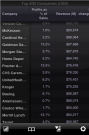
To use Roambi Visualizer, you’ll first have to sign up for a Roambi account on the company’s website. Then, simply upload your data-packed spreadsheet through the web-based interface and choose the type of chart/graph you’d like to use to display your data – from sales reports to employee profiles to demographic data, Roambi will probably have a graph to fit your needs. Then, when you’re satisfied with Roambi’s analysis of the data, you can push the eye-catching charts and graphs to your iPhone.
Roambi Visualizer is an incredibly useful app if you deal with spreadsheets often. If you deal with obscure or ridiculously complex data, don’t expect Roambi to turn all that noise into pretty graphs, but most people probably won’t run into that problem. Best of all, the app is free on the iPhone AppStore.
Roambi Visualizer [iTunes link]
Roambi website