The folks at SimplyZesty, which is self-described as a “full service digital agency,” have designed a rather nice new iOS 7 concept. It seems overall very polished and does have some credibility to it. They based the concept off of the report that the redesign of iOS 7 would have a new, “flatter” looking user interface somewhat similar to Windows Phone.
The concept redesigns pretty much every app, including the icons. The Music app in particular stands out to me because it looks like something you could definitely see on Windows Phone. It’s still nicely done though. Like this app, many others depart from the tendency toward a dark theme in favor of mostly white. This is apparent on the lock screen and Siri as well.
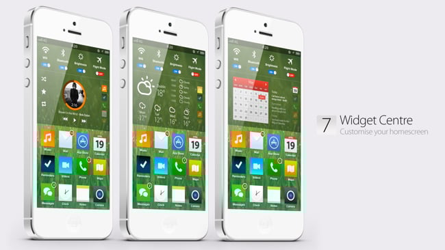
Also included here is a new pull-down menu combining widgets as well as the Notification Center. I couldn’t help but notice that the icons used to show weather conditions are almost identical to that of the Conditions weather app in the App Store, which is an interesting. I’m not sure if that’s on purpose, but it actually pairs well.
Overall it’s quite nice. I’m sure by now you want to stop reading my take and see the video demoing the iOS 7 concept for yourself, so check it out below. Be sure to leave a comment underneath with your opinions on this fresh idea of iOS 7 compared to previous concepts.