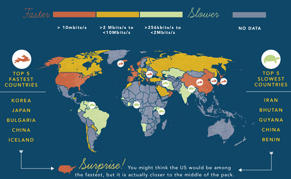
Holiday Gift Guide »

Latest Infographic News

Samsung Galaxy S evolution chart – take 4

Another Galaxy, another chart. So what has changed since the previous 3 releases? A lot, as you’re about to see from the following graphic. Sammy’s flagship grew from a 4-inch WVGA to a 5-inch full HD screen, getting a couple of additional cores along the way. There are no doubts in my mind we’re looking at the Sammy’s next best-seller which will will likely be sold in couple dozen million of units to users all around the world. Here’s the chart showing the road to the latest Galaxy S4 smartphone. Read more

Infographic Highlights Samsung Galaxy S4 Hardware Specs

Tired of reading about the Samsung Galaxy S4 yet? No? Good! A new infographic showcasing some of the unit’s hardware specs has been released, beautifully showing the off just what is crammed in that super thin device. This sleek piece comes from us via Samsung’s Samsung Tomorrow page, which wanted to provide a clear and look at the specs of the device amid  the sea of new software features that may have confused or overwhelmed consumers. The Samsung Galaxy S4 will be touting a 1.9 Ghz Quad Core processor in the U.S. and Read more

Ian Kersey

Smartphones: The past, present and the future [infographic]

The folks of Waypharer prepared a neat infographic to illustrate the long road modern smartphones has crossed from AT&T’s first mobile network established in 1946. to the latest smartphones like iPhone 5, HTC One and Samsung Galaxy S IV. Some of the more interesting dates include: 1994. IBM combines a cell phone and PDA to form the Simon Personal Communicator, which was sold for $1,099. 1999. The BlackBerry email device was launched 2000-2011. Symbian was the dominant platform. 2007. The iPhone was launched. 2008. Android saga begins. 2010. Windows Phone Read more

Mobile power users rule the day

A company called SessionM prepared two infographic to show us mobile user behavior and trends. Their focus is on the most active mobile user group that is also known as power users. The research looks to answer questions like where they are from, what days they are most likely to use apps, how much they use apps on their phones, and so on. Some of the findings includes: Most active users are least likely to engage with an app on Mondays, and most likely to engage on Tuesdays. This group Read more

iOS is more popular on planes than Android

In-flight wireless provider GoGo put together an infographic that details device usage at 36,000 feet. According to its metrics, travelers are more likely to use tablets (35 percent) than laptops (33 percent) or smartphones (32 percent) while flying. A whopping 84 percent of devices used on their service run iOS, while only 16 percent are powered by Android. When cruising at high altitude, most people use their devices to surf the web, check email or browse social networks. You check out all the metrics in the infographic below. [Via GoGo Read more

Kelly Hodgkins

Solving the battery life challenge infographic

Samsung Semiconductor released a neat infographic titled “Resolving the Battery Challenge in Mobile Devices” to show how modern mobile memory solutions (made by Samsung and other companies) help solving the battery life challenge in mobile devices. Even though battery technology has improved 300% in the past 20 years, mobile technology has advanced more than a thousand-fold during the same time frame. To make things worse, battery capacity is only expected to increase 2 times from 2010 to 2020. Unsurprisingly, this is a major concern for device manufacturers, and they’re trying Read more

McAfee: 55% of users share their mobile or tablet PIN with others

In its latest report, MaAfee looked at how people (fail to) protect their mobile phones and tablets. Some 3,000 consumers were asked to answer few questions and their responses are weird, to say the least. Here are the key findings: A majority of consumers in the UK and Germany stick with the first PIN they were ever given. In contrast, French and American respondents are more likely to opt for their lucky number. More than one in ten use the same PIN across multiple devices and accounts. Over half (55%) Read more

New survey shows how much we rely on our apps on a daily basis

Apigee came up with a neat infographic to show how desperately tied we are to our mobile apps. For instance, did you know that the majority (85%) of people would rather go without water than their mobile apps? That’s crazy and pretty much impossible, but that’s what the survey respondents said in their answers. Speaking of respondents, they come from 5 countries, including France, Germany, Spain, the UK and the US. Here are some of the more interesting answers: 18% of the French are unable to order dinner without using Read more

3 key points about mobile advertising in 2013

We know mobile advertising is getting really big, but it’s always nice to have numbers to put behind any claim. Thanks to the infographic prepared by Smart AdServer, we have some cool figures to share with our readers. Here are the key findings: Mobile traffic is expected to exceed desktop traffic as early as this year. In Q4 2012, mobile traffic accounted for 40% of all digital traffic of leading Sports Channels, and 32% of News Channels. Publishers running a mobile apps and/or mobile sites have seen their mobile traffic Read more

Running a small business from a smartphone [infographic]

Roughly a third of American small business owners use smartphones to manage their companies, performing tasks such as banking and customer relationship management. But which smartphone apps are best for you as a small business owners? A new infographic, prepared by SalesForce Desk, goes through the most popular mobile apps used by small business. Here’s the quick rundown: Financial management: Quickbooks, Mint.com and Office Time. File storage: – Box.net, Dropbox and (we would add) MediaFire. Document editing: Evernote (which is also used for note-taking) and Documents To Go. Plus, let’s Read more

Super Bowl mobile usage infographic

We’ve already wrote about Super Bowl’s affect on mobile app usage (insignificant) and now we have another piece of the puzzle to add to the story, with the help of a neat infographic prepared by Millennial Media. As you would assume, many viewers were watching Super Bowl with a mobile device in hand. Whether they were using social apps to keep a running commentary, looking up statistics to solve arguments, or checking out mobile content during downtime, they stay engaged with their mobile devices during the big game. On Millennial Read more