IntoMobile

Breaking news, information, and analysis on the latest mobile phones and mobile technology

Open NavigationOpen Search
  • Home
  • Platforms
    • iOS / iPhone OS
    • Android
    • Windows Phone
    • BlackBerry OS
  • Hardware
    • New Hardware
    • Tablets
    • Reviews
    • Rumors
  • Carriers
    • AT&T
    • Sprint
    • T-Mobile
    • Verizon
  • Manufacturers
    • Apple
    • Samsung
    • HTC
    • LG
    • Motorola
  • Best VPNs
  • Best AI Tools

T-Mobile Sony Xperia Z Review

July 10, 2013 by Blake Stimac - 1 Comment

We’ve already put the unlocked Xperia Z through its paces, along with the Xperia ZL and Xperia Tablet Z, but now the T-Mobile Sony Xperia Z is up to bat. While essentially the same as the unlocked model, this handset is one of the few Android devices from Sony that’s been offered on a US…

Read more
The Good
  • Great design
  • Solid camera experience
  • Good battery life
The Bad
  • Users will have to get used to the button placement and port doors.

Hardware

The Sony Xperia Z is both a beautiful and powerful device that's every bit as nice as the unlocked version we reviewed a few months ago.

Sporting a 5-inch 1080p HD display with Sony Mobile BRAVIA Engine 2, the screen on the Xperia Z is ultra crisp and clear. Under the hood, you'll find a 1.5GHz Qualcomm Snapdragon S4 Pro CPU, 2GB of RAM, 16GB internal storage, micro SD card slot, NFC, and more. Speaking of NFC, T-Mobile will be offering up two Sony NFC-enabled accessories for the Xperia Z at launch.

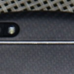
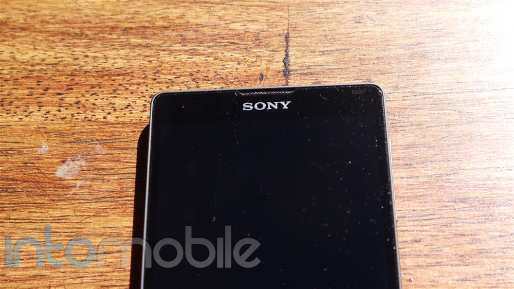
The face of the handset is very clean, as is true with most devices that ship with a 5+ inch display. The top of the handset gives you the standard assortment of sensors (proximity and ambient light), ear piece, Sony logo, and a notification LED at the top right. The notification LED isn't nearly as interesting at the ZL's, but it certainly gets the job done. Since the Xperia Z relies on on-screen navigation buttons, you'll only find a microphone piece at the bottom.

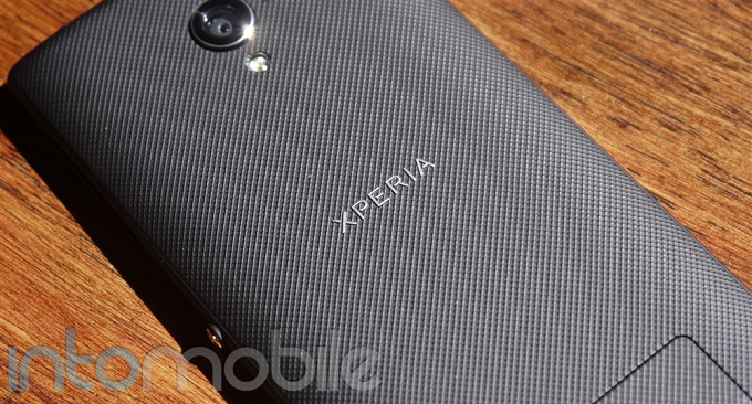
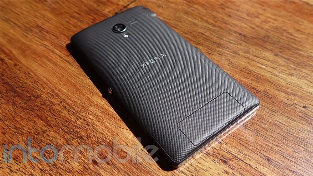
The back side of the handset is equally as clean as the front, where you'll only find the 13 megapixel camera with LED flash and Xperia logo in the middle.

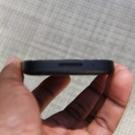
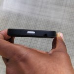
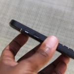
The sides of the Xperia Z are also simple and clean. Ports are covered with small, water-tight covers, and the exposed buttons on the sides (volume rocker and power/lock button) are also water resistent. Since the ports are covered, it can be a little tricky to rememeber what port is where, but it's something that the user will get used to quickly.

One of the main features that's being pushed hard in the Xperia Z is its water resistant capabilities, allowing the handset to be submerged under 3 feet of water for 30 minutes. And now that it's summer time, you can take your Xperia Z with you to the pool without any worries!

The Xperia Z basically looks like a smaller Xperia Tablet Z, and both share many of the same specifications, including it's nifty water resistant capabilities. Be sure to check out our Sony Xperia Tablet Z review here!

Design

Like the ZL and the Tablet Z, Sony's flagship smartphone ships with the Omnibalance design that's both clean and simple, but modern and appealing.

To make the look and feel of the Xperia Z even better, the handset is covered in two panes of glass. Because of this, the handset can pick up a ton of fingerprints, which is a tradeoff we've been living with on many phones.

The placement of the power/lock button and volume rocker is something the owner will have to get used to. Both are found on the same side, which isn't all too bad, but the placement seems a bit odd. The power button is almost right in the center of the right spine, but since it's rather big, you won't have trouble finding it even in the dark. But what's peculiar is that the volume rocker is below the power button, which can make for some awkward fiddling with the handset in the beginning. Still, it's certainly no deal breaker and it's easy enough to get to.

The Xperia Z feels durable in the hand, even with two pieces of glass adorning the front and the back. The device's skeletal frame surrounding the edges also make the handset feel like it can take quite a beating.

Software

Sony is offering up its latest software experience across the entire line of its new handsets and tablets, with little variation, so you can expect the same with the Xperia Z. This is a very good thing.

The entire software experience is simple and to the point, making it an easy transition for someone coming from another Android device. In fact, the "cleanness" of the UI makes Sony's offering one of our favorites, as there isn't a ton of over the top customization or unnecessary software that you won't use. The customization you do see on the Xperia Z make sense and is very easy to use.

There's a nice helping of pre-installed T-Mobile applications you may or not use, along with the carrier's MobileLife news widget. Luckily, the included T-Mobile applications can be disabled. Sony's home-brewed applications are great and offer up a nice experience that compliments the rest of the user interface. Apps like the gallery and Walkman are definitely neat and provide a slick alternative to Google's stock Android offerings.

Overall, the Xperia Z will give customers a refreshing take on Android, and that's always welcome in our books. Sony's "less is more" approach with its software definitely pays off.

Web Browser, Multimedia And Camera

Camera

One of the main features that will surely attract people to the Xperia Z is the 13 megapixel camera. The camera rocks Sony's Exmor RS sensor for mobile, allowing the handset to take great HDR photos and video.

Another feature you'll find on the Xperia Z is Superior Auto. We enjoyed this feature on the Xperia ZL and Tablet Z, and it's just as nice on the Z itself. Superior Auto automatically adjusts the camera settings depending on the lighting and subject, ensuring that you have a great shot every time. Of course, you can also turn Superior Auto off and get into the nitty gritty yourself if you so choose.

We like that Sony brings a no-fuss camera interface to the user, yet still allows those who want to dig through and customize settings to do so, making it a nice experience for anyone who uses it.

high light, Superior Auto


low light, flash on, Superior Auto

med/low light, Superior Auto


Call Quality And Battery Life

We found no issues in the call quality department. Calls came through loud and clear on both ends, with no distoration whatsoever.

Battery life was pretty impressive on the Xperia Z, and with a 5 inch HD display, it's something that you'll need a lot of. One should have no issue getting through the day on a single charge, but power users that have their settings cranked up at all times will likely see different results. Just in case you need more control with your phone's battery, Sony also offers up a few power management options like Stamina Mode and Low Battery Mode.


The Final Take

So does the Sony Xperia Z have what it takes to go up against the likes of the Samsung Galaxy S 4 and the HTC One? You bet it does.

Sony is offering up a unique experience that's more than welcomed in the Android space. The software on the handset is a simple and straight-forward experience that isn't hindered by ultra-heavy customization or useless features, and the Sony-made applications are solid.

With a powerful set of specifications and a great design, the Xperia Z can take on just about any smartphone on the market today. Plus, there aren't too many phones out there with dust and water resistance capabilities. Even if said feature isn't on the top of your list, it could come in handy when you least expect it.

The Sony Xperia Z will be available on July 17th at T-Mobile, so you don't have long to wait until you can grab one. Now all you have to figure out is whether you want the black or the limited-edition purple Xperia Z.

Sony Xperia Tablet Z Review

June 26, 2013 by Blake Stimac - 3 Comments

If you haven’t been paying attention to Sony lately, then you’ve been missing out on some of the company’s best mobile products it has ever released. The Sony Xperia Z and ZL are powerful and sleek devices that can take on just about any other smartphone available today head on, and the same goes for…

Read more
The Good
  • Beautiful Design
  • Great Display
  • Good Battery Life
The Bad
  • $500 price point may be a turn off to some.

Hardware

The Sony Xperia Tablet Z is packed with just about any feature one could imagine on a tablet, and then it goes a little further.

Rocking a 10.1 inch 1920 x 1200 Reality HD Display (about 225 ppi), the screen on the Tablet Z is quite beautiful. Images are crisp and color reproduction is stellar. This much we expected of Sony, but as we know, it's not just about the display. The Tablet Z also rocks a 1.5 GHz quad-core Snapdragon S4 Pro CPU, 2GB RAM, 16/32GB storage options, micro SD card slot, Wi-Fi a/b/g/n, Bluetooth 4.0, NFC, IR Blaster, and more.

Possibly the Sony Xperia Tablet Z's best trick is that its water and dust resistant, which can allow the device to be submerged into 3 feet of water for up to 30 minutes. Because of its water and dust resistance powers, you'll find all ports for the tablet under small covers to keep them water tight.

The front of the tablet is about as clean as any 10 inch tablet, where you'll find only the 2 megapixel front-facing camera and Sony's logo on the top left disrupting the otherwise solid black face. The left side of the Tablet Z gives home to the 3.5mm headphone jack (under a cover), the familiar silver power/lock button we've seen on devices like the Xperia Z, volume rocker, notification LED, two small connections for the optional docking accessory, and a small speaker grill at the bottom. The right side is clean, leaving only a speaker grill, with the bottom sporting two more speaker grills, the micro USB charging port, and micro SD card slot.

About those speakers. There are only two of them, but Sony cleverly placed two grills to each speaker on the corners of the tablet. This can help greatly depending on how the user holds the tablet, as sound will won't be muffled due to the other grills at the bottom to show the user where the chip is located.

The back of the Tablet Z is done up in a nice soft touch finish, and is as elegantly bare as the front. Here you'll find the 8 megapixel camera, Xperia branding smack dab in the middle, and a NFC logo at the bottom.

Looking at the Xperia Tablet Z and picking it up are two very different experiences. A simple glance at the device doesn't really do it justice. The Xperia Tablet Z is both incredibly thin and light. The Tablet Z is thinner than a pencil, coming in at a mere 6.8mm and ultra light weight at only 495 grams. Compare this to the 9.4mm/652 gram iPad and the 8.89mm/594 gram Galaxy Note 10.1.

Design

Unsurprisingly, Sony has brought its Omnibalance design found on the Xperia Z to it's tablet cousin. Sony's Omnibalance design is defined as minimal yet distinctive, and that's pretty much what you'd call the design of the Tablet Z in a nutshell.

The tablet avoids the swooping curves and rounded edges found on many tablets today to bring a stark contrast that works very well. The rounded edges that do exist on the corners are very subtle. There's a touch of elegance to the simplicity of the overall design and we think it would be a pretty great addition to the living room (due to its IR Blaster for controlling the TV) and just about anywhere else.

Build Quality

Outside of its water and dust resistant capabilities, the Xperia Tablet Z feels pretty durable. Sony clearly went heavy on the plastics when it made the Tablet Z, but the skeletal frame lining the sides of the entire tablet certainly makes it feel like the device can take a beating.

Of course, we'd love to see the Tablet Z built out of better materials, but this likely wouldn't allow Sony to boast about the tablet's light weight feel, so there's a bit of a trade off. I personally don't see the build quality of the tablet to be much of an issue to owners.

Software

Like the Xperia Z, the Tablet Z shares a nearly identical user interface, but slightly revamped to take advantage of the extra 5.1 inches of display.

The user interface of the Tablet Z is very clean, and with the exception of a few visual tweaks, the UI gives off a stock Android feel. Of course, it's also pretty obvious that Sony put a lot of effort into its UI, as it offers some unique features, like custom themes and more. Sony also added a nice touch to the selection sounds on the Tablet Z, which sound pretty much identical to that of the PS3 when panning through menus.

There's a nice helping of Sony-made applications on the Tablet Z, and the best part about this is that you'll probably find yourself using them. The Walkman, Albums, and Movies applications are all a nice step up from the stock Android applications, with playful animations that aren't over the top. Sony's Update Center tells you when any of it's home-made apps have an update waiting, which side steps having to update the entire system on the device.

Of course, since this is a Sony device, users will be able to use the Tablet Z to interact with Sony devices your other devices in your home. Tablet Z owners can easily pair NFC-enabled wireless speakers, use the PS3 Dualshock 3 wireless controller to play games on the device, and much more with ease.

Overall, the software experience on the Sony Xperia Tablet Z is just as nice as what you'd find on the Xperia Z and ZL, which is a very good thing.

Even better, if you don't like the user interface on the Tablet Z, you can look into the AOSP build.

Web Browser, Multimedia And Camera

Camera

While tablet photography looks laughingly awkward in just about every way, it's kind of hard to ignore when said device rocks an 8 megapixel camera. In our experience, the camera on the Tablet Z performs pretty well.

I had the same experience with the Tablet Z that I did with the Xperia ZL, in that the photos produced look very different than what you see in the view finder. Photos look much, much better when you see them in the gallery and I was pretty impressed to see the color saturation in the photos below in such gloomy SF weather.

The Superior Auto focus feature is a great addition to the tablet's camera, as it will automatically adjust the focus mode depending on the focus subject. This is a very handy feature that will keep you from fidgeting with the camera settings every time you choose to take a photos of a different subject.


The Final Take

The Sony Xperia Tablet Z is a home run in my book. It takes a lot for me to personally be interested in 10 inch tablets, as I've always preferred 7 inch devices. This tablet is the exception for me.

The Xperia Tablet Z oozes style and a beautiful design without needing to be in your face. This approach could have been a disaster, as the tablet could have just been another slab, but it's not. The combination of power and sleekness make this one of the best Android tablets available on the market today.

Sony has been churning out some of the sexiest devices for a while now, but it's now been able to find a great harmony between its hardware and software experiences. The Tablet Z would best be served as a companion to something equally as sexy as the Xperia Z or ZL, but it certainly can stand on it's own in every way.

We'd say that the only draw back is the price point of the Tablet Z. It's completely worth the price tag, but tablet prices are dropping like crazy these days, with many companies shipping smaller, more affordable units alongside their 10 inch tablet offerings. It doesn't look like Sony has plans on releasing a 7 inch version of the Tablet Z (as much as we'd love to see one), so if you want it, you're going to have to pay up. Still, we have our doubts that the price tag will stop anyone who has been eyeing this tablet.

If you're not sold on Samsung's Note 10.1, be sure to look at Sony's elegant and straight forward Android tablet. It's a winner.

BlackBerry Q10 Review

June 24, 2013 by Charles West - 4 Comments

When you think of a BlackBerry, you probably don’t think of an all touchscreen device, instead, you think of a Curve or Bold to buy. The company formerly known as Research in Motion (RIM) went back to its roots, with the release of its latest QWERTY handset. The Q10 has taken a long time to fully…

Read more
The Good
  • Perfectly-sized QWERTY
  • Bright 720p display
  • Solid overall design
The Bad
  • Lack of native apps
  • Screen too close to keyboard
  • Contract price too high

Hardware

To see a phone carry such a distinct feature like a portrait-QWERTY is rare, especially in today’s times. It is the successor to the Bold 9900; a device I felt was beautifully designed. The Q10’s 119.6 x 66.8mm dimensions actually wedges in somewhere between both the Z10 and 9900. Breaking the measurements down even further, I found the Q10's 10.35mm thickness is one full millimeter thicker than the Z10 that came before and just fractionally thinner than the 9900.

The U.S. version of the Q10 is powered with a 1.5GHz Qualcomm Snapdragon S4, and backed up by a 2GB of RAM. Stationed above the keyboard is a square 3.1-inch, 720 x 720 Super AMOLED display that makes watching 16:9 video content a bit of a drag. However, this wasn’t too big of a deal, as it wasn't the biggest issue I had with the display. Placement of the screen is a problem. I constantly found myself having to swipe up a second time to successfully get home, this is due to the screen being too close to the keyboard.

The Q10 also features a nice chamfer and a gentle curve you’ll find present all over the phone. The back of the Q10 has a matte, three-dimensional carbon fiber dress up that looks appealing to the eye, but lacks the sturdy grip found on its touch screen brethren, the Z10.

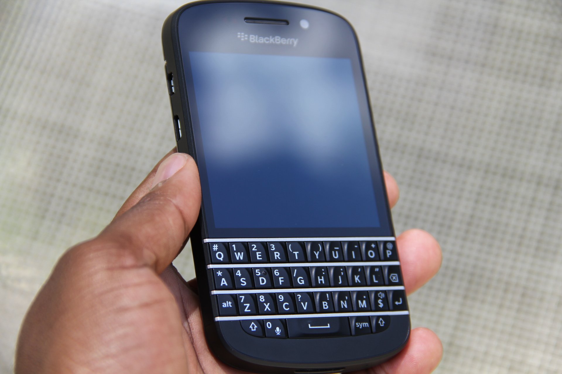
Anyway, back to the keyboard and the overall Q10 design. BlackBerry deserves some credit in delivering what a modern portrait QWERTY phone should look like: which is a touchscreen that's not too big, not too small, and an ideal sized keyboard. In fact, there’s something to be said about the look and feel element of the Q10 as a whole.

The keyboard on the Q10 is sure to please BlackBerry fans, as it delivers the “Bold-style” that many have fallen in love with. What is Bold-style, you ask? It’s BlackBerry building out the keys without space in between them. This looks sleek on the eyes, but I had crazy issues typing with it because of my own clumsiness; my accuracy was awful thanks to my inability not to hit other keys while speed texting. But to be fair, I hadn’t used a QWERTY device since the last Sidekick came out two or three years ago.

We all know having keyboard device of this caliber brings a different kind of feeling. This quote from my comparison article of the Z10 and Q10 pretty much sums up my thoughts of the look and feel of the Q10:

“There’s something to be said about the nostalgia that overcomes you once you feel a physical keyboard in your hands. Suddenly, you feel more important, more business-like — I can’t explain it. However, the reality is, QWERTY keypad phones are a relic in time gone by. Do I believe they should stay around? Sure. Just like I how I feel vinyls or CD’s should stay around.”

Other than that, with the Q10, expect everything you loved on the Bold 9900 but more refined, and with better software.

Software

What more can be said about BlackBerry 10 that hasn’t been said already? The Q10 ships with a revised 10.1 build of the platform, which brings a variety of minor enhancements to the version seen on the Z10. However, the user interface is a bit more polished and it looks to be more flattened in order to support the Q10’s 3.1-inch display. Now I’ve heard some folks who have reviewed or used the Q10 or Z10 on the daily, complain about how the OS becomes a bit sluggish or stuttering after heavy usage. Not saying this isn’t true, but it didn’t happen to me.

Actually, I found BlackBerry 10 to be remarkably solid and reliable. The main features of BlackBerry 10 are somewhat controversial, as the OS completely does away with the conventional way other operating systems perform multitasking, primarily relying gestures.

Here are the basic functions: swipe up from the bottom bezel of the phone brings you back to your running apps, swipe up and to the right and you get to the BlackBerry Hub, which consumes all your messages from email, Twitter, Facebook, LinkedIn, BBM and elsewhere into one massive pile of messages. My only issue with the execution of this is BlackBerry has yet to make the experience of parsing through messages in the Hub easier. Something I’m sure it will address with future updates.

With the 10.1 update, BlackBerry filled a couple of huge needs from the previous version, as the company brought the ability to download email attachments and send pin-to-pin messages in BBM. In addition, you can now do simple things like copy and paste a phone number into your dialer and take HDR photos.

Perhaps the most disappointing part about the BlackBerry 10.1 software is the lack of quality ‘NATIVE’ apps. Notice the emphasis I put on native? There are some decent Android ports, but nothing is better than seeing and testing a feature app that’s made specifically for the BlackBerry 10 platform. I stress this point heavily because no one living in the iOS or Android ecosystem will ever take BlackBerry serious, especially if it doesn’t get it’s shit together with more quality native apps in BlackBerry World.

Web Browser, Multimedia And Camera

Camera

The Q10 sports a 2-megapixel front-facing camera and 8-megapixel shooter in the back, paired with an LED flash. Nothing is offered here that’s different from what’s seen on the Z10. Like most cameras on feature phones, you get passable shots in light, albeit, still a bit noisy. Colors are mostly solid, but low-light shots are a waste of time.

As for one of BlackBerry’s top gimmicky features, Time Shift, I’d say the feature is better served on the Z10’s 4.2-inch display. The Q10’s small screen makes it almost impossible to search through the burst of different shots taken of your friend, as the option to zoom in isn’t available.

The Final Take

All things considered, the BlackBerry Q10 turned out to be what we expected: a smaller Z10 with a portrait-QWERTY, or the love child of the Z10 and Bold 9900. The latter sounds better. Strangely, I actually prefer the Z10’s virtual keyboard not just over the Q10 but every virtual keyboard -- I love the suggestive typing element added.

However, with the Q10, BlackBerry made a play for perhaps its most loyalist fans -- the company shouldn't be ridiculed for that. I think it would have served them better if they had released the Q10 ahead of the Z10, but that’s just my opinion. BlackBerry should be applauded for improving leaps and bounds when it comes to its OS, however, it’s still miles behind both iOS and Android in features and mind-share.

That said, if you’re a happy Bold owner, you shouldn't hesitate to get this phone. Besides that, unfortunately, it’s hard for me to recommend this device at the $199.99 price target this phone is asking when you can get the iPhone 5, HTC One, and Galaxy S 4 for less.

Rating averaged out to 7.25


AT&T LG Optimus G Pro Review

May 3, 2013 by Blake Stimac - 4 Comments

In the fall of 2012, LG unleashed its best smartphone to date, the Optimus G. The handset oozed with style and power, and proved to the world that LG knows exactly what it’s doing. But LG wasn’t done. The Optimus G became the DNA of the Nexus 4, which became the most popular handset of…

Read more
The Good
  • Gorgeous Full HD Display
  • Slick software features like QSlide and QMemo
  • Qualcomm Snapdragon 600 is a beast of a CPU
The Bad
  • Phablets still aren't for everyone and the Optimus G Pro could feel unwieldy to some
  • Loudspeaker could be a better
  • We've seen better designs from LG before.

Hardware

The LG Optimus G Pro is a beast of a phone that you'll either immediately fall in love with or be overwhelmed by its size. This isn't surprising, as phablet devices just aren't for everyone. Still, the Optimus G Pro is a handsome device that you'll want to pick up when you first see it.

Rocking a 5.5 inch 1080p HD display, the face of the Optimus G Pro is almost all screen. The bezels are very small surrounding the display, making it look almost edgeless. The screen is stunning , and offers up a crisp a clear experience with some stellar viewing angles.

Above the display, you'll find the standard assortment of sensors (proximity and ambient light), along with the ear piece, LG's logo, and 2.1 megapixl front-facing camera. Below the gorgeous display are two capacitive keys for back and menu, with a physical home button in between them.

I'm a total sucker for a nice notification LED implementation on a smartphone, and LG did just this. Instead of having the LED off to the side, LG placed it right below the display, lining the perimeter of the physical home button. It's definitely a nice touch that I think people will appreciate.

The sides of the Optimus G Pro are minimal, but offer up a few new tweaks along the way from it's smaller brother. The bottom of the handset features the micro USB port for charging and syncing, along with the microphone for calls, where the top has the 3.5mm jack, noise-cancelling microphone, as well as an IR blaster to act as your TV remote control.

The right side of the device houses only the power/lock switch, and you'll  find a small indentation to remove the battery cover here as well. On the left, you'll find your volume rocker and a dedicated button for Q Memo. This button can be customized to your liking, which is awesome.

The back of the Optimus G Pro is simple and to the point. Here you'll find the 13 megapixel camera, single-LED flash, and loud speaker all right next to each other, with AT&T's globe logo right below. The battery cover is also removable, so you can swap out the 3,140 mAh battery whenever you need to. You'll also find the micro SD card slot underneath the battery cover to expand your storage.

The Optimus G Pro just as much of a beast on the inside than it is on the outside. Featuring a 1.7GHz Qualcomm Snapdragon 600, this thing flies. Other specs include 2 GB of RAM, 32GB internal storage (23GB available to user), NFC, WiFi, Bluetooth, and every bell and whistle you could want in a high-end smartphone.

Design

The design of the Optimus G Pro is certainly and interesting one, as it basically looks exactly like Samsung's Galaxy Note II. While we have our doubts that LG is lacking in the design department (see Optimus G), it's a bit odd just how similar these competing devices are designed.

The battery cover itself features LG's patented Crystal Reflection Process that has a subtle shimmer when in the right light. The effect is somewhat subdued due to the fact that the battery cover is plastic and doesn't have the pane of glass found on the Optimus G or Nexus 4, which produces a more noticable effect. That said, seeing the back of the handset in direct sunlight is pretty stunning.

At the end of the day, the similarities to competition doesn't really matter. The LG Optimus G Pro is its own beast of a device that's powerful enough to take on any device on the market, no matter how it looks. Plus, the Crystal Reflection process found on the device is something you won't find on any other phone.

Build Quality

The Optimus G Pro looks to be able to stand a bit of wear and tear. It may be heavy on the plastics, but it certainly feels solid in the hand.

While we would have loved to see LG slap two panes of glass of both sides of the Optimus G Pro, but that surely sounds like it could be a fragile disaster. When dealing with screens of this size, we'd say that polycarbonate is a good choice. The OGP should easily be able to take on any normal wear and tear you throw at it, but we'd still advise anyone to keep that beautiful display protected at all costs.

The use of plastic on the Optimus G Pro keeps it relatively light -- for a phablet. Sure, we all wish that every phone had the build quality of the HTC One, but a solid aluminium body on a device with a 5.5 inch display would prove to be a small brick in the pocket.


Software

Running on Android 4.1.2, the Optimus G Pro ships with one of the latest versions of the operating system. The handset also runs an updated version of the Optumus UI found on the original Optimus G.

LG's software continues to impress with some incredibly interesting features we first saw debut on the Optimus G. QSlide and QMemo really stand out, and if you're a power user, you'll likely find yourself using these features a lot.

QSlide allows you to run two applications at the same time by adjusting the transparency. Applications can also act like widgets that one can move around like windows. While QSlide is limited to only a few applications, it's still one of the coolest implementations we've seen when it comes to doing two things at once on a smartphone.

A nifty update in the software now includes what applications can be used for QSlide right in the notification panel.

QMemo is also a rockin feature on the Optimus G Pro, and it's easier than ever to access now. The OGP has its own dedicated button for QMemo now (although it can be customized for just about any installed application), and when pressed, the current screen on the phone will be captured and you can quickly jot down notes and share. If you're on the phone and need to take down a number, simply hit the QMemo button and write the number down right on your screen.

The Optimus G Pro ships with a IR blaster, allowing you to kick your standard remote to the curb. Setting up your TV and cable box is very easy and you'll be able turn on and off your TV, adjust the volume, and change channels from your cable box.  It's pretty great. Unlike the Galaxy S 4, HTC One, and Xperia Z and ZL, the Optimus G Pro doesn't give you a program guide to see whats on TV.  This gives the competition a bit of an edge when it comes to usuability, but I certainly wouldn't be surprised if we saw LG come out with a similar solution in a forthcoming update.

As per usual, the OGP ships with a nice selection of AT&T bloatware. The lucky apps that you'll likely immediately disable in the settings are: AT&T DriveMode, AT&T FamilyMap, AT&T Locker, AT&T Navigator, AT&T Ready2Go, AT&T Smart Wi-Fi, AT&T Messages, Mobile Hotspot, Mobile TV, and My AT&T. There may be an application or two in the pre-installed software that you may want to keep around, but there's certainly quite a bit of software that you'll probably never touch.

Overall, the software experience on the Optimus G Pro is similar enough to the software we loved in the original Optimus G, but with some nice tweaks along the way. Currently, there's still no word as to when the AT&T version will be getting the "Value Pack" LG announced back in mid-March that will bring some great new features and updates to the software.

Web Browser, Multimedia And Camera

Camera

The LG Optimus Pro features a 13 megapixel camera, and it's a charmer. For the most part, pictures and video come out crisp and clear, but some can seem a bit dark at times.

Like a few other newer smartphones today, the Optimus G Pro has a nifty feature that allows automatically adjust shooting modes without any effort by the user. Close up an object? Macro mode will automatically kick in, and so on. In testing, sometimes the camera wasn't sure what mode to switch to and went back and forth from landscape to macro at points. Nonetheless, photos still came out pretty darn nice.

You're given multiple scenes (portrait, sunset, landscape, night, etc.) to choose from, along with white balance, color effect, ISO settings and more. The camera software isn't as robust as certain smartphones like the Xperia ZL or Galaxy S 4, but it will certainly get you where you need to go with little fuss. Luckily, even if your photo doesn't come out perfect, the built in photo editor will give you what you're looking for.


Multimedia

Like many LG smartphones before it, the Optimus G Pro features SmartShare. SmartShare allows you to easily send or view content over a network through DLNA. If you have a media server on your home network, you can easily view and even download the content right to your Optimus G Pro. Certain codecs aren't supported on the device, but this can be allieviated by downloading a third-party video player app in the Google Play Store.

There's a wealth of movies available through the Google Play Store, Netflix and much more for the Optimus G Pro, and it's something you'll find yourself doing often. Watching 1080p HD videos on the screen is a dream and you'll have a hard time putting it down once you start.

Call Quality And Battery Life

Call quality on the Optimus G Pro was pretty great. Calls came through loud and clear, with no distortion on either end whatsoever. However, when testing the speakerphone fuction, we did get a bit of feedback from the loudspeaker, but this has more to do with the speaker itself than the network.

Thanks to the massive 3140 mAh battery, the Optimus G Pro can last a full day without struggling. Not only was it a great decision to make the battery huge, we're very happy to see that it's removable. We haven't has much time with the Optimus G Pro yet, so if battery stats change dramatically, and we doubt they will, the review will be updated accordingly.


The Final Take

While phablet devices certainly aren't for everyone, if you're in the market for one, the LG Optimus G Pro demands a good, hard look. With a gorgeous display and powerful innards, this phablet is definitely one of, if not the best phablet on the market today.

LG seems to have no problem taking Samsung head on, and proves that with this device. With phablets gaining more and more popularity, LG is poised to make a name for itself in this category.

While there will be inevitable comparisons to the Galaxy Note line, I personally enjoy the Optimus G Pro a lot and believe it can stand on its own. It offers up practical features that you'll probably continue to use after the novelty has worn off. Not a bunch of "sucker" features that are cool to show to friends, only to never be used again within a month's time.

This is another smartphone that seriously shows that LG knows what it's doing, and that it's far from being done. The Optimus G is still a favorite of ours, and now we have the Optimus G Pro to hold us over for even better things to come from LG.

Samsung Galaxy S4 Review

April 23, 2013 by Blake Stimac - 2 Comments

The Samsung Galaxy S4 is a phone that needs no introduction. It’s poised to set fire to the smartphone market, and soon we’ll see the device landing on a fistful of US carriers with a massive ad campaign behind it. The successor to one of the world’s most popular phones is finally here. The Galaxy S4 retains…

Read more
The Good
  • Tons of interesting software features
  • Stellar camera experience
The Bad
  • A 5 inch display simply may be too much screen for some.
  • Some features are more "show off" than useful.

Hardware

The Galaxy S 4 is a thing of beauty, and while one could easily see the similarities of its predecessor in it, picking up the device is a completely different story.

The five-inch Super AMOLED 1080p HD display dominates the face of the Galaxy S 4, and for good reason. The display on this handset is gorgeous. The slight oversaturation of an AMOLED display provides a truly vivid experience. Watching videos on this display proves to be one of the more enjoyable experiences on this device, despite it's many other features.

Above the display, you'll find nice helping of sensors. The proximity and ambient light sensors are present, just like you'd expect, but you'll also find an IR blast in the mix for the Air Gesture feature. Along side these sensors, you'll also find 2 megapixel the front-facing camera, ear piece, and Samsung's logo. Below the display, you'll find the exact same layout as the Galaxy S III. An oblong home button in the center sits between two capacitive buttons for menu and home. We'll save our opinion of capacitive buttons on Android devices for another day, as we weren't expecting Samsung to deviate from these choices.

The sides of the Galaxy S 4 are kept clean and minimal, leaving only the essentials. The left side of the device houses only the volume rocker, while the right side houses the power/lock button. The microUSB port and microphone are found on the bottom, and the top of the device is where you'll find the 3.5 mm headphone jack, noise-cancelling microphone, and yet another IR blaster for WatchOn, Samsung's TV remote application.

The rear of the device brings no surprises, and that's not a bad thing. Here you'll find the 13 megapixel camera, LED flash, loud speaker, and Samsung's logo. One thing we did like about the Galaxy S III's rear was that the LED Flash, Camera, and loud speaker were all next to each other, offering up a nice bit of symmetry. You won't find this on the Galaxy S4, but we have our doubts that this will be a big issue for anyone.

This unit from Sprint offers up 16GB of internal storage, but thanks to the micro SD card slot, you can pop in a 64GB micro SD card and never look back.

Inside the S4 is the quad-core Snapdragon 600, which is plenty fast for the most part. You'll also be treated to 2GB of RAM, NFC, GPS, Wi-Fi, and just about any other feature anyone would want in a high-end smartphone today. Samsung left no stone unturned.

S-View Flip Cover

While it's not necessarily a piece of hardware out of the box, the S-View Flip cover becomes a part of your Galaxy S 4. Just like the existing covers for the Galaxy S III and Galaxy Note, the cover itself is attached to a battery cover for the handset, so you're adding no bulk whatsoever to the phone itself. The face of the S-View Flip Cover has a clear window on the top that will display the time, date, and notifications for you without having to open the cover at all. You can also answer or reject calls right from this small window. Opening up the cover will automatically unlock your Galaxy S 4 for you, and closing it will automatically lock it.

I've never been a sucker for accessories, but the S-View Flip Cover is very convenient and is something any soon to be Galaxy S 4 owner should look into.

Design

While the design changes from the Galaxy S III may look minimal on the Galaxy S4, Samsung has changed the design of it's new flagship device for the better. The back edges of the device do curve slightly, but less so from the Galaxy S III, making the battery cover more flat. The sides of the device are done up in a nice metallic finish that provides a pleasing contrast to the white version of the device, and will likely do so to the Black Mist version as well.

Instead of the brushed metal look found on the Galaxy S III, the S4 has a more subtle look to it. The design has a cross-hatch, textured look to it, which we can't say is anything amazing but it's nice for what it is.

Overall, the design is nice and most people who were fans of the GSIII's design should be satisfied. We'd say the design works well, so it's hard to say anything wrong. Unfortunately, those who wanted to see a dramatic departure in design from the Galaxy S III will be a bit disappointed. Still, it's hard to call the Galaxy S 4 a bad looking device. It's rather beautiful.

Build Quality

While the Galaxy S4 doesn't rock a metal casing, it feels significantly more durable than the Galaxy S III. By miles. It may not be comparable to the in-hand feel of something like the HTC One, but the Galaxy S 4 feels pretty damn amazing in the hand.

Samsung's love of plastics likely won't be going anywhere anytime soon, but the Galaxy S 4 feels more solid than any of its predecessors.

Plastic or not, the handset is going to last. Two slabs of glass on the front and the back of any phone is going to look sleek and sexy, but it certainly hold it's own to polycarbonate. Glass will shatter. I do believe that Samsung will eventually bring more solid materials to its handsets in the future, but I don't think the use of plastics in the Galaxy S 4 is ultimately going to keep too many people away from it.

The HTC One is still the best Android device when it comes to in-hand feel and premium build, but that in no way makes the Galaxy S 4 any less delightful than it is.

Software

The Galaxy S4 may be a powerful handset, but  hardware almost seems to be an afterthought when you look at how much Samsung has done with its software experience. From Air Gesture to Smart Scroll, Samsung is offering up features that we've yet to see on a phone before.

Yes, some features may seem a bit "showy", and many are, but that certainly doesn't make them useless.

Easy Mode

Easy Mode is a new homescreen experience for those who want a simplified user interface for the Galaxy S4. This is also extremely helpful for first-time smartphone buyers. Easy Mode cuts the fat and brings the users a very simple UI and actually restricts access to some of the advanced features. Like the LG Lucid 2 that has a similar "Easy" home feature, if the user chooses to switch to the standard mode and wants to go back to Easy Mode, all data and customizations done by the users are retained.

Air View

Air View was previously found on the Galaxy Note line, but it's made its way to the Galaxy S 4 without the need of an S-Pen. Simply put, Air View allows you to get relevant information in certain applications without diving into a particular email, gallery, etc. just by hovering your finger over the screen. For example, if you're looking through your sets of photo albums in the gallery, you can hover your finger over one of them to get a preview of what photos are inside. Air View also extends to the Email, Calendar, Samsung Hub, and Flipboard applications. While some could say that it may seem faster to just tap on the content to see what's inside, Air View allows you to get a peek without needing to jump in and have to press the back button to get out.

Synaptic's Clearpad is used for the touch sensor of the Galaxy S 4, and Air View is made possible by the company's 3D-touch technology. The high-performance proximity sensing of Synaptics's 3D touch is helping OEMs develop new ways for users to interact with their devices. We're sure that we'll be seeing some great things with Samsung's Air View, along with Synaptics' 3D touch technology leading the way in this area.

Gesture View

Gesture View, which will be discussed further in the browser section of this review, allows the users to wave their hands over the device to interact with it. Utilizing the IR blaster on the face of the device, one can scroll through pages on the web browser and go through photos in the gallery with a simple wave.

While many may not end up using this feature all the time, this is a novel feature that does provide a good chunk of usefulness. When someone is calling, you can simply wave your hand over the screen to answer and the call will automatically be answered with the speakerphone turned on.

Notification Panel tweaks

Since the Galaxy S 4 is running on Android 4.2.2, you'll find the newly tweaked notification panel for settings. Of course, Samsung has customized the experience, but for the better. You'll see a handful of features found here, including Air Gesture, Air View, Smart Scroll, and more. You'll also be able to edit the order of the 19 some odd features and even choose the icons that will line the top of your notification panel at all times.

There are a ton of new features in the Galaxy S 4, but the homescreen experience remains rather intact. TouchWiz is definitely better than previous iterations, and for such a heavily customized user interface, Samsung has struck a fine balance when it comes to implementing tons of features while keeping it simple at the same time.

Web Browser, Multimedia And Camera

Web Browser

The web browser on the Galaxy S4 has a few tricks up its sleeve, and it's only these tricks that would make one want to opt for Samsung's own web browser over something like our favorite, Google Chrome.

Air Gesture can be used within the browser, which is definitely a nifty trick. It's especially convenient if you're hands are messy, so if you're reading a recipe and you don't want to make a mess of your phone, you can simply wave your hand to scroll. With Air Gesture activated, you simply wave your hand up or down to scroll in whatever direction you'd like. You can also wave left to right to change tabs.

Another great feature within the browser is Smart Scroll. Yes, you can now scroll without touching the device or even waving your hand over it. Smart Scroll will recognize when you're looking at the device, and will scroll up or down when you tilt your head in either direction. The feature works well for the most part, but some attempts to show off the feature ended in failure. For what it is now, it's pretty awesome, and will likely continue to get better over time.

Camera

The camera experience really shines on the Galaxy S4, as it offers up some insanely fun features that we haven't seen on a handset before. Pre-installed, at least.

The camera software on the Galaxy S 4 borrows from the Galaxy Camera software, and it works very well. There are a ton of different modes to choose from as well.

Animated Photo

Animated photo is exactly what it sounds like, but even better. It can be a little wonky at times, but Samsung has made it very easy to make your own works of art. Basically, you take a small video clip and then freeze certain parts and choose what you'd like to be animated. After the processing is completed, you'll be given a GIF file that can be viewed just about anywhere you want. It's pretty awesome. I had personally seen more success with playing with the elements for animated photos, like water, smoke, and fire.

Drama Shot

Drama mode allows you to take multiple exposure shots, which produces a really cool effect.

Other modes include Beauty Show, Rich Tone (HDR), Best Shot, Sports, Night, Eraser, Best Face, and more.

Fisheye...

Of course, you'll find some great filters for the Galaxy S4 as well. Tapping on the small arrow at the bottom of the viewfinder will show you all the cool filters in a live format. Not only will you get the expected negative, sepia, and black and white tones, but some cool filters like Cartoon, Moody, Fisheye, Oil Pastel, and Rugged.

Call Quality And Battery Life

Running on Sprint's network, the Galaxy S 4 had no problem when it came to actually being a phone. Calls were loud and clear, with no distortion on either side in our testing.

The Galaxy S 4 ships with a whopping 2600 mAh removable battery. Battery life is more than acceptable, but I've need some dramatic differences from day to day use. The first day of use, the device had been going for 16 hours and still had 20% left in it. The second run through gave me almost 13 hours before hitting 20%, and the third go around lasted about 10.5 hours before the 20% mark.

Overall, the battery life on the Galaxy S 4 is pretty great. Not only will it get you through the day, but you can carry a spare around if you need it.

The Final Take

This phone is awesome. It's not a Galaxy S IIIS, as some have been calling it. The updates within the hardware are more than welcomed, and it offers up some very cool new features. With that said, the Galaxy S 4 doesn't have the gap it used to with the competition. Don't get me wrong, the Galaxy S4 will likely outsell any other Android device around, but there are quite a few great options out there that have a presence that the Galaxy S4 carries. In one way or another.

I'd say the biggest rival to the Galaxy S 4 is the HTC One, easily. If it were available via a carrier in the US, the Sony Xperia ZL would undoubtedly be on this list as well. The HTC One comes with a great design in a full aluminum casing, and offers up a hyper-refined version of the Sense UI. Both devices also share the same CPU inside, great camera experiences, and large, gorgeous displays.

The Galaxy S 4 is surely to win the hearts of Galaxy S III owners, and new customers alike. The combination of a great software experience and beefier specs are sure to make this smartphone a winner. Of course, we wouldn't have expected anything less from Samsung.

There are so many features in the Galaxy S 4 that it may just deserve its own follow-up review. Stay tuned!


Fisheye…


Sony Xperia ZL Review

April 19, 2013 by Blake Stimac - 1 Comment

Already sold on Sony’s latest Xperia Z handset? Not so fast. The Xperia Z isn’t the only great device that Sony announced at CES this year. Announced alongside the Z was the ZL, and it is very much its own beast of a phone. With an equally robust feature set as the Z, the Xperia…

Read more
The Good
  • Beautifully designed
  • Great camera
  • Software experience is very nice
The Bad
  • Battery cover doesn't feel as premium as the Xperia Z
  • Camera software can lag a bit at times
  • Available at unsubsidized price only

Hardware

Let's just get this part out of the way: The Xperia ZL is one hell of a phone. From it's hardware to software experience, Sony has put a lot of effort into the making of this device and it shows.

The face of the ZL is very clean and minimal. The 5 inch 1080p HD Reality display swallows the face of the device, and is ultra crisp. Watching videos with the ZL is a very nice experience, and you'll be wanting to all the time.

Above the display, you'll find the standard set of sensors (proximity and ambient light), the ear piece, as well as Sony's logo. Why didn't I mention the front-facing camera, you ask? Well, that's because Sony decided to put the 2 megapixel front-facing shooter on the bottom right of the face, below the display. We're guessing the logic here is that you'll be able to more comfortably use the front-facing camera when it's being held in landscape mode. It's no bother to us, and it's something that most will easily get used to.

The sides of the Xperia ZL are nice and simple, leaving giving the user just what they want. The left side of the device has the micro USB charging port, leaving the bottom of the device clean. The top of the device is where you'll find the 3.5mm headphone jack, and the right side houses the volume rocker, centralized power/lock button, IR Blaster, and a dedicated camera button. You can quickly launch the camera by just holding down this button, even if it's locked. Like any decent dedicated camera button, you can press halfway down to focus on the subject, and fully press to snap your picture. Camera buttons on phones really need to make a comeback, as they beat any touchscreen shutter key.

The back of the Xperia ZL is done up in a textured plastic material,  which might not give the same in-hand feel as the Xperia Z, but it works well nonetheless. Here you'll find the 13 megapixel camera and LED flash, along with the loud speaker, Xperia logo in the middle, and a small hatch for accessing the micro SIM and micro SD card slots.

Internally, the Xperia ZL shares the same DNA with the Xperia Z. The ZL may lack the Z's water-resistant powers, but you'll still get the 1.5GHz quad-core Snapdragon S4 Pro, 2GB RAM, IR Blaster, NFC, and other expected bells and whistles like WiFi, GPS, etc.

Notification LED

I'm giving the ZL's notification LED it's own section because it's one of my favorite parts of just about any phone, and Sony has done some great things with it. More interesting tweaks with the LED will be discussed in the software section as well.

The shape looks like a small slit below the display with a pin hole in the middle. It looks gorgeous, and isn't too in your face like the Motorola Droid RAZR HD. I really like that manufacturers are playing around with the shapes notification LEDs in phones, as it's a nice way to differentiate the handset.

The notifcation LED is also completely cutomizable through applications like Light Flow, so you can have a different color for whatever notification you choose. There are only a handful of phones that have fully customizable LEDs, with the exeption of some Nexus devices, Galaxy devices, and some of Motorola's more recent offerings. It changes the way I use my phone, letting me know if it's one of the dozens and dozens of emails that can wait, or if it's a text I should respond to immediately, all without unlocking the device.

Not only should more manufacturers provide multi-colored notification LEDs in phones, but they should also follow Sony in playing around with the shapes of them, which can add a subtle elegance to the phone as a whole, like the Xperia ZL.

Design

Like the Xperia Z, The Xperia ZL features Sony's Omnibalance design. The simplicity of the design really works for the device, and you'll find a nice amount of symmetry throughout it.

The back panel curves ever so slightly to fit into your hand, and it does just that. Sony also managed to achieve a very compact design with the ZL, giving you a lot of screen without a lot of bezel. This is definitely a testimonial to the company's confidence in this area.

The large, centralized power/lock button may be a put off to some users in the beginning, but I personally like it. The aluminium button protrudes out more than any other button on the side, meaning you'll always know what to press, even in the dark.

Software

Running on Android 4.1.2, the Xperia ZL rocks one of the latest versions of the OS, and given that Sony is rather transparent when it comes to updating its handsets, you'll likely be kept up to date as to when the ZL will be the next OS bump.

The software experience on the ZL, like the Z, is very unique. The UI is filled with small, enjoyable animations that aren't in your face. There's also a healthy amount of Sony-developed applications that will provide you with the full Xperia experience, like Walkman, Sony Select, Sociallife, Wisepilot for Xperia, Xperia Link, Remote Control, and much more. Sony also offers up an application called Update Center that allows you to update the Sony applications, as well as system updates.

Sony also provides a decent selection of widgets to adorn your ZL's home screen with. The photo gallery widget allows you to scroll through all of your photos with a nice 3D effect -- a nod to Timescape.

The software on the ZL also offers up eight different themes for your homescreen, with options like Silk, Amethyst, Sapphire, and Emerald. Once you've selected your theme, the notification LED will also change to the same color, which is a nice touch.

Sony offers up a pretty great photo gallery experience on the ZL. The application is divided into two tabs: Pictures and Albums. In the Pictures section, photos are divided by months, and you can easily pinch to zoom to get a better view of the photos without needing select a specific photo. When tapping on the Albums section, you can choose from Facebook, Picasa, and Globe, which will show you geo-tagged photos in a nifty 3D globe. You can also view photos from media servers on your home network.

I know I can't shut up about the Notification LED, but the the Photo Gallery also utilizes it, and it's pretty rockin'. When you're swiping through photos, the phone will grab one of the dominant colors in the photo and the LED will shine that color. Simple? Yes? Genius? I also say yes. This isn't going to change the way you view your photos, but it's simple features like this that truly marry the hardware and software experiences together, and I really applaud Sony for doing something so subtle and unique.

Sony's user interface for the Xperia ZL is refined and simple, inviting you in with playful animations and easy navigation.

Web Browser, Multimedia And Camera

Multimedia

As you'd probably expect from any Xperia device, the ZL is a multimedia powerhouse.

The Movie application allows you to view videos on the device or from media servers on your home network. You can also make your Xperia ZL a media server of its own so you can view content on the device on other devices. Unfortunately, when I attempted to play anything from the media server on my computer to the ZL, not one video successfully played. We're not sure what codec support the ZL has, but it needs a few more. If you are able to play a video from your home network's media server, you can download the video directly to your phone, which is pretty awesome.

Sony's Walkman application supports the same cool features the Movies application does. I was successfully streaming an audio file that was sitting on my computer and was able to download it to the device with a tap of a button.

Of course, you'll also have access to applications like Amazon MP3 and the Google Play Store for even more music and movies.

Camera

As you also could expect, the camera on the Xperia ZL offers a top-notch experience. Sony has implemented some great features in the camera software, making it pretty fantastic. Sony knows a thing or two about cameras, given its Cybershot line of digital shooters, and that shines through within the Xperia ZL.

The 13 megapixel camera on the ZL takes advantage of Sony's next-gen Exmor RS sensor, which produces high quality photos across the board. Funny enough, the viewfinder doesn't do that great of a job showing the subject in low-light situations, but a visit to the gallery with show you a very clear image. It's pretty impressive. Likely the only other slight issue with the camera is that is can be a bit slow at times, but that will likely be remedied with an update.

The camera software provides a wealth of features, allowing you to do just about anything you'd want on a smartphone camera and then some.

One of the features I enjoyed the most on the camera was the Superior Auto feature, which automatically changes the focus mode depending on the subject, proximity, or movement. If you're very close to the subject, the camera will automatically adjust to Macro mode. If you're catching a moving object, it will switch to action mode. Many phones have these features, but you manually need to change them, so it's pretty cool to see that the Xperia ZL can do this on the fly.

Of course, you'll still get the standard features that you'd expect in just about any smartphone camera these days. Sony goes above and beyond with an awesome experience, along with great HDR video recording capabilities.


Call Quality And Battery Life

With a T-Mobile SIM popped in, I was surfing at HSPA+ speeds and calls came through loud and clear. There was no distortion whatsoever that I could hear, nor on the other side of the call.

Battery life on the Xperia ZL was pretty exceptional. The first day I received the device, it was running for more than 12.5 hours and still had 20% left in it. The second battery run through gave me a little over 10 hours when it hit 20%, and the third produced similar results.  I wouldn't call these bad results in the least bit, but depending on how you use the device, your results in battery life may vary.

The Final Take

The Xperia ZL strikes a mighty fine balance of beauty and power, and offers up a great software across the board.

The ZL may lack the water and dust resistance you'll find on the Xperia Z, but one could easily alleviate this with something like Liquipel. The back panel of the device also lacks the sexy glass you'll find on the Xperia Z as well. Still, I'm finding all of these to be non-issues.

From the compact and sleek design, to the software experience across the board, the Xperia ZL is one awesome device. There's just one problem. It won't be coming to the US via any carrier. This is rather unfortunate, as it's almost a crime to only be available in it's unsubsidized state. If this handset was found on the store shelves of any carrier in the US, it would get the attention it deserves. Still, if you're sold on the Xperia ZL, the high price tag may not stop you.

There's a lot of competition out there, and Sony has certainly brought the fight, challenging the HTC One, Galaxy S 4, and just about any flagship device out there. To make things even sweeter for Sony, the latest Xperia devices come in two different flavors, both unique enough to hold their own.

At the end of the day, the Sony Xperia ZL has what it takes to run with the big dogs, and pass a few up in the process.


LG Lucid 2 Review for Verizon Wireless

April 12, 2013 by Blake Stimac - 3 Comments

LG is back with the follow-up to the Lucid that debuted around the same last year on Verizon Wireless. The aptly named Lucid 2 ships with updated innards and a new design. While the handset is firmly in the mid-range device category, it’s hardly something to dismiss if you’re a new smartphone user. Coming in…

Read more
The Good
  • Subtle design language is easy on the eyes
  • Starter Mode is great for new smartphone users
  • Larger and higher-res display than predecessor
The Bad
  • 5 megapixel camera has its hits and misses
  • Missing some cool features found on LG's higher-end devices, like QSlide.
  • A little bit of lag here and there.

Hardware

The LG Lucid 2 has a lot of things going for it. Just because it's a lower-end devices doesn't automatically make it a bad phone. It's spec list has been updated, though many remain the same, and its design has also received an overhaul.

As you'd expect from just about any smartphone today, the Lucid 2's face is mostly taken up by the 4.3 inch qHD AH-IPS display. This is a minor improvement over the original Lucid's WVGA display, but it's an improvement nonetheless. Above the display, you'll find a set of Verizon and LG logos, as well as the ear piece, sensors (proximity and ambient light), blue notification LED, and front-facing camera. Below the display, you'll find a set of 4 capacitive buttons for navigation. While we're pretty tired of seeing capacitive buttons on Android phone since you no longer need them, LG was a bit clever in its implementation on the Lucid 2. The capacitive buttons look exactly like the soft key buttons on the Nexus 4, or stock Android.

The sides of the device are pretty bare bones, and we like it like that. The left side houses the volume rocker, with the right housing the power/lock button. The bottom of the device shares the micro USB port with the microphone, and the top portion has the 3.5mm headphone jack, along with a noise-cancelling microphone. There's also some cool design elements going on on the sides of the device, with swooping silver accents -- a nod to its predecessor.

The backside of the side is streamlined and simple. Straight down the middle, you'll find the 5 megapixel camera, LED Flash, LG's logo, and the 4G LTE logo down below. Off to the side is where you'll find the speaker grill. The back of the device is textured, and we've seen similar implementations on other LG devices before.  The material feels rather sturdy and won't pick up fingerprints. Removing the back of the device will reveals the micro SIM card slot, micro SD card slot, and 2,460 battery.

Internally, the Lucid 2 has seen a few spec bumps. You'll still find a 1.2Ghz dual-core CPU running the show, but it's now a Qualcomm Krait-based chipset. You'll  also be treated to 1GB of RAM and 8GB of internal storage that can be expanded via the micro SD card slot.

The Lucid 2 also comes with a handful of optional accessories as well. Some of the accessories include a car dock, desktop docking station, wireless charger, and a wireless charging compatible battery cover.

Design

Looking at the Lucid2 head on, it appears to be a rather plain device. Same goes for the back. That's just fine with us, though, as LG has always gone for a very clean look with its devices. However, the sides of the Lucid 2 give the design a little pop of personality. The top of the sides have metal accents that encase both the volume rocker and power/lock button. The accents taper off a little less than half way down the devices. It's actually pretty interesting to see something so subtle make such a difference. I really like what LG did here.

The edges of the device are curved towards the back, but then flatten out. Not only does this make the already comfortable 4.3 inch display sit nicely in the hand, but the device will also sit flat onto a desk.

The Lucid2 is a simple phone with a simple design, and we like that a lot.

Software

The LG Lucid2 ships with one of the latest versions of the Android operating system, 4.1.2 Jelly Bean. This means that users will be able to take advantage of some of the best features Android offers today, like Google Now, expandable notifications, and much more. Android Jelly Bean also comes with Project Butter, making the experience smooth across the board.

The Lucid2 offers up a unique software experience for new and advanced users, effectively making this a smartphone for anyone. Upon initial setup, you'll be asked if you'd like to start the device in Starter or Standard mode. The modes offer up pretty much what you'd expect. Starter mode offers up a super simplified version of LG's Optimus UI, and shows helpful tips along the way for just about everything. It really takes the smart out of the smartphone, but that's a good thing if it's the first time you've ever picked one up.

Starter and Standard Mode Home Screens

Once you've graduated from Starter mode, you can easily switch to Standard mode within the settings. This gives you the full software experience from LG if you want it, but some may become comfortable with the Starter mode and never leave it. If you do end up switching to one mode and choose to go back, all of your customized settings will remain where you put them.


Web Browser, Multimedia And Camera

Camera

The world has been rather spoiled when it comes to camera experiences on smartphones, but sometimes a quick shot of whatever you're taking a photo of doesn't necessarily need a 13 megapixel shooter. The Lucid 2 keeps it simple and sports a 5 megapixel shooter with LED flash. Don't expect HTC One quality photos, but do expect a decent camera that can do its duties just fine.

Photos on the Lucid 2's are a bit hit and miss, but with the right lighting conditions, you likely won't be disappointed in the results. While you probably won't be blowing up and printing photos from any five megapixel these days, the shooter on the Lucid 2 will give you some nice shots for sharing on Facebook, Twitter, MMS, etc.


Call Quality And Battery Life

Call quality on the Lucid2 was pretty exceptional. There's little to complain about and calls came through loud and clear.

Battery life was also pretty decent on the Lucid 2 as well, and that's thanks to the bigger battery LG threw put into this version. The extra 760 mAh does make a difference from the original, even if it does have a larger, higher resolution display, which can be the biggest battery drainers for any smartphone.

You should be able to easily get through a full day with the Lucid2.

The Final Take

The LG Lucid 2 is a fine device for first time smartphone buyers and those that just want something that does what it needs to without an overwhelming feature set. This isn't to say that the device doesn't carry a hefty amount of features within it, but the Starter mode UI keeps everything simple, which is a well thought out strategy.

Sure, this may not be the LG Optimus G or Optimus G Pro, but the Lucid 2 certainly isn't try to be a flagship device. It's aimed a specific market and it's a great smartphone for that market. Complaining that a mid-range device isn't a high-end smartphone is like sitting in a VW Bug and complaining that it's not a Lexus. It doesn't make sense. That's why the Lucid 2 is a great phone for what it is and what market it's aimed at.

If you're finally looking to put that clam shell away and upgrade to a smartphone for the first time, or if you just want a simple no BS smartphone, be sure to look at the LG Lucid 2.

Asus Memo Pad Smart 10 Review

April 9, 2013 by Blake Stimac - Leave a Comment

Beyond the hordes of Android tablets currently on the market today, only a select few get attention. This is either because said tablet is very cheap or very powerful, in which the two rarely find a middle ground. It’s easy to assume that a $500 tablet should is better than a $200 tablet, and for…

Read more
The Good
  • Great price point
  • Tegra 3 running the show means the tablet will age gracefully
  • Fairly stock Android experience
The Bad
  • No keyboard dock option
  • Some may find more value in other, similar tablets

Hardware

We're going to try to hammer in this point as much as possible: This is a budget tablet. Budget. If you'd like us the illustrate the word, we will. Asus is specifically aiming at this market, and has done so with a set of specifications that fall in line with said market. Because of this, you won't find us complaining about a lack of certain specifications. The Asus Memo Pad is what it is. And It's pretty darn great for what it is.

The tablet rocks a 10.1 inch 1280 x 800 display, which used to be the standard for many tablets until the wave of 1080p and higher displays began to ship on phones and tablets. Still, the resolution of the screen performs serviceably. If you're a sucker for a high PPI count, you won't find one here, as the Memo Pad only has 149.45 pixels per inch, yet is still clear and crisp.

Fueling the tablet is the NVIDIA Tegra 3 Quad-core CPU and it's accompanied by 1 GB of RAM. This combination allows for a smooth experience across the board, and you'll also be able to take advantage of the NVIDIA TegraZone store, which showcases applications and games that have been specifically optimized for the powerful CPU.

While we're still waiting for the first NVIDIA Tegra 4 devices to ship, the NVIDIA Tegra 3 is hardly something to scoff at. It's a powerful SoC, and this tablet simply wouldn't be as good without it.

Of course, there's more to the tablet than a screen and a CPU. The Memo Pad also offers a 5 megapixel rear facing camera, 1.2 megapixel front-facing camera, dual speakers, micro SD Card slot, micro HDMI port, and micro USB port. The Micro USB port is a very welcomed addition, as the likes of the Transformer, Prime, and Infinity all had proprietary charging ports. The proprietary ports were  included due to the optional keyboard dock -- Something the Asus Memo Pad Smart 10 lacks.


Design

The design of the tablet is, well, that of a 10 inch tablet. Nothing really special here, but we're not expecting leaps and bounds in the design department from a budget tablet, or any tablet, these days.

The Memo Pad's design is simple and to the point. The plastic backing may not be everyone's favorite choice of material, but it feels fine in the hands. If you're looking for an Infinity Pad-like quality materials, then get the Infinity Pad. Simple as that.

The Asus Memo Pad Smart 10 comes in white, blue, and pink.

Build Quality

The tablet itself is sturdier than one might think. It may be mainly comprised of glass and plastic, but that's good enough to make it a sturdy piece of hardware. Ask Samsung. That, and you won't feel nearly as bad if the plastic gets scratched in comparison to something that has a metal casing.

We didn't go to extreme lengths to test the tablet's durability, as we had no desire to drop it. Nonetheless, we'd expect the Memo Pad to handle quite a few tumbles in its lifetime.

Software

Running on Android 4.1.1, the Memo Pad 10 runs as fairly stock Android experience. You'll find some customized applications from Asus, along with some widgets, but the Android OS remains largely intact.

Asus pre-installs a handful of applications for the tablet that you may or may not use. Either way, you can disable a majority of these applications in the settings. Some you can't.

In addition to the customized applications, Asus also threw in a chunk of widgets into the Memo Pad. You'll be able to find simple weather and clock widgets, but also some nifty widgets you don't normally find on tablets, like a task manager.

Like we said above, there may be a little Asus flavor thrown in, but the software experience on the Memo Pad leaves Android intact, and we're pretty happy to see that.


Web Browser, Multimedia And Camera

Camera

The Asus Memo Pad Smart 10 ships with a 5 megapixel camera on the back and a 1.2 megapixel shooter on the front.  Tablet photography is hardly our favorite past time, but the addition of cameras on this tablet is welcomed -- Even if the photos aren't the best we've seen.

For a 5 megapixel camera on a tablet, photos come out decently enough on the Memo Pad. With the right lighting conditions, you'll be able to get some nice and crisp photos.


Call Quality And Battery Life

The Memo Pad 10 claims to get 8.5 hours on a single charge, and while it's come close a few times, I've yet to achieve this. I've managed to squeeze out 6-7 hours on the tablet with moderate usage, and luckily, there wasn't a drastic drop in juice when playing graphic-intensive Tegra Zone games.

Overall, you'll be able to squeeze out at least 6 hours of battery life on the Memo Pad 10, and likely more.

The Final Take

The Asus Memo Pad Smart 10 strikes a fine balance of power and price. The NVIDIA Tegra 3 really is the star of the show, and Tegra Zone allows users to take full advantage of the CPU on board the tablet.

While the specifications aren't up to snuff with the tablets we're seeing ship today, it's easy to see that the Memo Pad 10 wasn't made to woo you with bleeding edge specs. It's an affordable, yet capable tablet, and that's all it needs to be. The market needs and option like this, and that's why this tablet exists.

The Asus Memo Pad Smart 10 is ideal for either a first time tablet buyer, or someone looking for an affordable tablet that isn't the Nexus 7 or Kindle Fire. It's easily one of the most affordable 10 inch Android tablets around.

At $299, the Asus Memo Pad Smart hits a nice price point for those who are hardly interested in throwing another $200 on something like the iPad. Sure, for $399 you can get a Nexus 10, but some people just want a tablet that isn't a piece of crap and will suit their needs. The Memo Pad fits that bill quite well.


LG Optimus G Pro Review

March 29, 2013 by Dusan Belic - 5 Comments

LG Optimus G Pro

It’s never easy to say some device is the best you’ve ever used, but the LG Optimus G Pro is one of those phones (phablets). If you can handle its size, you’ll want one. It has all of the latest goodies you can possibly imagine, including QSlide multi-tasking, Miracast support, LTE connectivity, powerful camera, full…

Read more
The Good
  • LG Optimus G Pro has top notch specs, including Qualcomm's Snapdragon 600 quad-core SoC, 13-megapixel camera, 5.5-inch full HD screen, 2GB of RAM, Miracast...
  • It's much easier to carry around than Samsung Galaxy Note II. It's not as wide and is even comparable to Sony Xperia Z.
  • You can fine-tune this bad boy the way you want. There are customization options for top sliding menu, docked and homescreen apps, sliding effects and so on.
The Bad
  • The ability to use the screen can work with gloves on makes it over-sensitive causing accidental taps here and there.
  • If you're living outside of South Korea, you can't buy the Optimus G Pro.

Hardware

As I said it, this is one of the best phones on the market with top-notch specs that include Qualcomm's APQ8064T Snapdragon 600 chipset with 1.7GHz 300 processor, 2GB of RAM, dual-cameras both of which can record video at 1080p, wired or wireless TV out, powerful 3140mAh battery, 32GB of built-in storage, and a microSD expansion slot if all of those gigs are not "good enough" for you. A stylus doesn't come as part of the package, though.

Here are the Optimus G Pro specs at a glance:

  • HSPA + LTE connectivity
  • 5.5-inch full HD (1080 x 1920 pixels) True HD-IPS+ LCD screen that works even with gloves on
  • Qualcomm APQ8064T Snapdragon 600 SoC with quad-core 1.7GHz Krait 300 CPU and Andreno 320 GPU
  • 2GB of RAM, 32GB of built-in storage, microSD card slot
  • 13-megapixel rear-camera with backlit sensor, HDR, touch-focus, face detection, LED flash, etc.
  • 2.1-megapixel front-facing camera
  • Dual-band Wi-Fi a/b/g/b, Bluetooth 4.0, A-GPS + GLONASS, NFC, 3.5mm audio jack, FM radio
  • 3140 mAh battery
  • TV out with MHL-enabled microUSB port and Miracast
  • Android 4.1.2 Jelly Bean with LG's Optimus UI running on top
  • Dimensions: 150.2 x 76.1 x 9.4 mm, 160 grams

Also worth mentioning is that inside the box you get a phone dock that also doubles as a 1.8A battery charger, standard microUSB charger, headphones and a spare battery. While the charger is cool, it can't charge the additional battery and phone at the same time. Guess something's gotta give.


Design

We can't really talk about the LG Optimus G Pro without comparing it to its archrival - Samsung Galaxy Note II. Personally I find the Note II a nicer-looking device, but when it comes to ergonomics - the Optimus G Pro is a clear winner. In fact, it's incredible how few millimeters make for a huge difference - Sammy's phablet measures 151.1 x 80.5 x 9.4 mm (5.95 x 3.16 x 0.37 inches), while LG's baby has dimensions of 150.2 x 76.1 x 9.4 mm (5.91 x 3 x 0.37 inches). Now that I'm thinking, the Optimus G Pro may be bigger than let's say the Sony Xperia Z, but it doesn't feel that much harder to carry around.

The front of the Pro is dominated by a big-ass screen, on top of which we find a front-facing camera, sensors (proximity + ambient light) and LG's logo. Below the screen, there is a physical home button, surrounded by capacitive back and menu keys. The home button leaves room for improvement but it does come with a nice touch as it also serves as a notification light. Nice way to leave room for other things that matter.

Customizable QButton key and volume rockers are on one side of the phone, while the other side only has a lock button. The top of the phone is reserved for a 3.5mm headphone jack, infrared blaster and second microphone which is used for clearing the background noise; and on the bottom there's just a microUSB port.

Lastly, on the phone's back, you'll find a camera with LED flash, speaker, LG and your mobile operator's logo. The device we were able to test boasts LG U+ logo, located just below the camera.

Build Quality

Similarly to many other smartphones on the market -- though unlike the HTC One and Apple iPhone -- the LG Optimus G Pro is made out of plastic. That, however, isn't bad as it sounds as we were able to attest after accidentally dropping it a few times. The phone was barely scratched and everything worked like nothing had happened. Of course, we weren't actually making the Pro suffer much... we'll let others test that part.

All in all, I would say LG's phablet is on par with the Galaxy Note II's built quality and because it's slightly easier to hold, it will last longer (as you will be dropping it less often).

Software

Just like that was the case with many other LG smartphones, the Optimus G Pro also runs the company's own UI on top of the Android core. While I know some folks who prefer HTC's Sense UI, I've found LG's Optimus UI a slightly more compelling. To be fair, it is "heavier" than HTC's software but it comes with so many customization options to allow you to fine-tune it to your specific needs.

The unit we've got also came with a ton of preloaded U+ apps, some of which were impossible to delete. To solve this "problem," we placed them all in one folder that will never be opened.

The main trick this phablet packs is called Q Slide. It's LG's way of Samsung's Multi Window multi-tasking and it rocks. Not only can you run few apps at the same time, but you can also adjust the transparency level of those app windows and resize them as you fancy. The end-result is pretty impressive, enabling you to see multiple things/apps at once.

Other apps preloaded on the Pro worth noting include mobile office suite Polaris Office 4, SmartShare (which lets you beam images and videos between different DLNA-certified devices) and the note-taking app QuickMemo.

Finally, let's not forget Wise screen, which is LG's version of Sammy's Smart Stay. Or that's the other way round since LG claims it was the first to file for eye-tracking patents. In any case, this handy feature relies on the front-facing camera to keep the screen turned on while you're looking at it.

Web Browser, Multimedia And Camera

Web Browser

The LG Optimus G Pro comes preloaded with both the "default" Android browser and Google Chrome. We love Chrome more, but we were also playing with the other browser. The reason is obvious - it's a QSlide-enabled app that can double as a mini app, floating above other running applications. Once in this mode, you can't switch between tabs but you can quickly return back to the regular browser if you fancy so.

As for the Chrome, it remains one of our top choices for loading JavaScript-intensive websites... the other being Dolphin Browser.

Multimedia

As you would imagine, the Optimus G Pro is a multimedia power-house, not least thank to the built-in Qualcomm Snapdragon 600 SoC that combines quad-core 1.7GHz Krait 300 CPU and Andreno 320 GPU. You can both record and play video files in 1080p full HD, and even watch them in a popup window relying on the Q Slide software. Just like other such popup windows, you can adjust its transparency.

The Pro we got to test comes with T-DMB support, making sure Koreans can watch TV while on the go. Then there's Miracast so you can beam video to compatible TV sets sans any wires, DLNA and MHL-enabled microUSB port.

Camera

There is a pair of cameras found on LG's phablet, both of which can record 1080p full HD video. The front-facing camera has a 2.1-megapixel sensor while the one on the back rocks a 13-megapixel sensor and a LED flash. Additionally, there's a powerful software with a ton of features that allows you to make that perfect shot.

The rear camera comes with a 15x digital zoom, geotagging, timer, 5 white balances, 4 color effects, 5 ISO options ranging from 100 to 800, 6 scene modes, 3 focuses, voice activated shutter and time-machine options. Plus, let's not forget 6 shooting modes, including HDR, panorama, beauty shot and VR panorama. The last mentioned is especially interesting as it enables taking Photo Sphere photos by moving the phone around the central photo to fill out as much of the sphere as you want. Pretty powerful stuff though we must add that it took us a couple of bad photos to make a decent looking sphere.

When it comes to video recording, you can choose between 5 video sizes, and adjust such options as anti-shaking, brightness meter, white balances and colors. Moreover, there are 4 shooting modes, including the super-cool dual-recording that allows you to record with two cameras at once. While you may be wondering what's the point on this, we can easily envision this capability being used by teachers of tomorrow where they can both show us the object of the lesson alongside their face. And besides, the soon-to-be-launched Galaxy S4 also supports this capability.

Call Quality And Battery Life

We were perfectly happy with the way LG Optimus G Pro managed to hold on to signal even in places where we thought the connection will break. That said, we haven't really pushed the limits as we live and go around generally well covered areas. The voice quality is on par with other high-end phones we've used and not a single person told us they didn't hear us properly. Guess we have that other microphone and the built-in software to thank for clearing all the background noise and delivering crystal-clear sound.

As for the battery life, we managed to get through the day on a single charge. That large screen obviously comes with a caveat but the included 3,140mAh battery provided enough energy to keep us online even after watching a couple of YouTube clips and browsing the web like it's nobody's business. Best of all, the other battery (included in the box) is always waiting at home so you never miss a beat.

The Final Take

There is one big downside to the LG Optimus G Pro - the chances are you can't buy one. As I'm writing this, it's only available in South Korea.

We're sure LG is pitching carriers as we speak and can only hope the launch is imminent. Yes, this is the best phablet we've ever used! If you're on a market looking for such a device, the Optimus G Pro is your best option - it's much better purchase than the Galaxy Note II, rocking a faster processor, better camera and full HD screen. Hopefully, it will hit major carriers' offerings in the next few weeks when you will be able to come to the same conclusion as we did. ;)

HTC One Review

March 18, 2013 by Blake Stimac - 20 Comments

It’s only mid March of 2013 and so far we’ve seen some compelling smartphone offerings from the likes of  Sony, LG, and more recently, Samsung. But on February 19th, HTC unveiled its latest flagship smartphone, the One, and it’s one hell of a device. Oozing with style and power from every port, the HTC One is…

Read more
The Good
  • The design and in-hand feel is unrivaled on the HTC One
  • The Ultrapixel camera provides some great photos and Zoe is awesome!
  • The new BoomSound speakers are the best I've ever heard on a phone
The Bad
  • Some new software tweaks are unnecessary
  • You dont have to use Blinkfeed if you don't want to, but you're still stuck with it on the home panels.

Hardware

While the design that we'll get into later is a feast for the eyes, the hardware on the HTC One is a feast for the geek's heart.

Rocking a 4.7 inch 1080p HD Super LCD 3 display that's ultra crisp and clear, the screen on the HTC One is one of the best we've ever come across in a smartphone. You'll find a slightly higher PPI on the device as well, as most of the competition's devices have 5+ inch displays. The screen is taller than many 4.7 inch handset we've come across, which helps the device fit in the hand better. This was a smart decision on HTC's part.

Above the display, you'll be treated to the expected assortment of sensors and other features you'd expect here. This includes the proximity and ambient light sensors, 2.1 megapixel front-facing camera, notification LED (that I really wish wasn't limited to green/red/amber) and the ear piece that's baked right into one of the two speakers found on the front of the device.

Coming in at 137.4 x 68.2 x 9.3mm, the One is a bit taller than the Nexus 4, and you wouldn't know it's a bit thicker by holding it next to the latest Nexus handset. The Nexus 4 is also a hair wider than the One (68.2mm vs 68.7). I for one love how tall the One is. Not only does the width of the device feel great in the hand, but the height makes it feel like you have more to hold onto.

Below the screen is where you'll find two capacitive buttons for back and home, with HTC's logo sitting in between them. The decision to remove the multitasking button wasn't a good idea in my opinion. The decision to include capacitive buttons at all wasn't a good idea in my opinion. Some may find on-screen buttons an unnecessary waste of screen space, but we're not dealing with 3.2 inch displays anymore. Never once have I thought my Nexus 4's display was too small because of the on-screen buttons.

Only recently have we begun to see bigger names move to using on-screen navigation on its smartphones, like Motorola and Sony, and it's a trend I'd like to see continue. Accessing Google Now should be as easy as when the dedicated search button was a part of the standard Android navigation buttons. To go to your recent apps on the One, you double tap the home button, where you hold down on the home button to access Google Now. No, it's not hard to get to Google Now or recent applications, but I've never been a fan of doubling up on buttons. Still, it's obviously not going to be that big of an issue to most people.

The speakers on the top and bottom of the face provide some beautiful contrast to the solid black screen on the HTC One. Similarities to other devices be damned, HTC's implementation has a reason to exist, which provides a stellar sound experience. The speakers are crisp, clear, and much louder than what you'd find on many other handsets today. I've been taken aback a couple of times when I watch a video or listen to music on the One. The BoomSound speakers on this handset are damn good. I'm hardly an audiophile of any kind, but HTC might have just spoiled me with this handset.

HTC kept the sides of the One as minimal as possible. The bottom houses only the Micro US port/MHL and HDR microphone for calls, the right side is where you'll find the volume rocker, and the left side gives you an area to access the micro SIM card. The top of the device is where you'll find the 3.5mm head phone jack and power/lock button. This button is also where the IR blaster is, allowing you to use the phone to control your TV.

The back of the HTC One is clean and simple. Comprised of aluminum, only broken by small white lines accenting the top and bottom, the back of the One is very easy on the eyes. Of course, this is also where you'll find the new UltraPixel Camera and LED Flash. You'll find HTC's logo right in the middle, along with a Beasts Audio logo at the bottom.

Inside, the HTC One is just as nice as everything on the outside. You won't be in short supply of processing power thanks to the quad-core Snapdragon 600 CPU and 2GB of RAM. You'll also be treated to the now-expected Bluetooth, GPS, NFC, etc. If you're a geek like me, then you'll also be happy to see that the HTC One also supportsWiFi 802.11 AC, which will allow you to achieve some insane speeds if your wireless router supports it.


Design

HTC has long been known for making some of the most drool-worthy phone designs in the industry, and the One shows that the company can continue to out-design itself. The HTC One is freaking beautiful, and feels as sturdy as any handset could possibly be.

As I mentioned before, the decision to make the screen taller rather than wider was a great decision on HTC's part. It fits snugly into your hand, and gives a wonderfully weighty in-hand feel. It doesn't feel like it's going to break if you drop it, even if it would produce some scuffs on the metal case. The edges of the device are cut in a way that light will catch easily, which is a nice aesthetic touch, and also helps the pleasing in-hand feel.

There's a lot to like about the HTC One on the design front. It's very eye-catching and is sure to turn heads. And that's all without the phone being turned on at all. This is a beautiful design that is in the top of its class.

Software

HTC has been working on many enhancements within its custom user interface, and there's quite a bit different in Sense 5.

Blinkfeed

When you first unlock the HTC One, you'll be greeted by Blinkfeed, which is unlike any homescreen experience you've probably ever seen on the Android OS. Blinkfeed is a social media and news aggregator that will keep you up to date with your Twitter and Facebook feeds, and gives you thousands of publications to choose from. Luckily, you can refine Blinkfeed down to either one publication or one social network, allowing you to have a dedicated Facebook stream only, etc.

While it isn't without some Flipboard similarities, Blinkfeed is very nice. I was a bit apprehensive to use it, but I enjoy it very much now. It's a great way to catch up with the day when you first wake up, or just when you have some time to kill. For those who aren't in love with Blinkfeed, or just don't want to be greeted with news upon unlocking the device, you can choose a standard Android panel as your homescreen. Once you do that, you can choose when you want to catch up on the news you'd like to, without it being forced on you.

I use Blinkfeed similarly to how I user my Twitter widget on other handsets I've owned, so a quick swipe to the left is what I naturally tend to do to keep up with news. Blinkfeed may not be for everyone, but you don't need to use it if it's not your cup of tea. However, it's grown on me a lot and I'm a big fan of Blinkfeed.

Blinkfeed aside, the rest of Sense 5 has also undergone a dramatic change, and for the better. You'll now find a more stock Android look and feel to the homescreen layout, with the expected HTC flare. HTC has chosen to limit the amount of home panels to just four now, not including the Blinkfeed panel.

The app drawer has also seen quite a few tweaks. The default grid size for your apps is now 3x4, which not only will make it take longer for you to swipe through your apps, but the layout also has a lot of dead space around it. It doesn't look all that great. Luckily, you can change the grid size to a 4x5 layout, which will likely be more satisfying for the user.

HTC TV

When dealing with smartphones nearing 5 inches in screen size, it's been customary of manufacturers to place the power/lock button on the side of the device. While the HTC One X also had its lock button on the top of the handset, the One's power button has a real reason to be there. The IR blaster is built into the power button, so you can use the One to control your TV via HTC TV.

HTC TV is a Peel-based app that will show you what's currently airing and what's upcoming on TV and more. The setup is rather simple if the remote code works. In my case, my Dish Network box wasn't recognized by HTC TV. If that happens, you'll need to get your regular remote, and point the IR blasters in front of each other to assign the remote keys manually -- a 30 step process. It's a bit of a pain, but it works, so I'm certainly not complaining too much.

From there, you change channels, volume, set DVR recordings, and much more right from your One. It's pretty great.

Overall, the software tweaks in Sense 5 are more than welcomed. Another cool tweak in Sense 5 is the Gallery application. You can sift through your Zoes, or just look through your photos via a standard gallery, but that's not all. HTC took it a step further and added a section for your friend's photos from Facebook. If you've logged into Facebook via Blinkfeed, you can see photos from your friend's feeds, which makes the Gallery ever-changing. It's a nice touch.

While HTC has been attempting to tone Sense down to look closer to the stock Android experience, it had always been hard for me to want to retire my Nexus completely. This time around, HTC struck a fine balance of customization that doesn't completely take away from the overall Android experience, all while being wholly HTC.


Web Browser, Multimedia And Camera

Camera

Outside of the beautiful, powerful hardware and nifty software tweaks, the camera on the HTC One is a showstopper. HTC's UltraPixel camera utilizes larger pixels, which allow up to 300% more light in comparison to what you'd find on existing smartphones today. The camera itself and dedicated ImageSense 2 chip aren't the only things to love about the camera experience on the HTC One. HTC also introduced Zoe with the One, which is a new way to view your photos. More on that later.

Simply put, the photos come out great with the HTC One. Given that the actual camera on the One is 4 megapixels, photos can become slightly noisy when zoomed in all the way. Still, this likely won't be an issue to most, unless you're looking to print out the photos. The UltraPixel camera's photos are perfect for sharing online via email, social networks, etc., which is more than likely what you'll be doing anyway.

As far as the guts of the camera go, you'll find an impressive sheet of specs. The HTC One's UltraPixel camera rocks a F2.0 aperture and 28 mm lens, Optical Image Stabilization, and a Smart LED Flash with five levels of brightness. Of course, you'll also be treated to a wealth of tweaks within the camera software with filters, ISO settings, HDR, panorama, night mode, scenes, and much more. Best of all, most of the settings and features also extend to the 2.1 megapixel front-facing camera.

Zoe

When you activate Zoe, the camera will take a few seconds of video before and after the picture is taken. When you have taken a few Zoes and photos, a Zoe Highlights video will be created for you, without any work on your part. You take the photos and Zoe can do it thing. And what a thing it is.

The Highlights video is an auto-edited and mixed 30 second video of your photos and Zoes, complete with music and filters to go with it. At the moment, you can't add your own music, but you can choose from 7 different tracks, which vary from elegant to loud and energetic.

From there, you can pass your Zoe along with Zoe Share, YouTube, Facebook, etc. It's simple to do and definitely something we have't seen on a phone before. Unfortunately, I personally wouldn't be surprised to see a Zoe ripoff become available in the Google Play Store shortly after the One is released (if something similar isn't available yet). In any case, Zoe is something to be admired and will only get better over time.

Check out the Highlight Video, camera samples, and HD Video test below!


It's easy to see that the camera on the HTC One does its job very well, but it's not perfect. Since we are dealing with a 4 megapixel camera here, you will notice that  zooming will create quite a bit of noise in the photo. As we mentioned before, the main mode of sharing on smartphones is via MMS, email, and social networks, and the HTC One performs admirably when it comes to this form of sharing.

The UltraPixel camera on the HTC One has it all, and we wouldn't expect anything less.


Call Quality And Battery Life

Call quality on the HTC One was a nice experience. Thanks to the HDR mic at the bottom and noise cancelling microphone on the back of the handset, the call quality seemed better than most handsets that claim to have similar features. Calls were clear, with no distortion whatsoever.

Battery life on the HTC One is a bit of a mixed bag. After 11 hours of moderate use, I was down to 15% left on my battery. This was also with the Battery Saver mode off, and I'll be sure to update my findings when I've put that feature to the test. Battery Saver mode automatically enables itself when the phone hits 14%.

Overall, the battery life is a bit disappointing. Still, it will get you through the day for the most part. The 1080p display is likely the main reason for the battery drain, and toning down such a nice screen just to keep it going through the day is a bit sad. The 2300 mAh battery does its best, but we do wish HTC squeezed in a little more juice into the One.


The Final Take

Just saying that the HTC One is the company's best handset to date doesn't do the device justice. This is a handset that you want in your hands at all times, even if you're not using it. The One begs to be held.

This is possibly the most solid phone I've ever touched. The premium materials combined with the ultra sleek design rivals anything on the market today, easily. But it's not just the in-hand feel that makes the HTC One a great handset, as just about everything else on the device is top notch. From the awesome BoomSound speakers to the latest Sense 5, the HTC One mostly hits all high marks in my book. Even the personal quirks I have with this phone aren't enough to keep this from being my daily driver.

We got some hands-on time with the HTC One in February, which left us very impressed. Still, that wasn't enough to experience what HTC has been working on. After using this handset for the past week and a half or so, the One hasn't ceased to amaze me. I have a total crush on this phone.

There's so much good going on with the HTC One, it would be a mistake not to consider if you're looking to purchase a new smartphone soon. Instead of a handful of features you'll never use in a phone, the HTC One provides the reason to buy it when you first pick it up. There may be a lot of competition that provide a similar set of specifications, but the One is a 'One" of a kind phone. It's beautiful inside and out, and uniquely HTC.

At the end of the day, the HTC One is more than deserving of its name.


« Previous Page
Next Page »

Back to top ▴

Follow IntoMobile

38k
36k
4k
13k
12k

Most Recent Posts

  • OnePlus 15 may support Quick Share and AirDrop file transfers
  • Galaxy Z Flip 8 clears FCC certification ahead of summer launch
  • Samsung Galaxy A27 gets price hike despite downgrades from previous model
  • iPhone Ultra foldable confirmed by iOS 27 beta code discoveries
  • Samsung Galaxy M15 and Xcover7 receive One UI 8.5 update

Get Updates Via E-Mail

  • This field is for validation purposes and should be left unchanged.

About IntoMobile

  • About IntoMobile
  • Contact IntoMobile
  • Send us News Tips
  • Privacy Policy

Social Links

  • IntoMobile on Facebook
  • IntoMobile on Twitter
  • IntoMobile on Google+
  • IntoMobile on YouTube

Copyright © 2006-2021 IntoMobile. All rights reserved.