IntoMobile

Breaking news, information, and analysis on the latest mobile phones and mobile technology

Open NavigationOpen Search
  • Home
  • Platforms
    • iOS / iPhone OS
    • Android
    • Windows Phone
    • BlackBerry OS
  • Hardware
    • New Hardware
    • Tablets
    • Reviews
    • Rumors
  • Carriers
    • AT&T
    • Sprint
    • T-Mobile
    • Verizon
  • Manufacturers
    • Apple
    • Samsung
    • HTC
    • LG
    • Motorola
  • Best VPNs
  • Best AI Tools

LG Optimus G Review – Damn it feels good to be an Optimus

October 15, 2012 by Blake Stimac - 1 Comment

It wasn’t too long ago that we got our hands on the LG Optimus G for the first time, and even now, the phone leaves some lasting impressions. LG has brought the world a piece of hardware that goes far beyond what we’ve received before, and it has pieces of previous LG devices living in…

Read more
The Good
  • Insanely powerful Snapdragon S4 Pro ensures a smooth experience
  • Several software features help the Optimus G experience go above and beyond
  • The Crystal Reflection glass on the back gives a great premium look and feel.
The Bad
  • The same understated design we like might not be flashy enough for some
  • Some features have some unnecessary similarities to Samsung devices

Hardware

LG left no stone un-turned with the Optimus G, as it offers up some best in class hardware. The first handset powered by Qualcomm's Snapdragon S4 Pro,  the Optimus G flies into a category of its own that will want you to keep it in your hands at all times.

Offering up a 4.7 inch True HD IPS+ display (1280 x 768 resolution), LG's latest iteration of its IPS panels have little competition when it comes to clarity. That said, there are a few areas that one could give the likes of the HTC One X's Super LCD 2 display a few more brownie points. Either way, the display on the device is pretty damn great. On top of the very crisp and clear display, the screen on the Optimus G is also incredibly right. Capable of pushing out 470 nits of brightness, the display should be more than bright enough at half illumination for most times of the day.

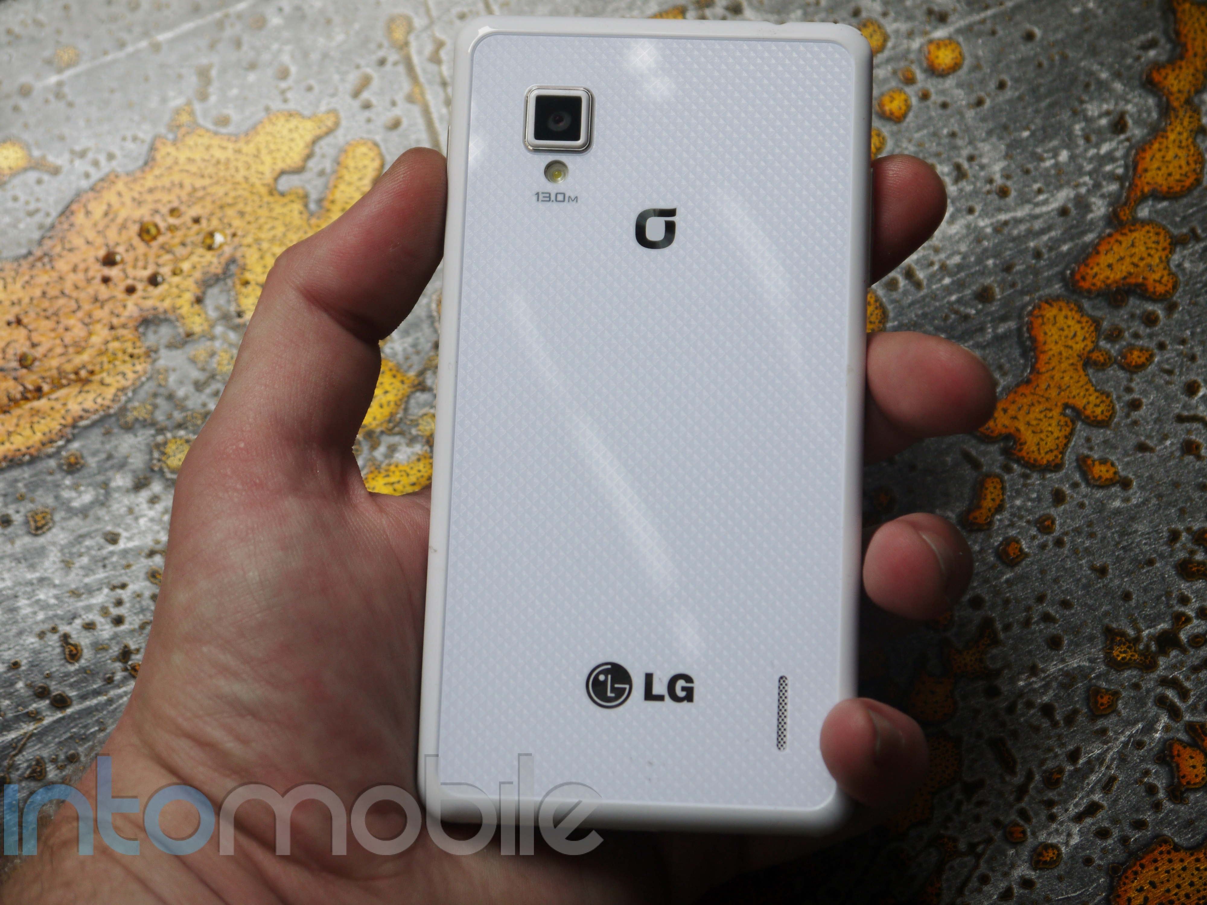
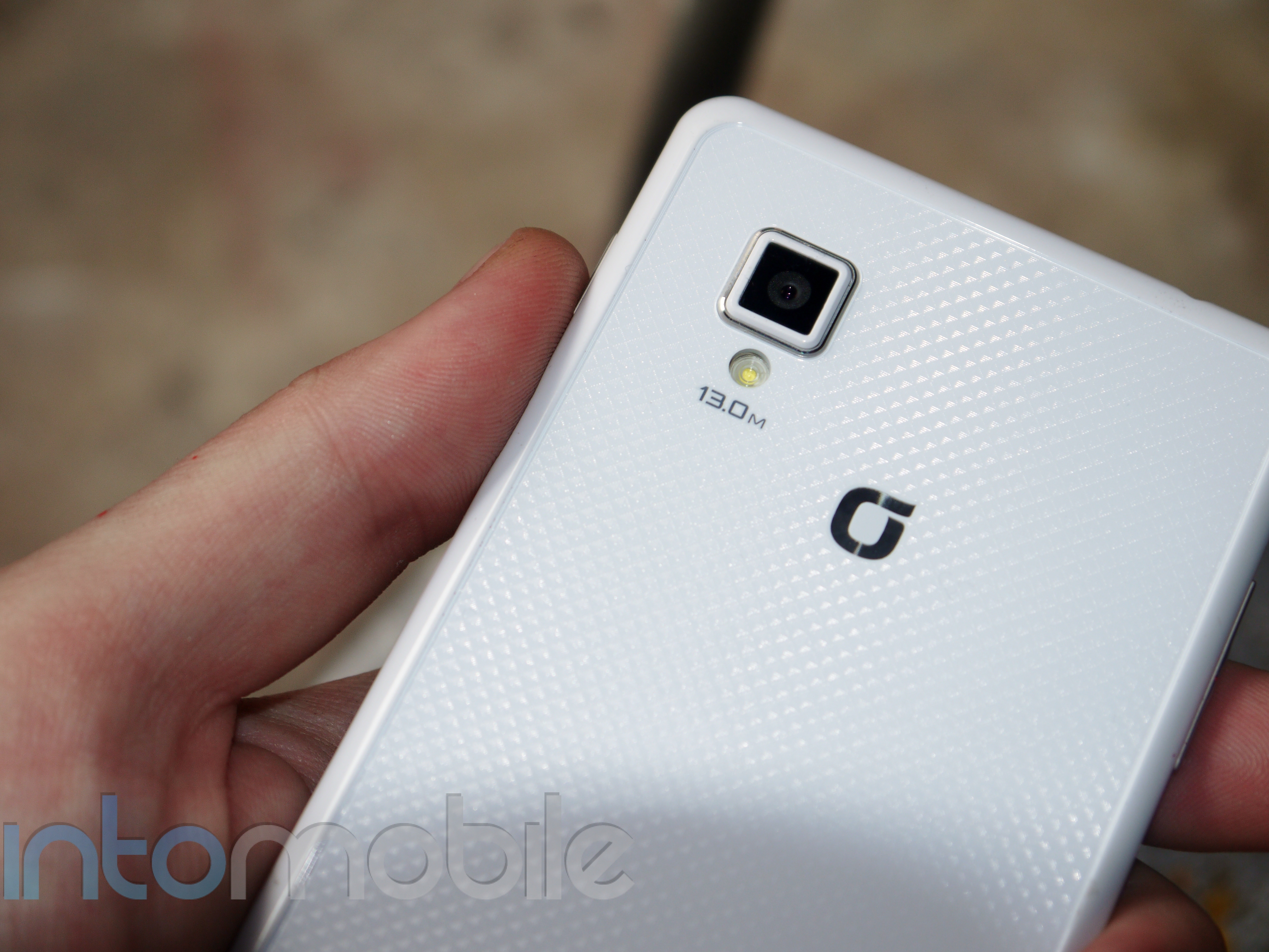
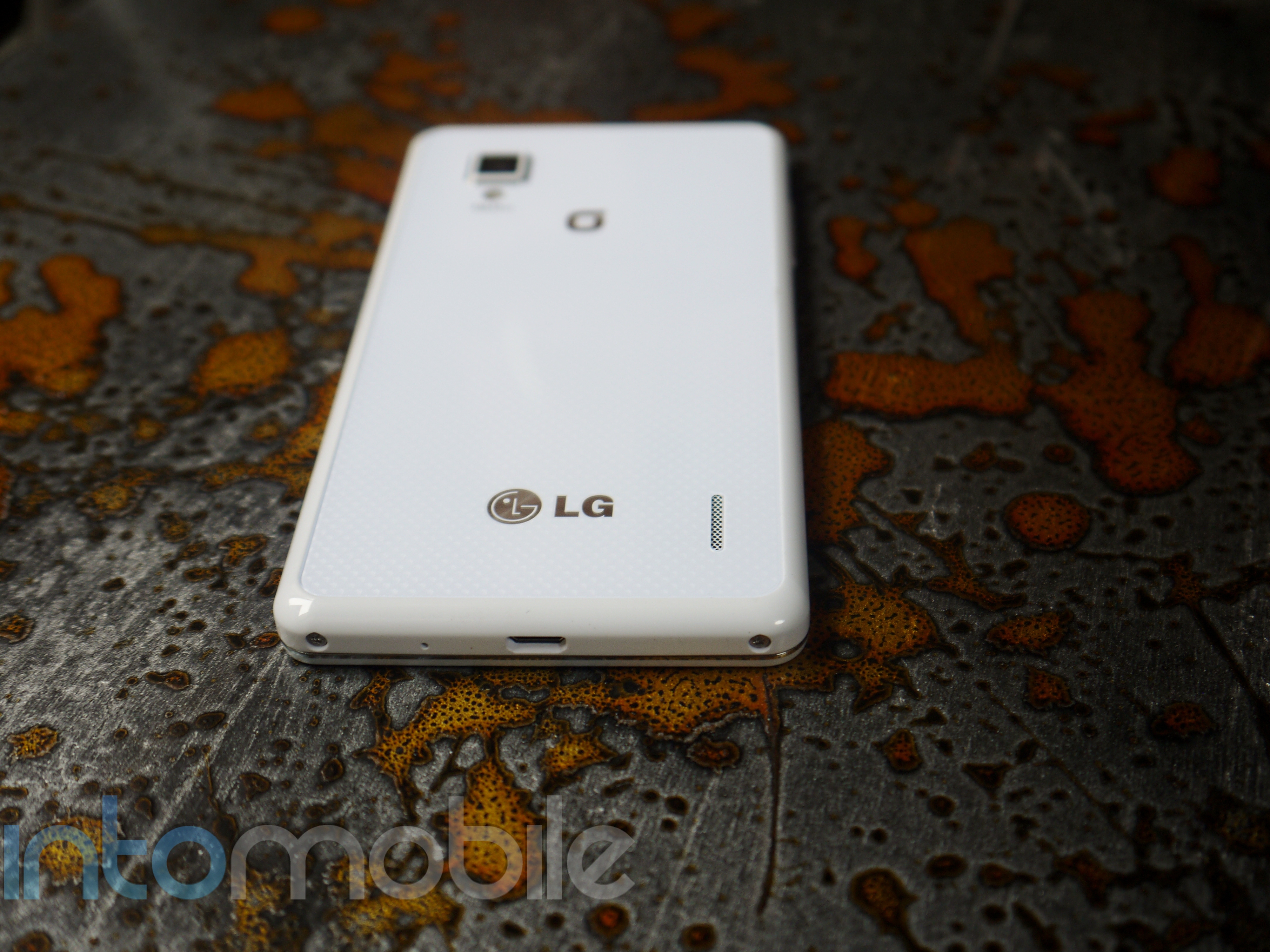
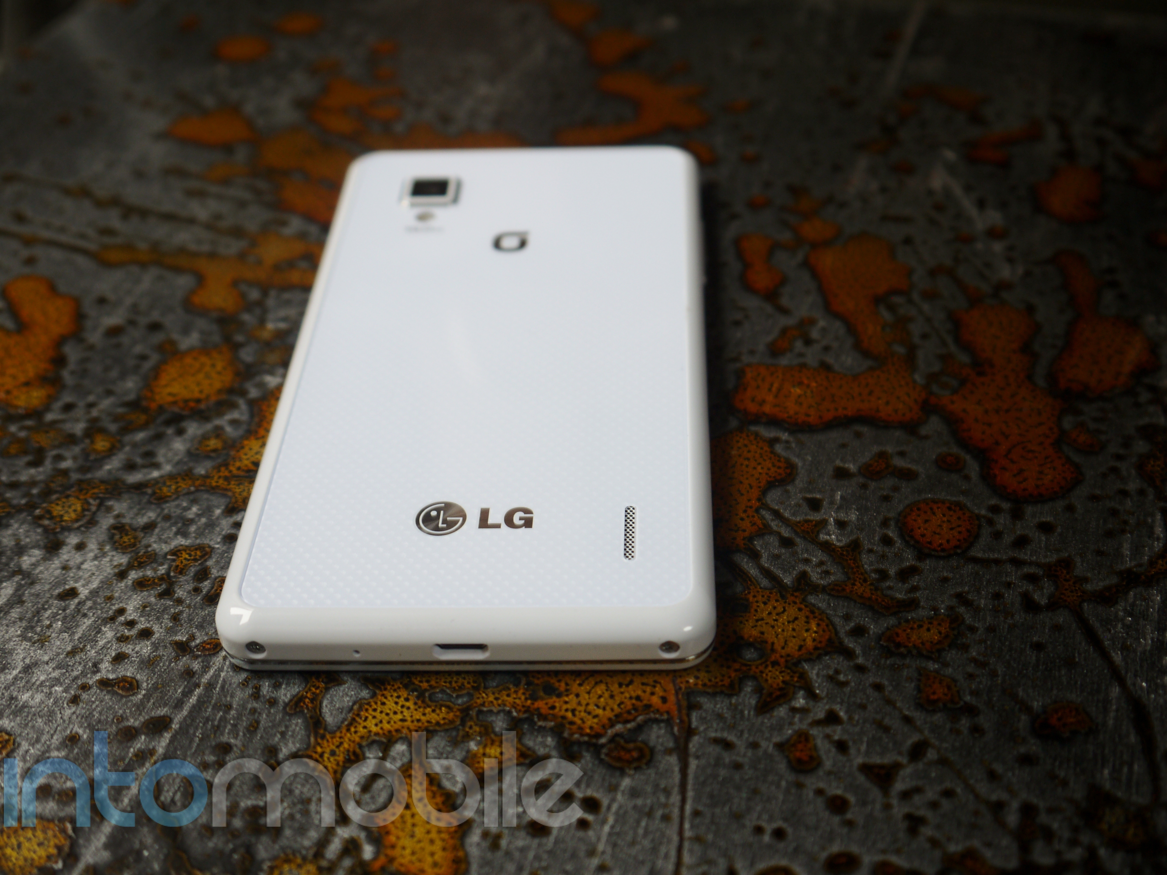
The Optimus G also rocks 32GB of internal storage (no microSD card slot), 13 or 8 megapixel camera (depending on market) with LED flash that was developed by LG Innotek, 2,100 mAh battery, NFC, and anything else you could want in a high-end smartphone today.

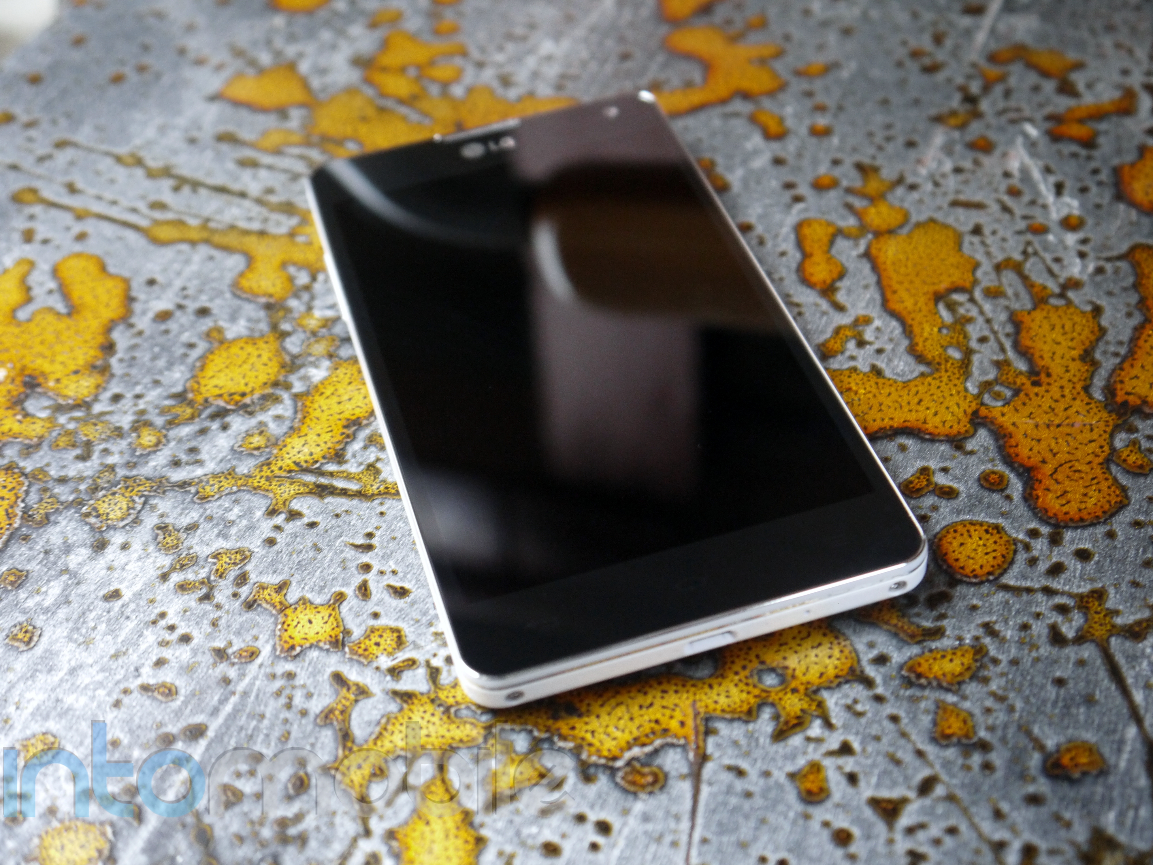
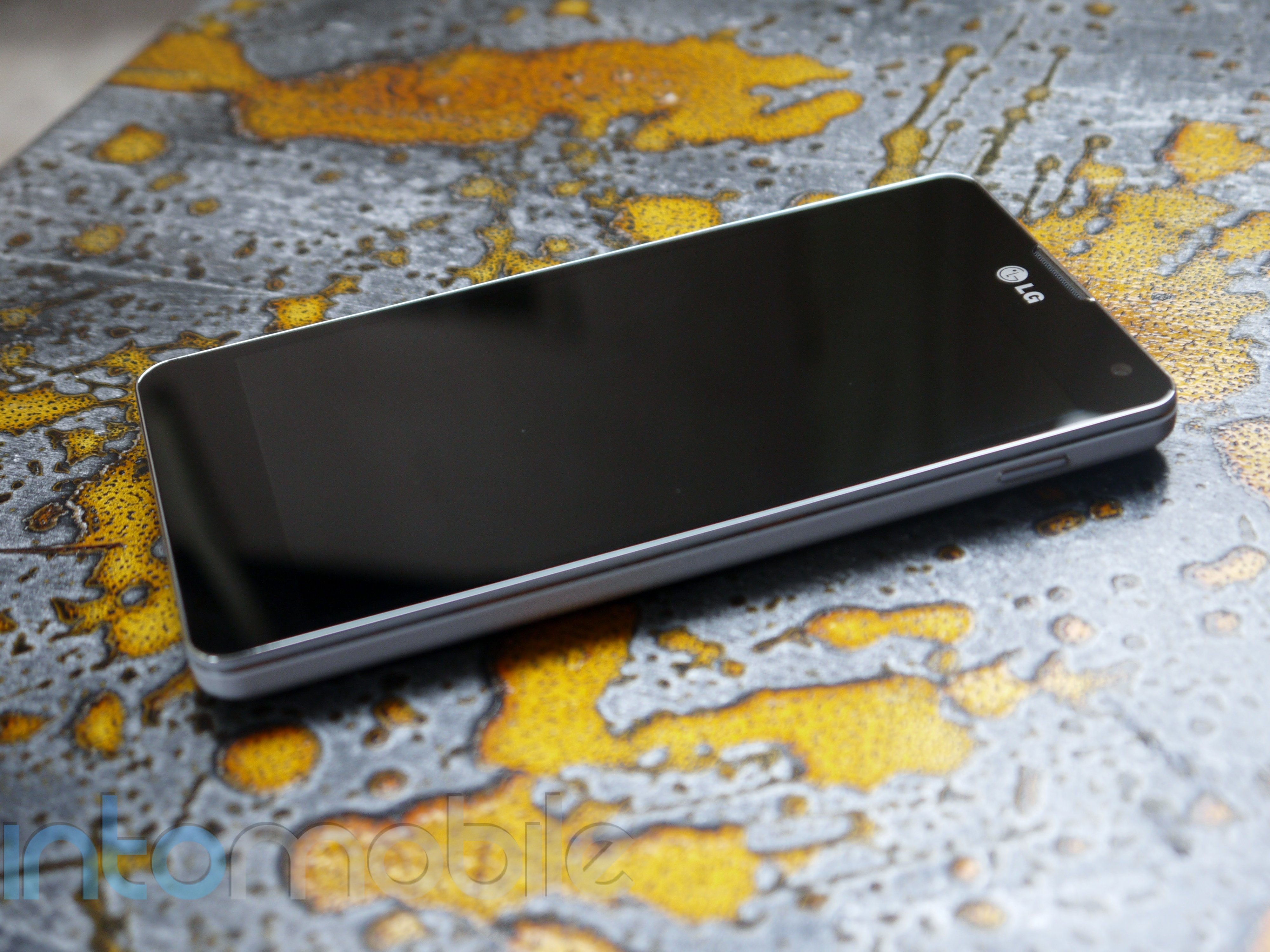
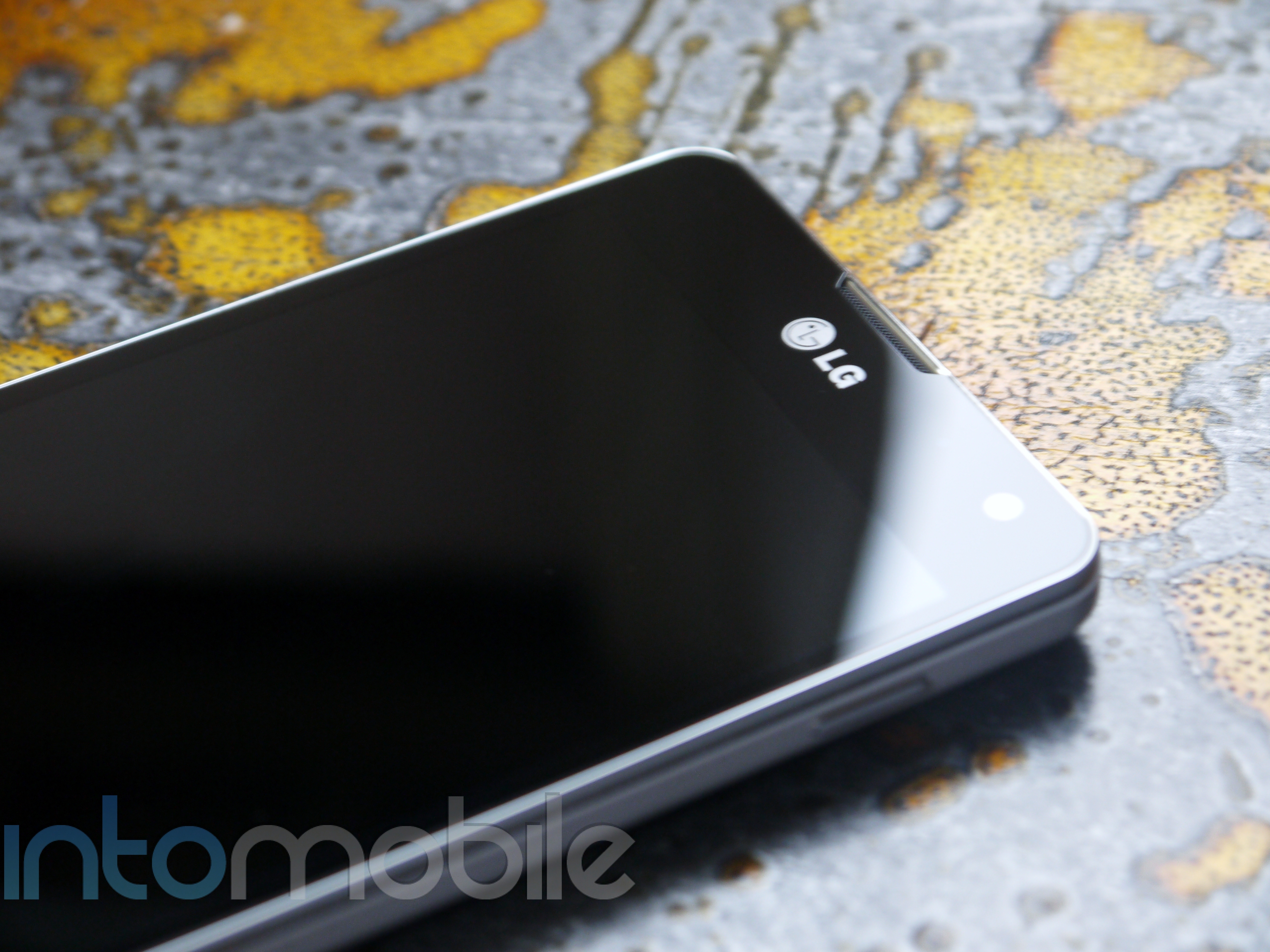
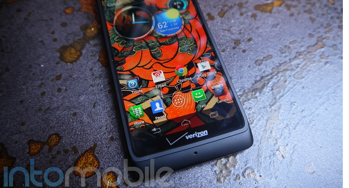
The face of the Optimus G is about as clean as any Android device could come, as there's nothing to disrupt the glass on the front. When unlocked, you will see that LG decided to keep the capacitive buttons on the device, which will leave some scratching their heads. Why the likes of Samsung, HTC, and now LG are keeping the aged menu button on their devices is pretty odd, but it doesn't necessarily take away from the LG Optimus G's beauty.  These buttons include back, home, and menu.

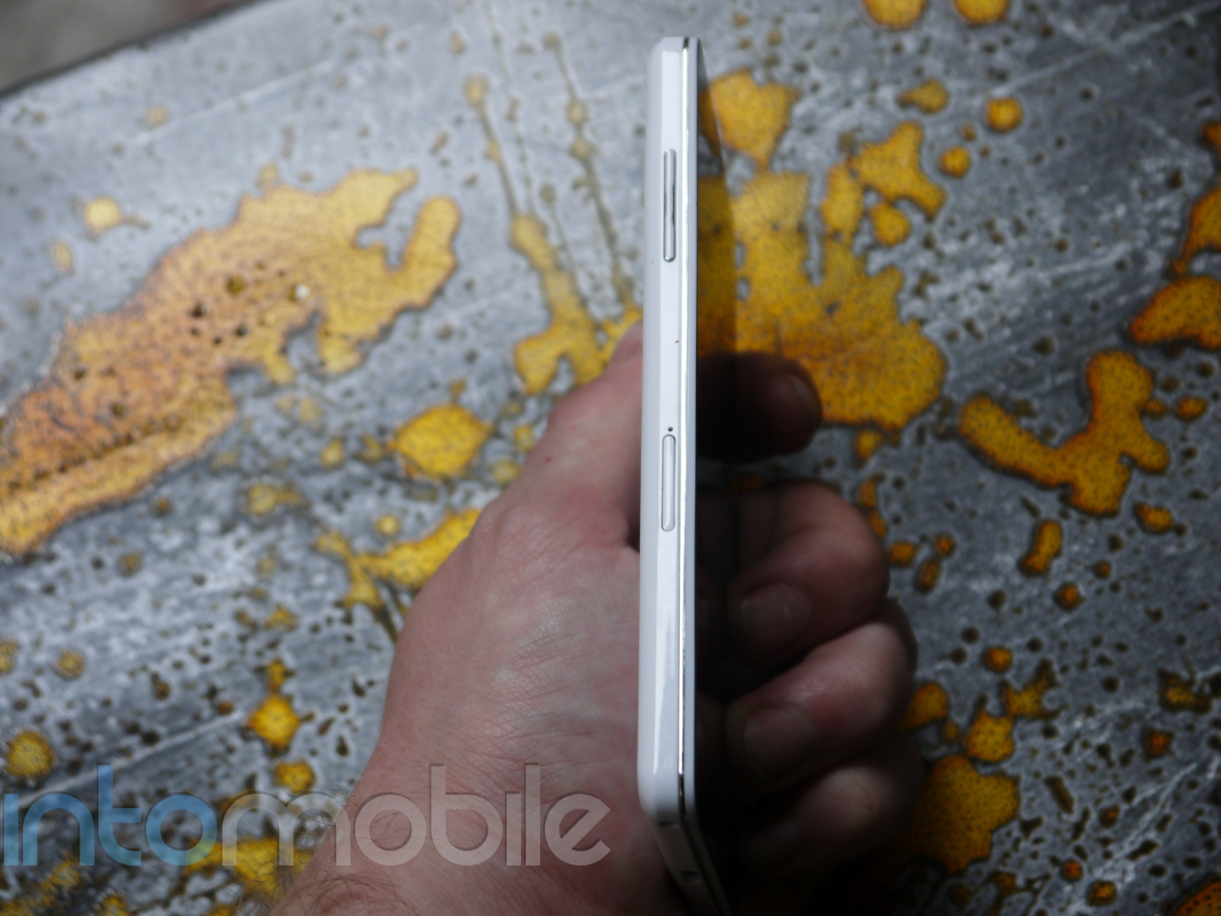
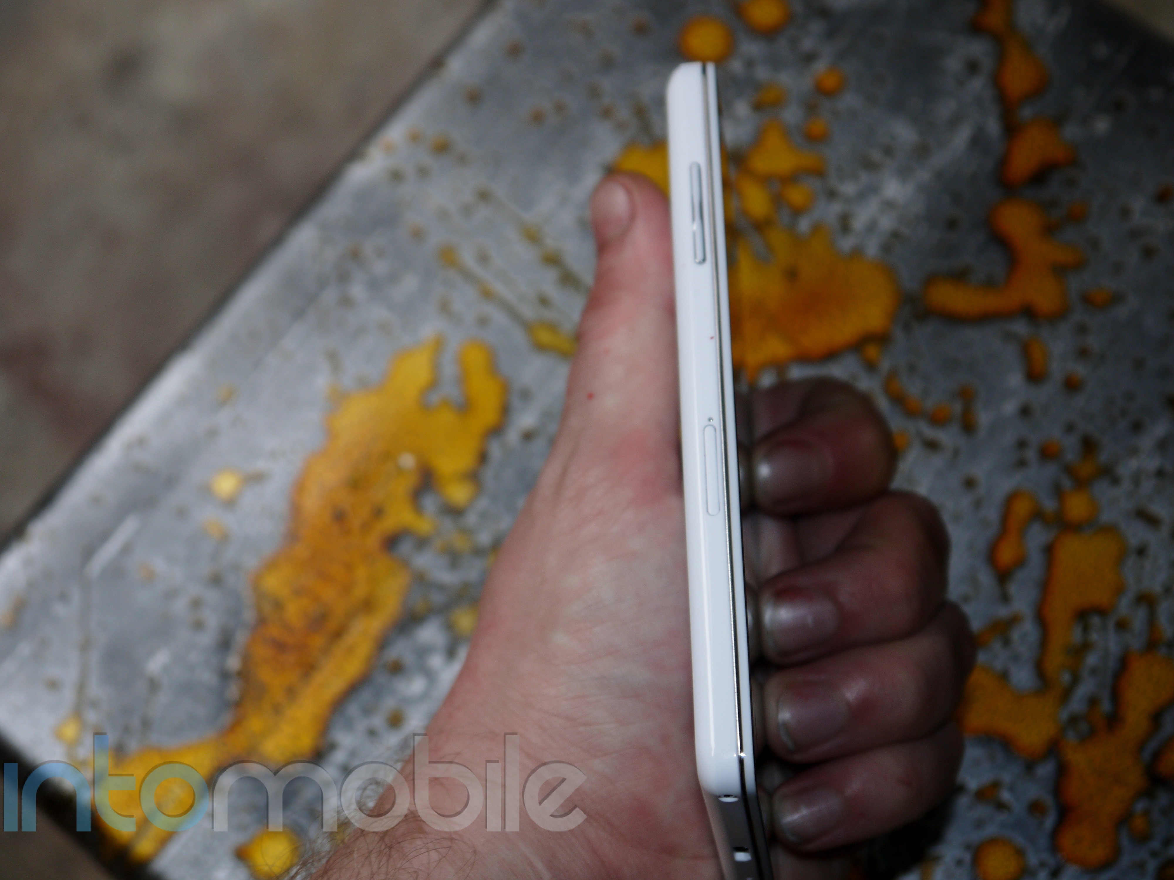
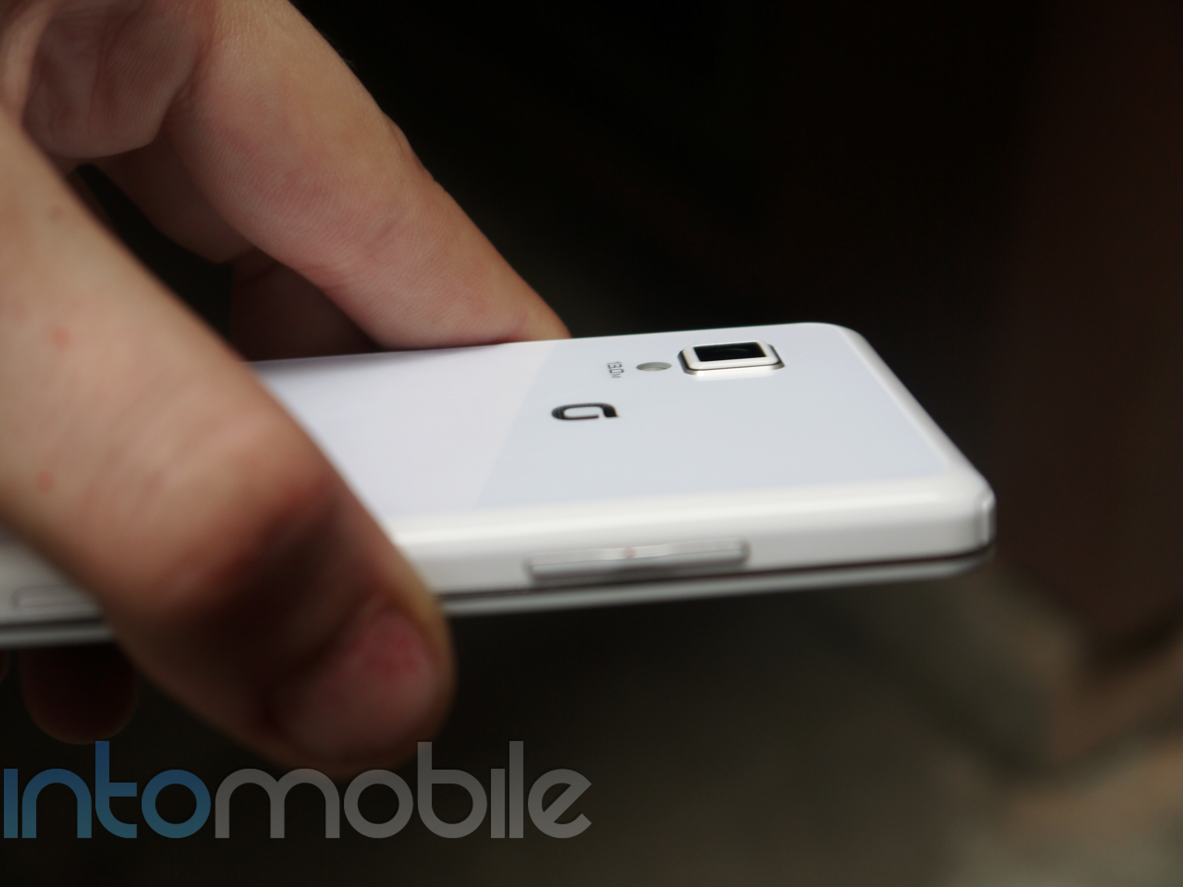
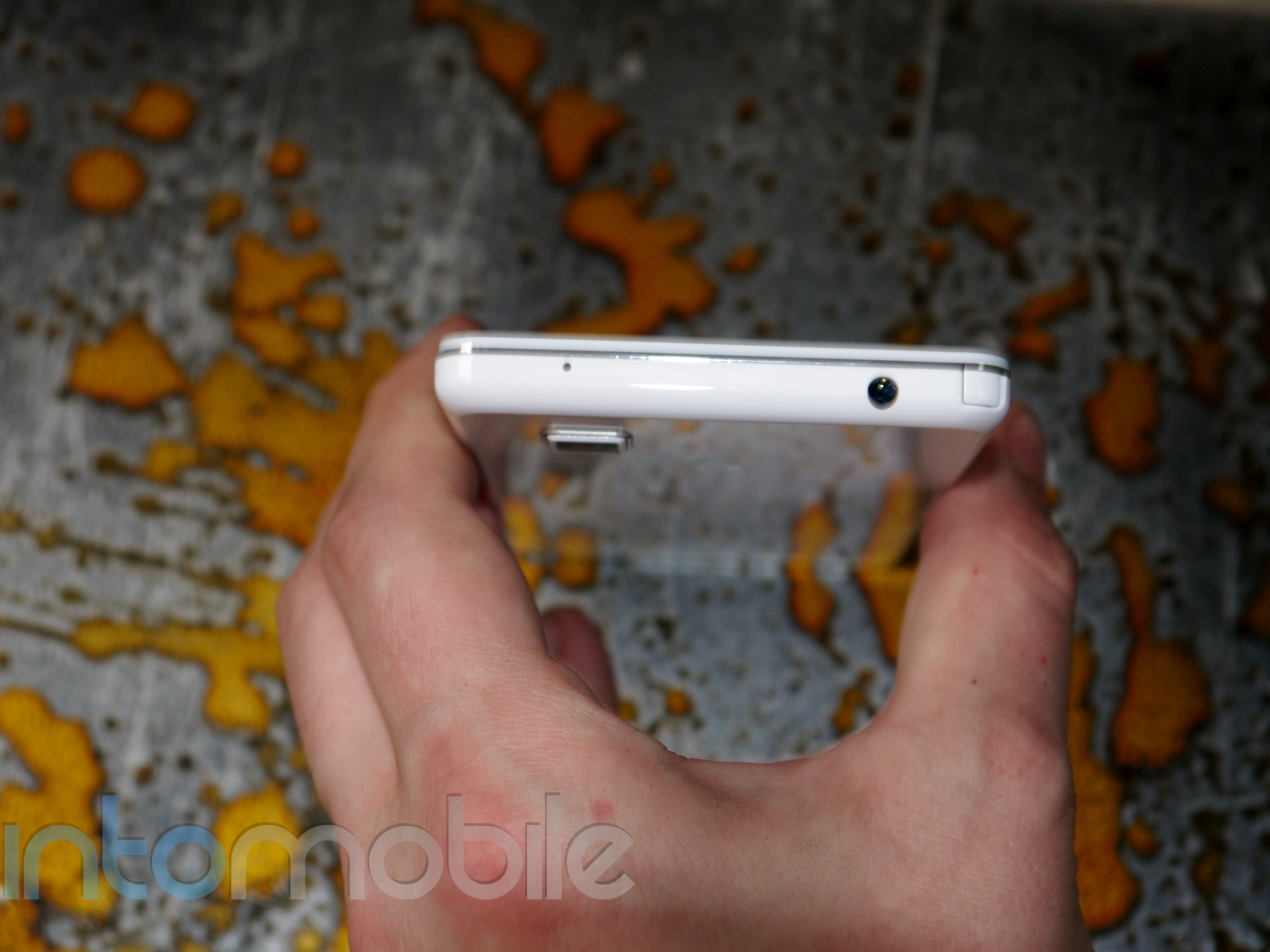
You'll find a similar set up along the sides of the Optimus G that you'd expect to see on a lot of Android handsets today. The top of the device houses the 3.5mm headphone jack, with the power/lock button moving onto the right side of the device now. It might seem a little "Samsung" of LG to do this, but when dealing with such large displays like this, it makes a lot of sense to put the button on the side of the device instead of the top. The left side of the G sports the volume rocker, and you'll find the  micro USB port for charging on the bottom.


Design

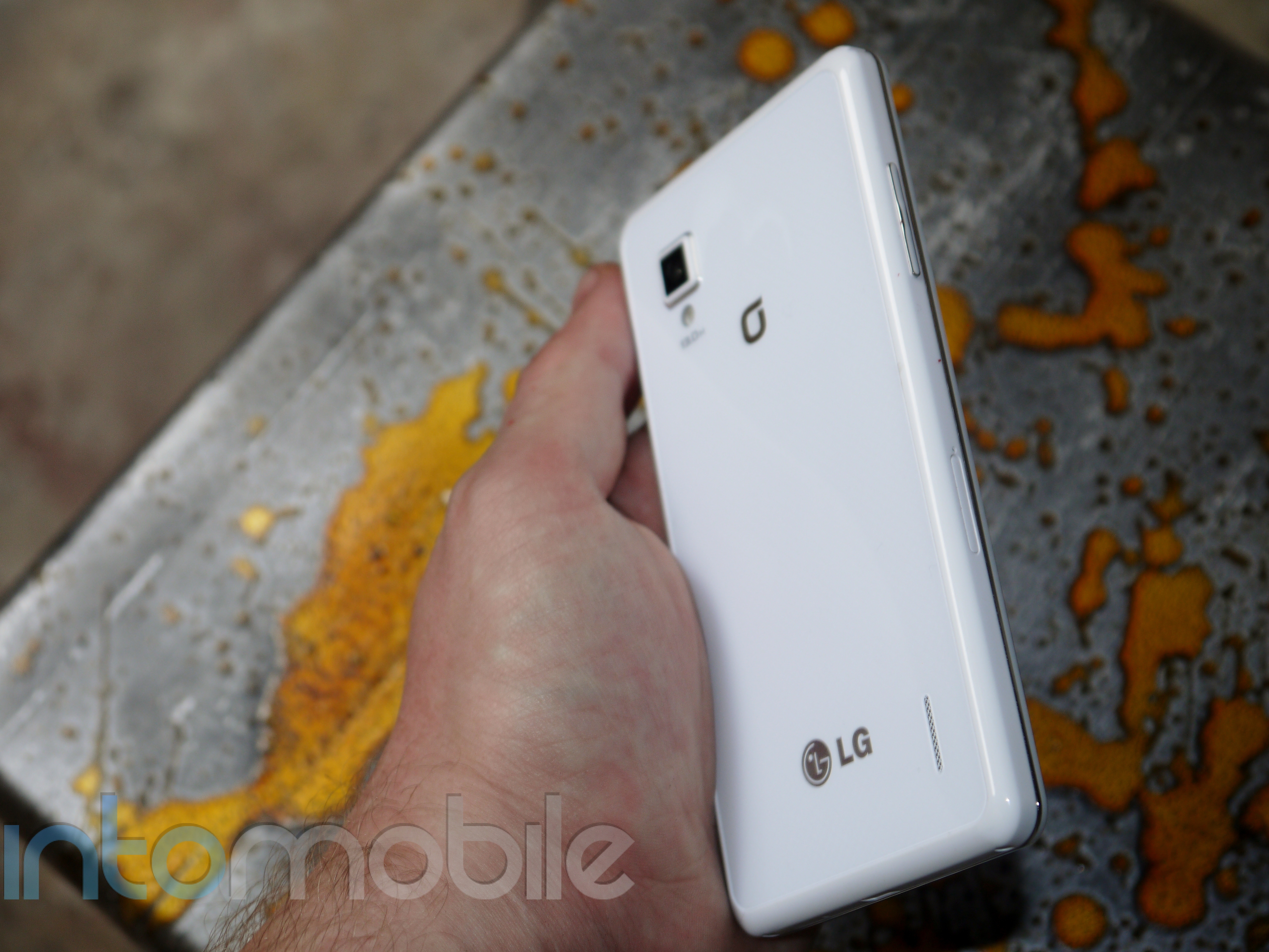
LG has achieved what it set out to do with a lot of its previous handset in the design area with the Optimus G. It's created a beautiful handset that's both understated and modern. Thin, silver accents line the face of the device and other physical buttons like the volume rocker, making it look even sexier. This is a handset you'd see in any woman's purse, in the pocket of any business man, and any average Joe. This becomes more apparent when you take a look at the handset's back side.

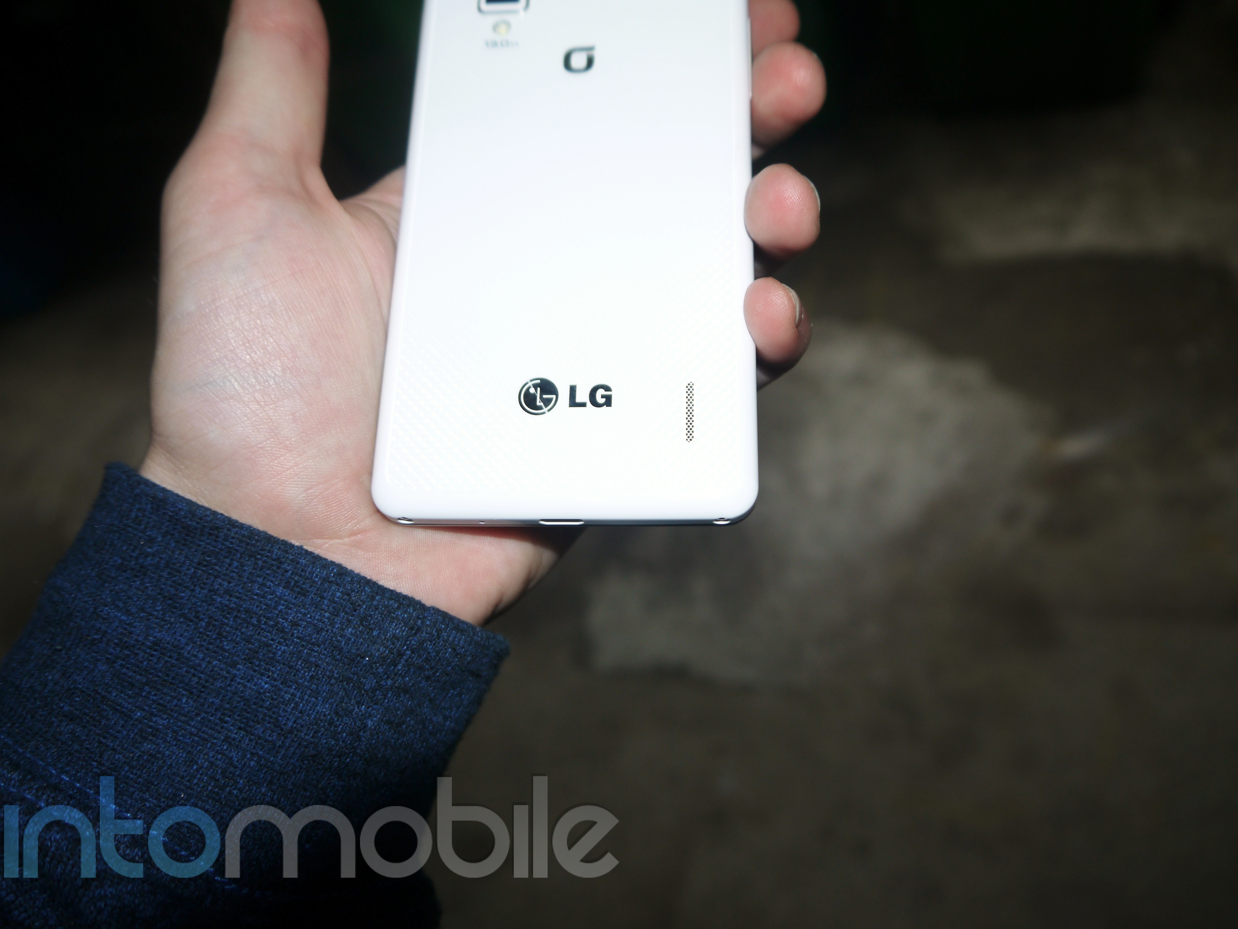
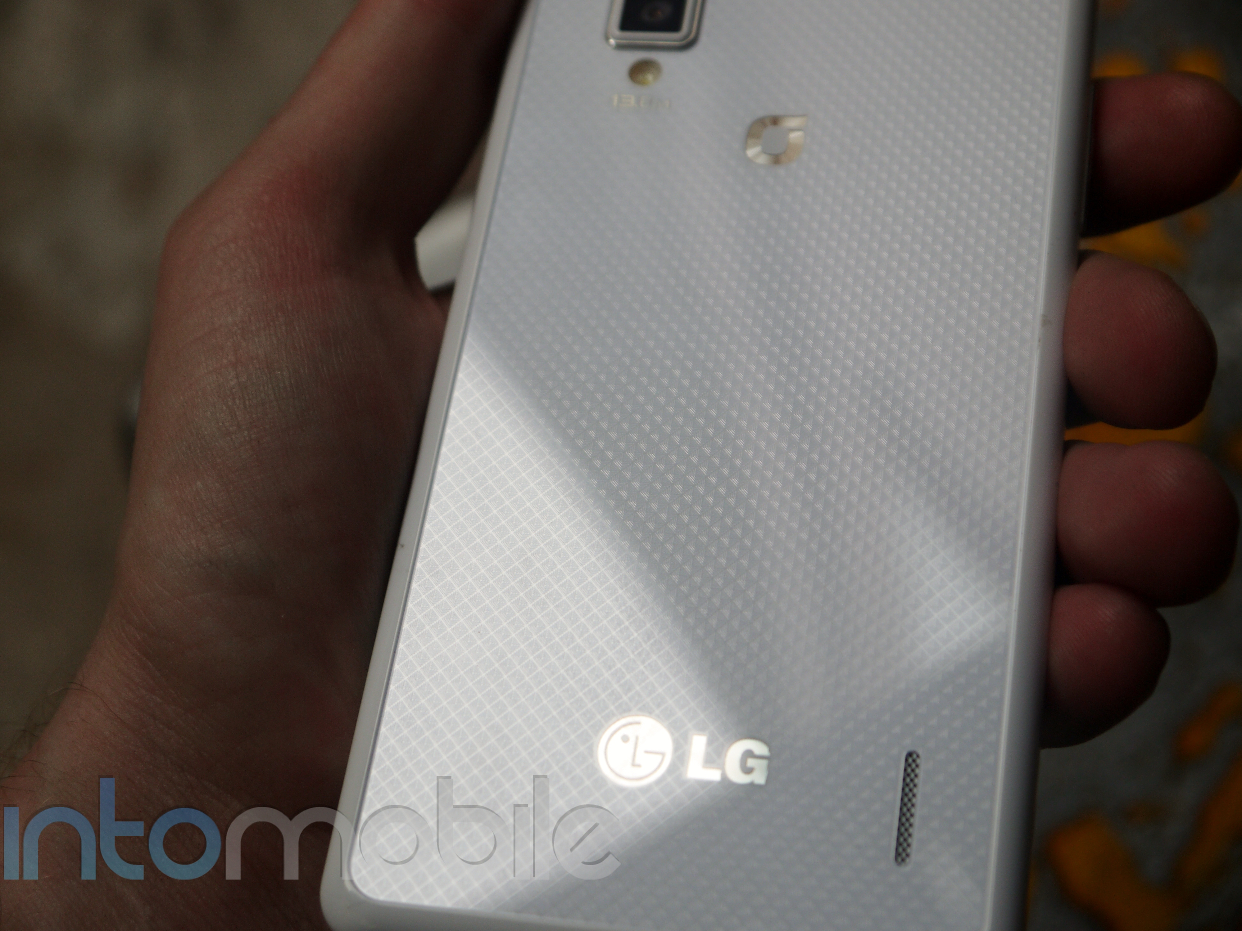
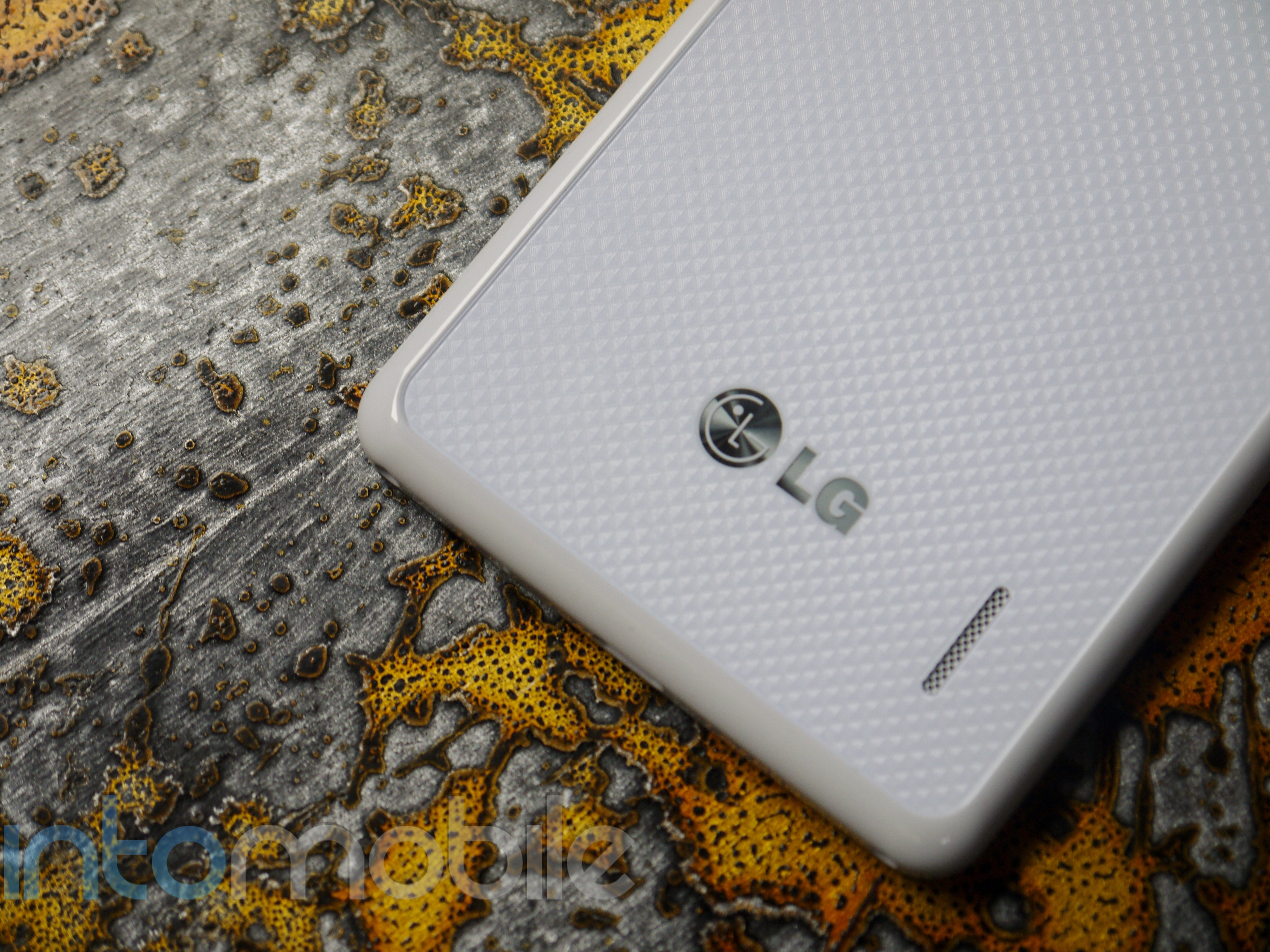
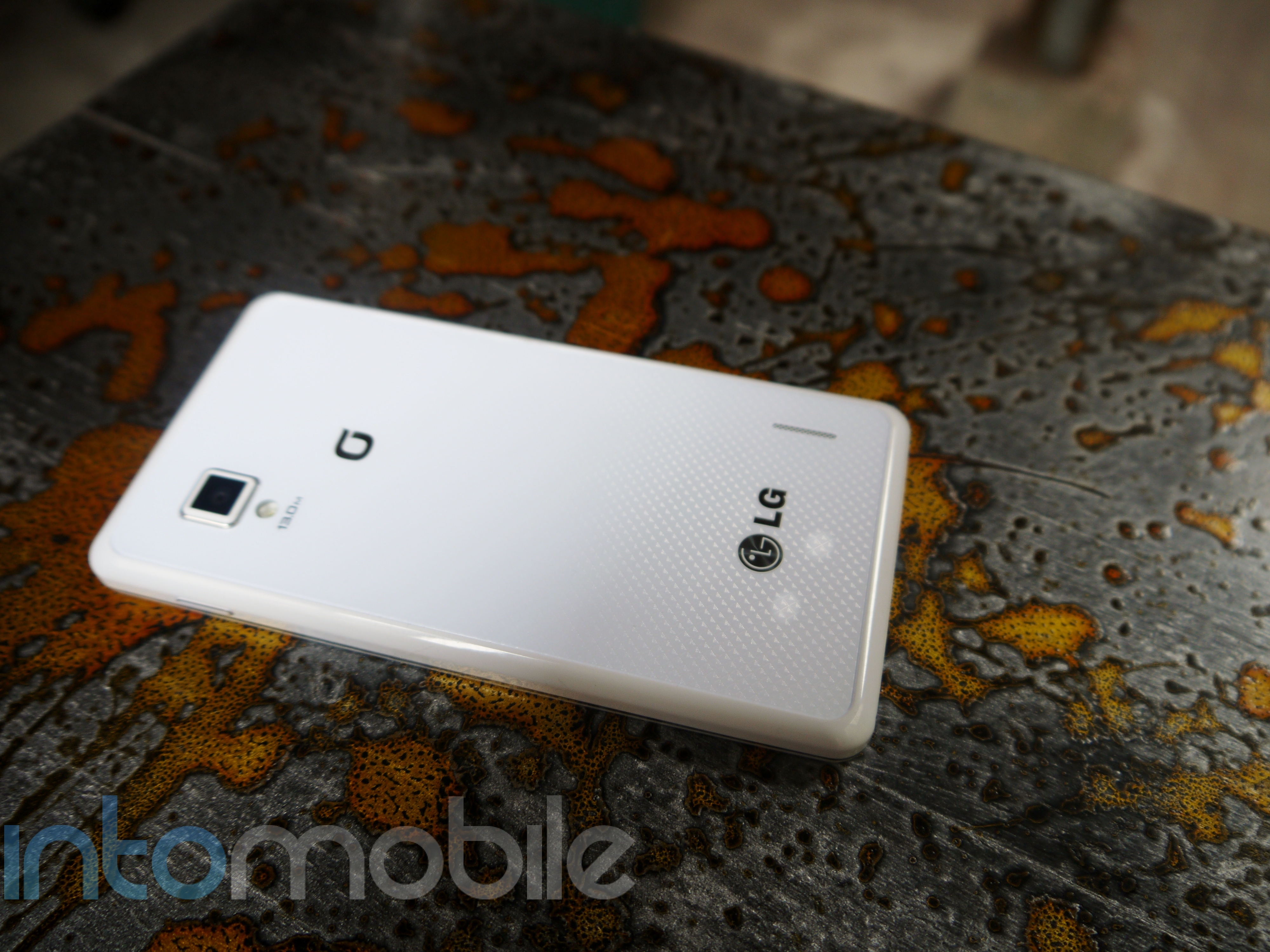
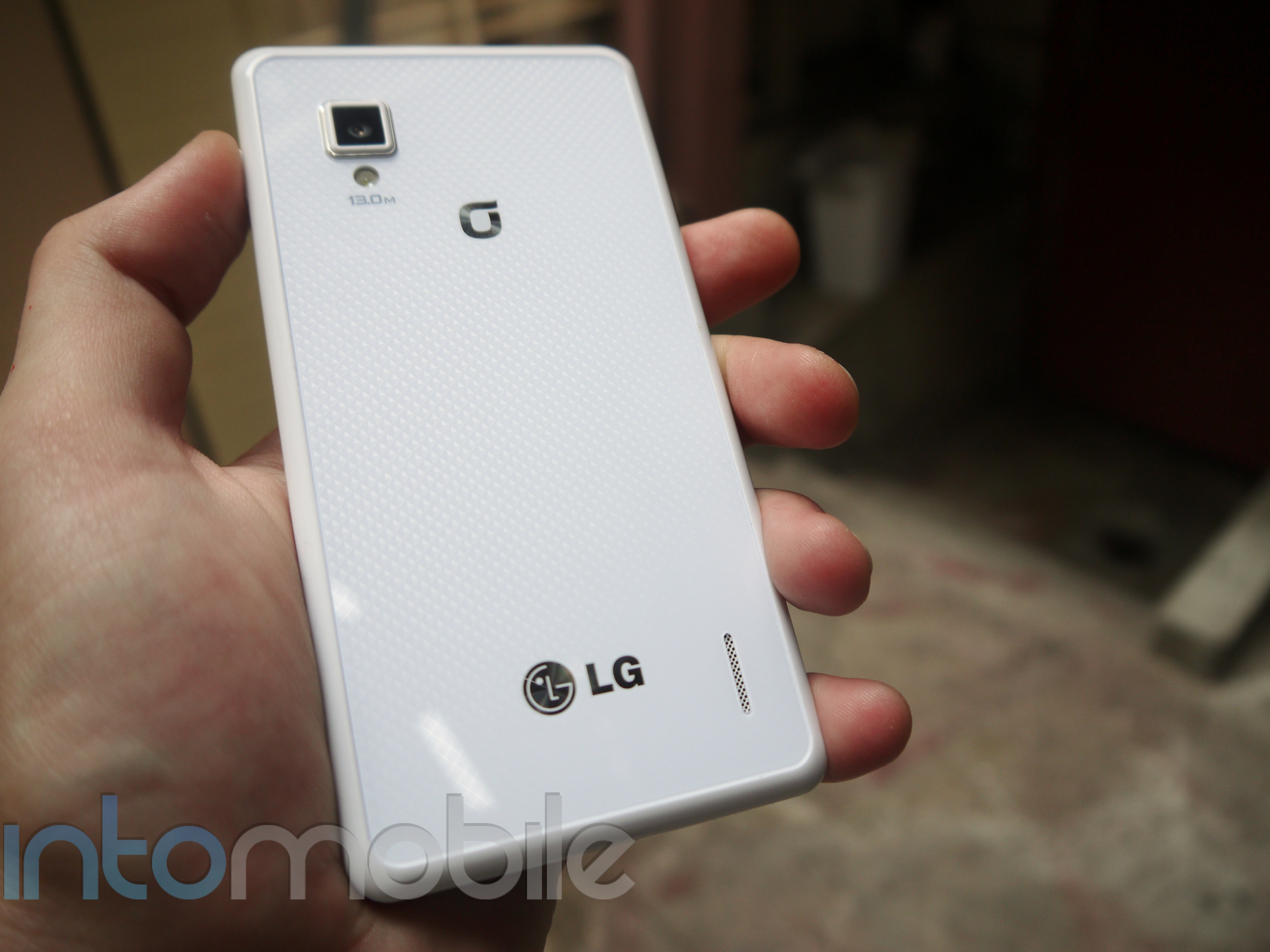
The Optimus G's rear is covered in LG's patented Crystal Reflection process, which produces different patterns depending on the lighting and angle that the devices is viewed in. It's really something to see on the white version of the device, as it gives a three-dimensional feel to the back glass panel. With a slightly different pattern on the black handset, the pattern still pops at first glance. It took LG 15 months to patent the Crystal Reflection process, and it's paid off, as it's easy to stare off into the ever-changing patterns.

In an attempt to bring a minimalistic look and feel without bringing a boring handset to market, LG nailed it with the Optimus G, as did it with the 4XHD. But in its latest flagship device, LG brought a whole new level to its device by choosing premium materials. Designs don't have to be flashy or decorative to be beautiful, and we applaud LG for fine-tuning its vision.

Build Quality

The LG Optimus G feels great in the hand. The glass panel on the back gives a very nice premium feel to the handset that we've yet to see from LG before. The one drawback you'll find on just about any device that's covered in glass is the ability to attract fingerprints. This is obviously more noticeable with the black Optimus G, but since this is glass we're dealing with, cleaning it off is simple enough.

The Optimus G feels very solid in the hand, but dealing with this much glass can make it feel fragile. Still, Android handsets are in desperate need of better materials, so we can only applaud LG for bringing these components to the Optimus G.

Software

In previous iterations, LG's custom user interface has never been something to write home about. It's never been an amazing experience to use, but it's also never been a cumbersome, over-customized experience. It's just been -- there. This actually isn't a bad thing, as LG's software has remained one of the most usable and unintrusive custom user interfaces to grace the Android space. When we got our hands on the Optimus 4XHD and saw the revamped software, LG's software began to flex some muscle. It remained subtle without bringing too many tweaks to the table, and the updated UI on the Optimus G has received quite a nice face lift.

LG has really gone after Samsung in the software department, and for the most part, LG has successfully kicked Samsung in the software -- area.

LG focused on making some not only novel features within its new software, but some highly functional ones as well. The only downside we could really say about these certain features is that applications need to use a certain API to take advantage of the software. Nonetheless, the latest software on the Optimus G is something to be admired.

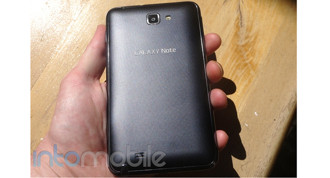
Some of the most interesting features seem to compete directly with a few of Samsung's interesting features found on the Galaxy S III and the Galaxy Note. One feature that comes to mind is QSlide. QSlide, while implemented in a different way, is LG's version of Samsung's Pop Out Play video. Instead of a separate window appearing that you can move around on the screen, QSlide merges the two screens together and you can use a small slider on the screen to adjust the transparency. This allows you to do two things at once, without needing to move around a window.

LG has also provided some interesting tweaks when it comes to zooming with Live Zoom and Screen Zoom. The former allows you to zoom in on a particular area on live HD video, and the power of the Qualcomm Snapdragon S4 Pro ensures there's not even a little bit of a stutter during the process.

Screen Zoom is an interesting and simple feature that you may find yourself using a bit. It allows you to pinch in or out of certain applications, which will then reconfigured the content being display. One of the best examples of Screen Zoom (found in the video above) is in the photo gallery. Pinching out will make the photo thumbnails larger, changing the size of the photo grid from 5 x 8 to 2 x 6. This feature extends to a handful of other applications on the handset as well.

Another pretty nifty feature on the Optimus G is Dual Screen Dual Play, which lets the user stream content from their phone to a compatible TV, while still being able to use the phone any way you want. A potential use case for this is sending a slide of a presentation to the TV and viewing the slide's extra notes on the phone. Another, more simple example would be streaming a video to your TV via your phone, and checking your email in the process.

There are quite a few new and interesting features packaged in with the Optimus G, and LG has done a great job at blending fun and functional features, all while keeping things pretty simple.

All the Small Things

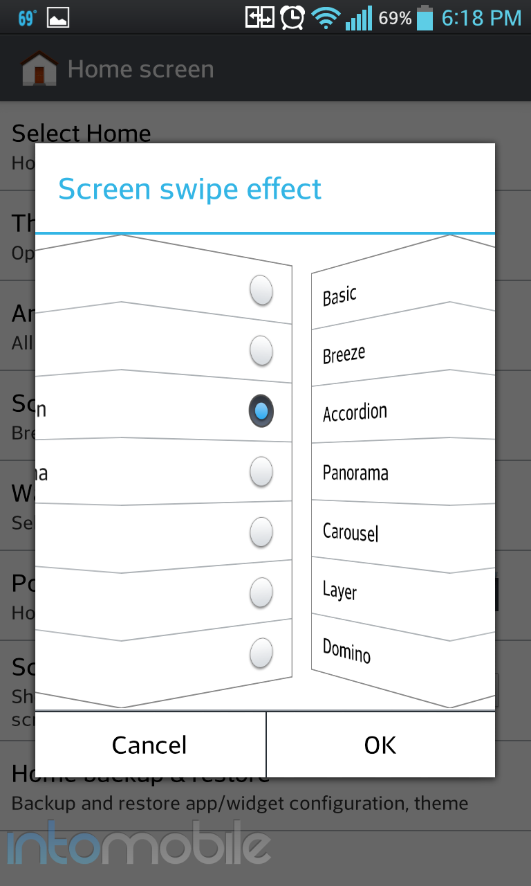
Alongside some nice new features, LG has gone out of it's way to add tweaks that most would only find in either a custom ROM, or home replacement application. Subtle customizations like allowing the battery meter to show the percentage on the status bar, or allowing the user to view the home screen transition within the same window (pictured below), and multiple lockscreen unlock animations are just a few examples of LG really focusing on the user experience and convenience. No, these features may not make the average user to want to go buy the device, but it's this kind of attention to detail is very appreciated and makes us want other handset-makers to look into the kind of subtle details.

#winning

Web Browser, Multimedia And Camera

Web Browser

The web browsing experience on the Optimus G hasn't changed much from previous LG devices, and that's not necessarily a bad thing. The layout is simple and to the point, and you'll have a hard time getting lost.

Essentially a skinned version of the stock Android browser, the main defining characteristic within the browser is the small tab on the bottom of the screen that gives you your standard browser navigation options. You'll find options for back, forward, home page, add tab, and bookmarks options. Tapping the menu button will bring more options for more settings to tweak.


Camera

The camera on the Optimus G can take some pretty shots. It can also take some not so amazing shots in lower light settings. Overall, most photos are acceptable. On a standard gloomy San Francisco day, the camera performed well enough capturing the moment.

The camera software has been updated significantly and brings a nice set of new features. Features like Cheese Shutter, which allows you to say "Cheese" or another defined word that will make the camera take the pictures aren't anything new, but it's a nice touch and that's certainly not all to expect.

Time Catch Shot is one of the most interesting camera tweaks you'll find on the Optimus G. While holding down on the shutter button will allow you to take multiple pictures with the camera, Time Catch Shot takes a different approach. With the feature activated, the camera will begin taking pictures of the subject, allowing you to choose the best one, before you even press the shutter button. This could come in handy if you're trying to take a photo with some fidgety children.

Call Quality And Battery Life

This particular review unit is straight out of Korea, so we were only working with GPRS on T-Mobile. We'll soon have the Sprint and AT&T models to test call quality with the Optimus G.

When the Optimus G was announced in Korea, I had time to use it for a few days and the not final software, along with the combination of (excellent) LTE caused the battery to drain in a very short amount of time. Although I'm on a much slower network, I've been using the handset on WiFi constantly. So far, the battery life on the device is more than adequate, but again, we'll see how the two US variants fare when we get some time with them in the coming days.

While you shouldn't expect this sort of battery life, it was pretty nice to see the Optimus G at 45% after 13 solid hours of use. Oh, GPRS.

The Final Take

In an uphill battle for relevance, LG has come out with a sharp right hook. The Optimus G is a great device that certainly shows the world that it isn't going anywhere. We saw some great things comes from the LG Optimus 4XHD, and the Optimus G builds upon that further with some great build materials, and a very nice, yet not overdone facelift in the software department.

While this is nothing more than my personal opinion, but I'd probably opt for the Optimus G over the Galaxy S III if I were to buy one these devices. From the screen technology to the processor, the Optimus G sails past Samsung's flagship device. It would be a harder decision if the Galaxy S III was rocking the same Exynos processor we'll soon find in the Galaxy Note II, but that's just not the case. While some may not be in love the the Optimus G's boxy design, I've got to say that I'm a huge fan of it. Especially the rear glass panel with the Crystal Reflection pattern. And while some may appreciate the design of the Galaxy S III more, when it comes to in hand feel, there's no question as to which feels more like a premium device.

At the moment, the power under the hood of the Optimus G goes unmatched. The Snapdragon S4 Pro give the feeling that the Optimus G is already rocking Android 4.1 with Project Butter since it runs so smoothly. We'll soon have the HTC One X+ and the Galaxy Note II to challenge LG's newest flagship handset, but we'd say that Life is Good for the company right about now.

If anything, the Optimus G should at very least prove to the world that it's not the chump many have believed it was in the smartphone market. The handset is every bit as interesting and powerful as the rest of them, and it should make interested parties that much more excited about the upcoming Nexus device.


Motorola Droid RAZR M Review – How far does an edge-to-edge display get you?

October 2, 2012 by Blake Stimac - 2 Comments

While we’ve seen a handful of Motorola Droid RAZR handsets in less than a year, the RAZR M might be the most interesting, even if it’s not the most powerful of the bunch. Rocking a modern set of specs for the mid-range level, the RAZR M’s eye-catching feature is it that it’s one of the…

Read more
The Good
  • Tiny bezel makes the handset look eye-catching
  • Custom UI tweaks offer better usability
  • Solid in-hand feel is what we expect from Motorola
The Bad
  • Display tech not as good as we hoped
  • Design is solid but a bit underwhelming

Hardware

The Droid RAZR M is both interesting and underwhelming at the same time. The design, while slightly tweaked, is pretty much what you'd expect to see in a handset with the RAZR name, but it's hard not to like.

4.3 inch displays seem to be quite the sweet spot for smartphones, as they fit nicely in the hand without taking too much space. The exceptionally thin also lends to the great in-hand feel. It's thin, but not too thin, which is a great thing. The 7.7mm on the original RAZR was simply uncomfortable in the hand and this was mainly due to the wideness of the display. This is not an issue at all with the RAZR M, and the size feels just right in the hand.

The real selling point of the RAZR M is obviously the micro-bezel it's rocking. Unfortunately, the display itself leaves a lot to be desired. The qHD Super AMOLED Advanced pentile display is that last thing you really want to show off when the bezel is so small, as you'll see pixels everywhere - across the board.  It's fine for what it is, but Motorola missed the mark in the display arena. Still, the display tech in the handset might be a non-issue for some.

As you'd expect, the RAZR M's face is rather clean. Above the display, you'll find a LED Notification light, Motorola's logo, as well as the front facing camera and the standard assortment of proximity and ambient light sensors. Below the screen is where you'll find one of the two Verizon logos, with a microphone below for calls. The left side of the device houses the microUSB port and a small tab that hides the SIM card slot and microSD card slot. The right side of the device is where you'll find both the power/lock button and volume rocker, which can make it a bit cumbersome to take screenshots. The top houses the 3.5mm headphone jack and the bottom side is clean.

The back of the RAZR M is your standard affair as well. You'll find the Kevlar backing that is nice and sturdy, but slowly losing its novelty with every new RAZR iteration, as well as the 8 megapixel camera and speaker grill here.

Design

With the exception of how small Motorola managed to make the bezel on this device, the design isn't terribly different from other RAZR handsets. Still, if you like the industrial look of the RAZR series, you'll no doubt like the RAZR M.

Like with most of the RAZR handsets we've seen before, the RAZR M starts out thicker at the top and slightly tapers when you get to the bottom. The Kevlar back panel does little to impress us anymore, but it's still as sturdy as you'd expect it to be, and has become a staple material in many Motorola devices.

Build Quality

What's probably the least surprising thing about the RAZR M is its build quality, and that's a good thing. Motorola has long been making its handsets  as sturdy as  possible, and you'll find that same effort in the RAZR M. The handset feels about as solid as any handset could be these days, and that's thanks to its size and build materials. The use of metals and Kevlar give it a strong in-hand feel, and we wouldn't expect anything less from Moto.


Guts And Glory

The RAZR M should satisfy the needs of just about anyone who handles it. We may have some more powerful devices available at the moment, but it's hard to beat the innards of the M since it's only $99 on a new contract.

The RAZR M will offer up a 1.5 GHz dual-core Snapdragon S4 processor, 1GB of RAM, and all the goodies you'd want in a handset of this price range. In reality, you're getting a pretty damn powerful phone for $100.

Software

Motorola has seriously stepped up its come in a couple areas with its software. It's essentially the same UI you'll find on the likes of the Atrix HD  and some of the other new Moto handsets. Still, there are a couple of tweaks found in the RAZR M that will likely be making their way to more handsets that we like a lot.

We've seen LG and Samsung bring quick settings toggles to the notification panel on their own Android handsets, but Motorola has taken a different approach. But to understand how said toggles are implemented, you need to know about how the new "Not-MotoBlur's" home screens work. Instead of having the middle panel as your main homescreen panel, Motorola's UI panels go from left to right. When you tap the home button, you'll be brought back to the first panel all the way on the left.

So what does this have to do with a quick settings menu at all?  Well, from the main home screen, all you need to do is swipe once to the left to get a rather large assortment of settings toggles. This is a bit easier to do than reaching all the way at the top to drag down the notification window, but you do need to be on the main panel to access the quick settings, so there's a give and take between both methods. Nonetheless, it's implemented well enough to be helpful, which is all we've been asking for from Motorola.

Other than some minor UI changes, the software on the RAZR M is pretty much the standard experience you've seen on most Motorola handsets as of late, and that's not a bad thing at all. Motorola's custom UI is so much better than what it used to be, and now comes with some truly useful features.


Web Browser, Multimedia And Camera

Camera

The camera on Motorola phones have usually been a miss for whatever reason, and while the shooter on the RAZR M isn't nearly as bad as some previous handsets, it still falls a bit short.

Gone is the massive amount of graininess that had plagued devices like the first two Atrix handsets, but the RAZR M still has some issues with low-light shots. Many photos come out significantly darker than you'd expect them to be, even if the environment isn't all that dark. That said, with great lighting, the RAZR M can take some gems.

The camera software remains the same as what you'd find on something like the Atrix HD, and it's nothing to write home about. It brings most of the main features to the forefront, but lacks the style you'll find on competing devices.

Call Quality And Battery Life

As you'd expect on most Verizon handsets, call quality was pretty good. I experienced no dropped calls nor interference while using the phone on either side.

Battery life is acceptable with the RAZR M. It may lack the 3300 mAh battery on the RAZR MAXX, but the 2000 mAh battery does its best to keep up. And it does so accordingly. I managed to get through a day with the RAZR M with moderate usage, but as per usual, results will vary. LTE has come a long way when it comes to battery life, but expect to take a hit .

The Final Take

There's a lot to like about the RAZR M, even if it doesn't look much different from other RAZR handsets at first glance. The RAZR M has a lot going for it and the fact that it's only $100 will easily be enough to satisfy potential buyers.

We've been waiting for an edge-to-edge display from Apple, Samsung, HTC, --- anyone - and it was Motorola who brought it to the table. It may not be a bezeless device, but the RAZR M's is thin enough to keep you interested, and that it does. We do wish the display tech was a bit better, but it's just a minor complaint when you consider the price and the solid in-hand feel of the handset.

The Droid RAZR M might not sway you from something like the Galaxy S III or HTC One X, but its still a nice looking phone with a powerful set of specs. If you've been looking into the RAZR series for your next smartphone purchase, be sure to direct you attention to the RAZR M. Until the RAZR MAXX HD comes out, at least.


Kindle Fire HD 7-inch review: Are services more important than software?

September 28, 2012 by Charles West - 9 Comments

Getting to review the second generation Kindle Fire 7-inch is a great reminder of how fast a company has grown in what was supposed to be an unknown territory. Amazon, who’s arguably responsible for brick and mortar’s closing around the globe has made its own compelling case to why consumers should pick its ecosystem of…

Read more
The Good
  • Speakers that are legit, their loud and not distorted.
  • Sturdy piece of hardware.
  • An awesome 7-inch display
  • Amazon ecosystem. Watching movies, reading Kindle books, or shopping are all well integrated experiences.
The Bad
  • Amazon's OS sometimes feels sluggish, laggy.
  • No customization
  • AppStore lacks apps

Hardware

When you first look at the Kindle Fire HD you get a feeling that all plastic matte black body is well put together. It’s certainly no cheap piece of hardware. The device has a much wider bezel on it when compared to its predecessor; this expanded bezel is suppose to make reading a bit more enjoyable. In fact, going back and forth between the Kindle Fire HD and my Nexus 7, made me realize the Fire’s wider bezel gave a better reading experience (held in portrait view). Reading with the Nexus 7 in portrait mode sometimes causes my thumbs to accidentally flip pages due to its small bezel -- it’s a little annoying.

Back to the hardware. At 395g, weight on the tablet is good, as it doesn’t feel too light or heavy. The sides of the Kindle Fire HD are moved around from front to back, separated only by a headphone jack, volume rocker, and power / sleep button placed at the top (or right side in landscape) of the device. Along the bottom you'll find a Micro USB and Micro HDMI jack, which can be used for hooking up your TV to play movies or music. The back of the Fire has a soft-touch black backing, with a thin plastic strip going across the length of the body that houses a set of stereo speakers. The speakers aren’t the best, but sound quality is much better compared to the Nexus 7.

In order for things to get better while staying the same price ($199) came some concessions that weren’t so great for the user experience. And that’s where advertisement comes in (more on this in the software section).


Design

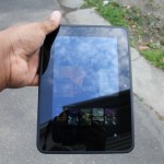
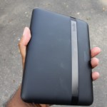
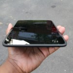
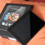
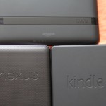
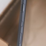
Amazon designed this device really well. Going with a rounded body instead of a rectangular shape makes the tablet more comfortable in the hands, regardless of what viewing angle is used. I also appreciate how Amazon kept things moderate or aesthetically conservative, as the company decided not to over brand its tablet by making the size of its logo or the Kindle Fire name overly dramatic on the back.

The only qualm that I have with the design of the Kindle Fire HD is how Amazon decided to place the buttons. They are hard to recognize and sometimes hard to press, depending on which direction you've got the device propped up.


Guts And Glory

The tablet comes with a pretty decent set of specifications. The Kindle Fire HD packs a 1.2GHz dual-core CPU, 1GB of RAM, a PowerVR GPU, this on both the 16GB or 32GB version (I tested the 16GB version). Moreover, you’ll find Bluetooth, and the very cool MIMO Wi-Fi, along with an accelerometer, light sensor, and gyroscope. The camera is placed under the screen on the front of the Fire, and apparently it holds a HD lens that it takes photos at a 720p resolution (I’ll have more on the camera later).

There is no GPS or NFC chip inside of the Fire HD, which shouldn’t be that big of a deal to the people Amazon is targeting. Jeff Bezos went in great detail about how awesome MIMO WiFi is on the second generation Kindle Fire, and it was for good reason. Wireless technology built inside the Kindle Fire HD is quite refreshing. The dual band connectivity feature worked really well. It was super convenient to be able to detect and lock onto both my 2.5 GHz and 5 GHz bands on my N router, something most devices aren’t capable of doing.


Software

This is where the Kindle Fire HD falls flat for me. Firstly, for someone who’s a fan of stock Android, forking it to the level Amazon has is egregious. Now with that out of the way, lets dive deep into the Kindle Fire OS. Underneath this Android face lift, runs Google's Android 4.0.3 Ice Cream Sandwich. The tablet experience is truly a mixed bag, as the Fire HD is sold with software that is uninspiring, but offers services that is almost comparable to that of Apple’s iTunes.

Besides the OS being annoyingly slow and unresponsive at times, it still outperforms the original Kindle Fire. Not sure if that’s a glowing endorsement or not. It does get points for its simplicity though, as it puts all content on front street for quick access. This is something stock Android struggled with in the past, because its options and settings were sometimes hard to find for the average consumer (it was dubbed too techie).

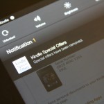
Lets talk about ads, shall we? In an unpopular move, Amazon decided to put ads on the lock screen to help compensate for cost of the improved parts. This forced the online retailer to offer an choice for users to opt out. Removing ads was painless. All you had to do is hit the manage device section on the website and unsubscribe from “offers” and pay $15 for the opt out. The lock screen returns back to the look of the original Kindle Fire. However, users are still unable to change the wallpaper on the lock screen, which makes no sense.

Once you get passed the lock screen, more changes await. Amazon found it necessary to move its home button to the far left, and put a back button in the center. This is somewhat puzzling, especially since it was an alteration that wasn’t needed. There is multitasking, but it’s half-assed. Instead of getting a cards like presentation that lets you swipe away apps like in stock Android 4.0+; or a double tap button option that shows opened programs in an app drawer at the bottom like Apple; you get a cheesy “favorites” drawer which can be pulled up with a touch on a star icon in the corner of the bottom menu bar. Sometimes you have to tap the star repeatedly to open the drawer thanks to the lag and unresponsiveness that can occur (doesn’t happen all the time).

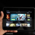
The home screen is composed of five main sections, three of which are what Amazon calls “carousel’s.” The primary carousel resides in the middle, where you’d find recently opened stuff (apps, music, movies, books, etc). The second carousel shows all the things the Kindle Fire is suppose to do. It sits right on top of the primary carousel, and contains a static list of all the various things your Kindle Fire HD can do. Here's the list: Shop, Games, Apps, Books, Music, Videos, Newsstand, Audiobooks, Web, Photos, Docs, and Offers.

Of course, none of the things I’ve talked about can be altered. To be fair, most people who are looking to buy the Kindle Fire HD won’t care about customizing the experience on the tablet anyway.

Now to the apps. Amazon apps aren’t up to par when compared to Android and Apple’s iOS. But, lets keep it real. Amazon should get a pass on the strength that Google still doesn’t have it together with apps that are optimized for its own Nexus 7 tablet. It’s not many applications tailored for the Nexus 7 experience -- I recently listed 10 must have apps that were.

Another interesting feature on the Kindle Fire HD is X-Ray for movies and books. X-Ray is powered by IMDb, and it lets users get more specifics on what their watching or reading. For example, in movies that means folks get the actor and crew lists, and for books it's characters and bios.

Besides that, email, calendar, and contacts are finally apart of the Fire OS. The email is usable, but it’s not as productive. No Gmail labeling and no threaded messages the end. The calendar and contacts are okay, but they aren’t comparable to what Google offers.

Like I said, the software and user experience is a mixed bag.

Web Browser, Multimedia And Camera

Web Browser

Not much has changed with what’s powering the web on the Kindle Fire HD, as you’ll find the same Silk browser that was on the original Fire. However, this time around, the browser brings some improvements lacking in last year’s Kindle Fire like faster download speeds thanks to a bunch of back end, server-side processing.

I didn’t see the biggest change in performance, but I’d be lying if I didn’t say there’s a bit of a boost in how pages load up. Although improved, the browser still falls behind that on the Nexus 7. The fact that the company chose Microsoft’s Bing as its default search engine is quite puzzling -- but thankfully -- Amazon gives you the ability to change it.


Multimedia

This is suppose to be Amazon’s bread and butter, the thing that differentiates it from the rest of the pack (not including Apple). With Amazon, users who are or willing to be inside of its ecosystem of services, gets to indulge in some interesting features. The e-commerce giant offers an Apple like experience when it comes veriest entertainment portals.

Amazon brings movies, music, books, apps and etc. All of its media options are saved through the cloud with the help of its top notch Wispersync service. So for example, when you pull up music albums in the player, it can be listened to in the cloud or downloaded to your device at any moment (same goes for all its other media outlets).

As an Amazon Prime user, I can say it’s awesome to be able to access the company’s streaming movie service. You can find Amazon Instant Videos on the Xbox or Roku; start watching a movie on those boxes and finish the movie on your Kindle Fire HD.


Camera

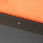
The Kindle Fire HD has a 1.3MP front-facing camera that you can use for video chatting on Skype HD. Unfortunately, there isn’t a native camera app, but I was able to find a third party application called Picshop that lets you take snapshots. Sorry, I’m not going to show you poor quality snap shots of my face, but trust me, it works. There's no rear camera, which doesn’t bother me. I believe having a shooter on the back of a tablet is not only a waste of money, but flat out ridiculous. I cringe every time I see folks taking pictures with a big slab.

Call Quality And Battery Life

Amazon claims you can get almost half a day of use out of a single charge; this from web browsing, video viewing, music streaming, reading or whatever. I found this to be mostly true when I used it for a few days. That being said, like all devices the battery does suffer a bit from intensive use of things like Skype video calling. Other than that, the battery life on the Kindle Fire HD is cool.


The Final Take

All in all, the Kindle Fire HD is a service driven product, not a device tailored for flaunting how great its software is. Users should buy this having the clear understanding of what to expect with this tablet. Amazon has gutted everything Android out of it, to the point you can’t say it’s a legit Android tablet. Indeed, that was the point. It’s an extension of Amazon.com, its services, and it’s the perfect media consumption tool for non techie types looking to spend $199. I have a love hate relationship with companies trying to suck you in to their ecosystem because it locks users in to a system that is inoperable: apps, books, movies, etc, aren’t compatible with other operating systems. However, Amazon’s decision to be a trendsetter in how it sells its products has to be commended. The company made the right choice when it decided to focus on making money off its services rather than its hardware.

The Kindle Fire HD may be limited in some aspects, but it’s hard to ignore as true heavyweight in the tablet space. The Fire may not steer me away from my Nexus 7, or make me stop buying my movies, music, and books from other platforms. Nevertheless, it keeps me mindful of another company besides Apple that really knows what it is doing with slates. It’ll be interesting to see how far Kindle Fire progresses in the next couple of years.


Samsung Galaxy S Relay 4G review: Are phones with solid QWERTY keyboards still in?

September 25, 2012 by Charles West - 3 Comments

Remember when QWERTY keyboards were all the rage? Well, those times have long passed, but the newest batch of mid-range devices are trying to bring it back. There seems to be a growing need to keep these type of phones around, especially for those who can’t let go the feel of a keypad underneath their…

Read more
The Good
  • Legit five row QWERTY keyboard
  • Responsive Swype typing
  • Smooth performance
The Bad
  • Photo and video capturing is awful
  • Too many pre-installed apps
  • Dated hardware design

Hardware

Don’t expect to be wowed by the hardware on the Galaxy S Relay 4G, as it brings a typical but solid look you’d find on most Samsung handsets. The display on the Relay is average at best sporting a 4-inch WVGA 480x800 Super AMOLED Screen. On the inside, the phone boards a 1.5 GHz dual-core Qualcomm Snapdragon S4 processor, 1GB of RAM, 8GB internal memory expandable to 32GB, DLNA, micro HDMI port, and a Near Field Communications (NFC) chip.

I didn't like the feel of the rubbery keys, as it felt a bit on the cheap side. I also found it really difficult to slide the phone open with one hand, this could be due to the phone being built close to the keys or just having poor build quality.

Design

The handset’s all plastic body is nice to hold, despite it being pretty thick compared to most phones out on the market today. When I carried the device around in my pocket it didn’t feel uncomfortable (mind you, I was wearing skinny jeans). The design looks very similar to Samsung's first flagship Galaxy S, which makes the Relay come off a bit dated. An LED light is placed at the upper left corner for notifications, which I’ve always been a big fan of.

Furthermore, there's a large hardware Home key beneath the display, covered by a capacitive Options key and a Back button. The touchscreen isn't the highlight of this phone, as it's the design of the keyboard.

Software

Where should I start? Lets just say that the software is usable, but it’s disappointing at the same time. It’s bloatware everywhere! The phone is flooded with pre-installed applications from T-Mobile and Samsung; both companies went crazy with the apps on this device. These apps include Dropbox, Evernote, Lookout Security, Slacker Radio, and TeleNav GPS Navigator. T-Mobile went hard on making its presence felt, with its own apps like Access T-Mobile, Game Base, MobileLife Organizer, T-Mobile Name ID, T-Mobile TV, and visual voicemail.

Of course, most of these pre-installed apps can’t be uninstalled, so you’re stuck with a bunch of stuff you didn’t ask for or needed. However, once you get pass the bloat, there lies a few cool features brought in by the TouchWiz Nature UX experience.

With Nature UX, TouchWiz has come a long way. Samsung’s custom user interface doesn’t annoy me as much as it used to. The custom skin lays on top of Android 4.0.4 Ice Cream Sandwich, but still provides most of what you’ll find in stock Android. Nature UX ushers in its own personal features such as S Beam and S Voice. Sparingly, the functionality isn’t quite the same as Samsung’s flagship Galaxy S III, but it’s at least good enough for users.

When I dove deeper into the Relay 4G, I noticed there were some features you guys would like. For example, the phone has a decent email client and calendar that both carry the same TouchWiz flare. As for the virtual keyboard, the handset comes preloaded with Swype.

On one hand, the typing experience on the touchscreen was cramped due to the tightly compacted vertical and horizontal layout -- the text box was weirdly small when trying to type out messages. However, once you open the physical keyboard the text boxes magically expand. Besides the strange spacing issues, Swype was responsive and worked well.


Web Browser, Multimedia And Camera

Web Browser

Browsing the web is an okay experience, as pages don’t load lightning fast, but still form at a reasonable speed. I have no idea what’s powering the internet surfing on the Galaxy Relay 4G. That said, if the default browser isn’t your thing just download Google Chrome -- it’s way better anyway.

Multimedia

To no one surprise, music on the phone is ran by Samsung’s TouchWiz music player. The functionality in the player doesn’t pack the most powerful sound punch that you’ll find in HTC’s Beats Audio offerings, but its speaker outputs put out some average tones that don't strain at the loudest setting. Video playback is actually pleasant on the Super AMOLED display, especially when your watching movies, shows, or YouTube in 1920x1080 resolution.

Camera

The camera is a basic 5 megapixel shooter that struggles to offer powerful and colorful full featured images. When I took photos in the daytime it seemed to have trouble showing objects properly in shots taken with low light (shade areas), as the images come out grainy. Pictures taken in decent sunlight also looked dull and boring; it wasn’t the kind of color pop you’ll find in the high end Galaxy S line of phones. I didn’t waste time taking shots in the night.

Other than that, the camera carries some decent tricks to get around its shortcomings. Shooting mode has an interesting concept to it because it features smile shot, which tells the camera to shoot the picture once a person smiles. Moreover, users will find a Carton option, which makes the picture look toon-ish, and lastly, the camera brings Panorama. In addition to ‘shooting mode’, there’s an option that keeps built-in filters. As for video recording, it suffers from the same dullness -- but hey -- at least it records in 720p.


Call Quality And Battery Life

T-Mobile gets a lot of crap for not having the best of networks, but I found talking on the phone’s HSPA+ service to be an enjoyable one. First, I have to preference that I live in an area where T-Mobile is relatively good, so my experience with calling is definitely a bit skewed. Signal strength was great, as I didn’t experience any dropped calls or strange occurrences during my usage in the city of Hartford.

Battery life was average. I mean, consumers who purchase the phone should get at least a days use out of the 1800 mAh battery if used for just calls and text. However, if you are the type who loves to talk, text, and browse then multiple charges is necessary.

The Final Take

I know, to some of you out there who are fans of vanilla stock Android -- custom skins are the devil. That being said, the vast majority of phone users don’t know the difference. TouchWiz Nature UX is something the average consumer will like on a mid-tier phone with a solid keyboard. A device like this hits the sweet spot for those strapped for cash, as it usually commands a price tag of around $100 to $150 on a two-year contract. If you’re content with intrusive software modifications, and happen to be a sucker for phones carrying fantastic keyboards, then T-Mobile’s Samsung Galaxy S Relay 4G is for you.

Photo credit: Claireasabella


iPhone 5 Review: Is Apple still on top?

September 24, 2012 by George Tinari - 9 Comments

The iPhone 5 has an all new design, dual-core A6 chip, 4G LTE, 4-inch display, and iOS 6. IntoMobile dives right in to see all the highs and lows of this blockbuster handset.

The Good
  • Looks and durability of the design are excellent
  • Both hardware and LTE speeds best the competition
  • Camera remains one of the best in any smartphone
The Bad
  • Siri can be useful, but still needs work
  • Apple Maps is overall a downgrade from Google Maps
  • Early adopters will notice many apps are not yet optimized for new 4-inch display

Hardware

Let’s run through some of the notable hardware components. The iPhone 5 is made entirely out of glass and aluminum. The front has a brand new 4-inch 1136x640 resolution display, a home button below it, and a speaker and FaceTime HD camera on top that has great 720p quality for a front-facing shooter.

On the back is an 8MP camera with a microphone and LED flash to the right. The 8MP camera is similar to the one found on the iPhone 4S, but it has improved low-light performance, faster shooting times, and some subtle enhancements to the overall quality of the photos. On the bottom of the device is one of three microphones (the other two are on the front and back) plus there’s a speaker, the headphone jack (previously located on the top) and the new Lightning connector port, which is just a smaller reversible version of the 30-pin. Time to either save up for some new accessories or buy Apple's 30-pin to Lightning adapter for $29.

Inside, there’s Apple’s new dual-core A6 chip clocked at approximately 1-1.2GHz according to reports and 1GB of RAM.

Design

Glass and aluminum — those are the only two materials you’ll find on your iPhone 5. The front is naturally consumed by the glass, but the sides use that aluminum as does a large chunk of the back, save for two glass inserts on the top and bottom for wireless connection purposes.

Apple was able to slim down its latest handset to just 7.6mm thick and just over 4 oz in weight, the latter most likely due to the removal of the giant glass back plate in the iPhone 4 and 4S design.

The iPhone 5 comes in two colors variations: black/slate and white/silver. I have the black and slate one. So far I have mixed feelings about the aesthetics. I love the aluminum back making a welcome return from the first-generation iPhone, but the slate color of the black model is what’s throwing me off. I think the black and silver designs of the iPhone 4 and 4S might be slightly more elegant. I tend to enjoy having the contrasting colors between the black and silver, but the 5 is just a totally dark device. There’s no shiny silver band around the side anymore and even the silver circle surrounding the lens of the back camera has been replaced with a black one. I’m absolutely positive this will grow on me over time (it’s already begun to) and many people love it already, but for me it’s a bit of an adjustment.

Picky criticisms aside, there is no doubt that the iPhone remains one of the most beautifully designed handsets out there, if not the absolute best. The attention to detail here is remarkable as we’ve come to expect from Apple and the design in general just blows away the competition.

Build Quality

Just like the design itself puts the competitors to shame, so does the build quality. This thing is solid, just like nearly every iPhone that came before it. Even though it’s significantly lighter than its predecessor, it still manages to feel like a product that I won’t easily break. It doesn’t use cheap plastic like most of the Android phones out today and nothing feels like it’s going to pop out of place.

One major advantage of having the aluminum on the back is drop protection. If you dropped your all-glass iPhone 4 or 4S onto pavement just once, there was a good chance you shattered the phone. I’m happy to report that I don’t feel like I have to worry about dropping my phone anymore. The numerous drop tests results on YouTube can attest to this. I suspect this is why Apple didn’t release a bumper case for the iPhone 5. The phone seems to hold up well against scratches too.

A small observation worth noting is that if you shake the iPhone 5 near your ear, you can hear ever so slightly the volume up and down buttons jiggle. I also hear it when I gently throw it down onto a couch. I’m not sure if this is just my own iPhone, but by no means does the subtle jiggling sound give the impression that the buttons will break or fall out any time soon.

Guts And Glory

I could post all sorts of charts and graphs with benchmark results that would ultimately mean very little to you when using the iPhone 5 out in the real world, so take my word for it, this phone zips.

Most apps load up around twice as fast as before as promised, panning through the Maps app in 3D mode is silky smooth with not one stutter, and LTE is just an added layer of speed. It’s about as fast as my WiFi connection at home. The phone never felt like it was lagging at all and kept up with every single task I threw at it. Put simply, it’s the fastest iPhone by and far the fastest smartphone available right now — fact.

Credit should go to the new dual-core A6 processor, 1GB of RAM, and I'm sure the plethora of performance optimizations made in iOS 6.

Software

I don’t want to spend too much time talking about this because, frankly, iOS is still iOS. Sure there’s some new features to enhance the experience, but nothing revolutionary has happened to it since its debut as “iPhone OS” in 2007. For many people, that’s a good thing because iOS is still a fantastic operating system and arguably one of the best available for smartphones today. For others, their purchase of an Android device speaks for itself.

There’s a few new things worth noting. The Maps app is Apple’s own child for the first time and it’s under fire for lacking features/data and being inaccurate in certain parts of the world. I have to agree that it’s a downgrade from Google Maps, and I’d honestly be surprised if Apple didn’t realize that. The amount of location information Apple Maps present is minuscule compared to Google’s. I want more labels and more buildings. An overly simplistic map is never a good thing. On the bright side, I had no problems with navigation and getting where I need to be accurately, plus Yelp integration for businesses is useful.

Siri can now answer questions about movies in theaters, sports scores, and help you book reservations at nearby restaurants. I’ve noticed that Siri is far better at correctly recognizing what I say compared to on the 4S, so I’ll give credit to the new set of microphones on the iPhone 5 for that. As much as Siri can do, it still needs work. For instance, it’ll find movies, but it won’t tell me what’s on TV. There’s a wide range of potential for Siri and I’d like to see Apple channel more of that hopefully without waiting until iOS 7.

Facebook integration is Facebook integration, shared Photo Streams are shared Photo Streams, iCloud tabs are iCloud tabs, and VIP mail is VIP mail. My point is that they all work exactly as advertised, so there’s really no need to go too in depth with describing them. They’re nice additions to the OS. I didn’t get a chance to try out Passbook because there’s currently little to no apps supporting it, but many are getting on board soon and I do think it’s going to take off within the next few months and best NFC.

What I love most about new iOS releases are the little things. Pulling down Notification Center lets you quickly send a tweet or post to Facebook. Swiping up when receiving a call allows you to send a text message to the caller to get back to them later. Do Not Disturb mode won’t wake you with a bright screen or vibration in the middle of the night when all or just certain contacts try to call or text you. iMessage can combine your Apple ID and cell phone number into a unified ID for universal access to all messages and FaceTime calls.

Once you add all of this up, you’ll find iOS 6 to be a very pleasant experience and one that especially shines on the iPhone 5.

Web Browser, Multimedia And Camera

Web Browser

Mobile Safari is still one of the best if not the best smartphone web browser. Web pages look great and if bigger companies and services don't already have an app for the iPhone in the App Store, you can bet they've optimized their website to near perfection in Safari. Plus, the addition of LTE in the iPhone 5 makes downloading web pages on par with WiFi speeds. The 2x faster GPU is good for buttery smooth scrolling and zooming as well. Lastly, the 4-inch display lets you see more of each web page you visit, but at the same time keeps it all within the reach of one hand.

Multimedia

iPhone is still the king of multimedia. Apple has an insanely large collection of music, movies, and TV shows in the iTunes Store plus hundreds of thousands of quality apps in the App Store. Downloading all of it just got faster with LTE support for the first time ever in the iPhone and viewing and/or using all of it just got better with the new 4-inch display, up from 3.5-inches in all preceding iPhone generations. Arguably best of all is that you can keep everything in sync thanks to iCloud. It's a remarkable ecosystem.

Camera

The camera on the iPhone 5 is superb. It’s basically the iPhone 4S camera except it is faster at taking photos, uses a sapphire crystal lens cover, and has dramatically improved quality in low-light conditions and a subtle boost in quality overall. New on the software side is better video stabilization, the ability to take photos while recording video, and panorama shots. The shooter on the front now takes 720p HD video and actually takes decent photos as well. The cameras are on par if not better than the best smartphone shooters on the market, but rather than talk all about it, it’s best if you see it for yourself.


Call Quality And Battery Life

For once on an iPhone, call quality isn’t just acceptable, it’s good. It seems like Apple went to great lengths trying to improve the “phone” portion of the iPhone, squeezing in three microphones plus better speakers in the iPhone 5. Callers on the opposite end said my voice sounded particularly clear. On my end, the sound quality of theirs was impressive as well — and sound quality has been strengthened across the board here. Rejoice for the ability to stop trying to figure out what people are saying to you and start actually listening and communicating with them.

The call quality and speed of the handset don’t mean anything once the iPhone 5 dies though. Fortunately, you shouldn’t be let down by battery life either. It’s improved slightly from the iPhone 4 and 4S. It arrived at my home fully charged at about 4 p.m. ET on Friday afternoon. After initially re-downloading all my apps, some web surfing over LTE and WiFi, taking about 20 photos, watching a YouTube video, plenty of texting, a couple of short phone calls, and about 10 minutes of game play, the iPhone 5 died at about 2:30 p.m. on Sunday afternoon. Things to note: brightness was on auto and I shut the device off when I went to sleep for roughly seven hours on Friday and Saturday night. Not too shabby at all.

The Final Take

For some, iOS is a deal breaker. It doesn't offer the flexibility Android clearly boasts. For many, iOS has the right combination of speed, apps, and overall function to be the operating system they choose to use every day of their life. If you're one of those people, you will not be disappointed with the iPhone 5 by any means. As I write this review, it's the fastest smartphone on the market, the hardware design isn't even in the same league as many of those cheap plastic competitors, and the small boost in display size is quite useful. Like anything else, it has some minor shortcomings but in a nutshell, the iPhone 5 is a fantastic phone and if you haven't already bought one like the millions who have, I'd recommend it.

Sprint Samsung Galaxy S III Review: Sprint’s tradition of offering a bit more for its customers continues

September 12, 2012 by Kelly Hodgkins - 41 Comments

Sprint launched the Galaxy S III this summer and the handset is widely regarded as one of the best Android phones available from the carrier. We’ve already taken a look at other versions of the Samsung Galaxy S III, and in this review, we are going to take a quick look at the Sprint version. We…

Read more
The Good
  • The 4.8 inch Super AMOLED HD display is gorgeous.
  • 1.5GHz dual-core Snapdragon S4 is very fast.
  • Innovative software features like TecTiles, Share Shot photo sharing.
The Bad
  • Lightweight, plastic feel to the phone.
  • A wide variety of touch-based actions may be confusing to new Android users.
  • It has a large form factor, not a pocketable phone for some.

Hardware

Under the hood, the Samsung Galaxy S III from Sprint is the same as the other US models. It ships with a dual-core 1.5GHz processor and 2GB of RAM, which compensates for the missing quad-core processor that is found in the international version of the handset. The S III also has 16GB of internal storage and microSD expansion up to 64GB.

The most striking feature of the phone is the 4.8-inch Super AMOLED display with 1280x720 resolution. You can't help but be impressed by the beautiful screen when you boot up the phone for the first time. The S III is one of a few phones on Sprint that'll work with the carrier's up and coming 4G LTE network. Other connectivity options include Bluetooth 4.0 and WiFi 802.11 b/g/n.

The rear-facing camera is also an impressive 8-megapixel shooter with 1080P HD video capture, while the front-facing camera boasts of 1.9-megapixels with 720P capture. The handset is a robust 5.4” x 2.8” x 0.3” and weighs in at 4.7 ounces. Rounding out the specs is a hefty 2100 mAh battery that promises up to 15 hours talk time or 200 hours of standby.

For a large phone, the Galaxy S III is well-designed. It has a big screen, but its small bezel and thin profile make the handset comfortable to hold. It's very similar to the Galaxy Nexus, just a bit longer and a tad thinner. It's weighted nicely for your hand, but, when you're holding it, you can't escape the lightweight, plasticky feel. Once you throw a case on it, though, that plasticky feel disappears and all you see is that gorgeous screen.

There is no getting around it -- the S III is an oversized phone. Unless you have the hands of a basketball player, it requires you to hold it with two hands to do anything beyond the basic swipe navigation. Typing, tapping and other actions require you to steady the phone in one hand and interact with the other. For those who like LED notifications, the S III has a bright, multi-color LED in the upper left corner.

Software

Software-wise, the Sprint Galaxy S III is a slightly different beast from the other US models. It ships with Android 4.0 Ice Cream Sandwich that's been customized with several Sprint apps, including Sprint Zone and the Sprint Mobile Hotspot app. Sprint also ships the device with Dropbox in a promotion that'll give you 50GB of additional storage for free. It's a great deal if you use Dropbox to backup or transfer files.

Sprint's Galaxy S III is the only US model to include Google Wallet. The Google-backed payment service lets you add reward cards and credit cards to an online payment account. Google Wallet uses the NFC chip in the phone and lets you make payments at stores that support the service. It's as easy as waking up your phones and swiping it at the checkout terminal. You can also find discount offers that are available in your area as well as view a history of your transactions.

Besides the Dropbox and Google Wallet, there are also several Samsung apps and other third-party apps like ChatON, Flipboard, Samsung Media hub, Samsung Music hub, Samsung Apps and Samsung's S-Apps (S Memo, S Voice and S Suggest). The rest of the S III is Android 4.0 ICS with Samsung's TouchWiz overlay. It has all the bells and whistles in the AT&T version of the handset. You can read about the many features of the S III in our original review of the S III handset.

Call Quality And Battery Life

The Galaxy S III is an LTE handset that's compatible with Sprint's newly launched 4G network. If you don't live in an area with LTE, the Sprint S III will fall back to the carrier's 3G network without any problems. I tested the phone on 3G and the data connection was very reliable. During my testing, I didn't experience any dropped calls or any other connectivity problems.

With normal use, the Galaxy S III performs very well for a smartphone of its caliber. It should definitely last you through the day, thanks to the 2100mAh battery inside.

The Final Take

The Samsung Galaxy S III is an impressive phone. The screen is lovely and the phone is full of software features that'll make your head spin. The camera is great and rivals that of the iPhone 4S. From a hardware-only perspective, it is the best Android phone Sprint has to offer at this time.

It surpasses the Galaxy Nexus with a significantly better camera, improved battery life and 4G LTE connectivity. Its closest rivals are the Motorola Photon Q 4G LTE and the HTC EVO 4G LTE. The Galaxy SIII has a bigger screen, larger battery and more RAM than the Photon Q. The EVO 4G LTE rivals the S III in battery life, but it has an integrated battery that cannot be removed it. It also has 1GB of RAM, compared to the 2GB that's available in the S III.

On the software-side, the Galaxy S III is a fantastic. The average consumer will be happy with all the features Samsung managed to cram into its TouchWiz enhanced version of Android 4.0 ICS. Samsung hasn't announced a date, but rumors suggest the Android 4.1 Jelly Bean update should be available soon. If you don't want to wait, you can always install a custom ROM with Jelly Bean.

If you're not afraid of a big phone, then you can't go wrong with the Samsung Galaxy S III from Sprint. It's a solid handset with a great camera and the performance is top-notch. I wouldn't hesitate to recommend it to anyone who is comfortable with that size phone. If you're not sure about the size, then travel down to a Sprint store and check it out. You might be pleasantly surprised.

LG Optimus 4XHD Review – Meet LG’s best smartphone to date

August 3, 2012 by Blake Stimac - 1 Comment

It’s been an arduous journey for LG in the smartphone market. While we’ve seen the company ship some interesting smartphones in the past few years, there’s always been another handset from another company that has edged LG’s offerings out. Well, it looks like LG might have genuinely learned from the past, which has led up…

Read more
The Good
  • One of the best designed phones to come from the company
  • The NVIDIA Tegra 3 is very powerful and fast
  • The True HD IPS display is one of our favorites
The Bad
  • The battery life was questionable, with good and bad days
  • The camera is decent but not great.

Hardware

The LG Optimus 4xHD is packing some great hardware inside and out. The 4.7 inchTrue HD IPS panel is one of our all-time favorites, which is crisp, clear, and bright.

The entire device looks very clean no matter which side you're looking at it. The face of the device is pretty much all screen, with just the essentials on the top and bottom of the HD panel. Above the display, you'll find the standard mix : Proximity and ambient light sensors, earpiece, front-facing camera, and LG's logo. Below the display are three capacitive buttons for back, home, and menu, of which they look almost invisible until the phone is unlocked.

The left side of the device has a small an textured volume rocker that gives just a little less feedback than we'd want it to, but works fine nonetheless. The top houses the 3.5 mm headphone jack and power/lock button, the right side is clean, and the bottom shares the micro USB charging port with a noise cancelling microphone for video-recording.

The back of the 4xHD sports the 8 megapixel camera with LED flash, LG's logo, and a speaker grill.

While it may have disrupted the sleek and modern flow of the 4XHD's design, the handset is sadly lacking a notification LED. While this might not bother too many people, I've come to rely on this feature on my Galaxy Nexus.

Design

LG's previous smartphone designs have never been something to write home about. The LG Nitro and Spectrum weren't necessarily bad designs but had relatively subtle designs that did little to woo the customer. LG's more recent handsets, which include the Vu and the Optimus 4xHD have taken a bolder approach and we'd say it's worked out for the company.

The 4XHD's very boxy appearance might not look like anything special at first glance but the metal around the perimeter of the device along with the textured battery cover make for a much more well-rounded and sleek design. And what makes the 4XHD even more svelte is its 8.9mm thickness.

Taking some obvious ques from the Prada 3, the 4XHD looks and feels like a premium product and it's one of our favorite designs we've seen from the company in a while. Personally, I think this is a beautiful handset.

Build Quality

LG didn't seem to skimp on the build quality of the 4XHD but it would be a sad day to see the phone drop from a high distance. While we're fairly sure the handset can take a fair amount of beating but you'll likely end up with some noticeable blemishes along the metal strips around the device.

The 4XHD has a great in-hand feel, and a lot of this is due to LG's (smart) choice to bevel the edges on the battery cover. This decision allows the device to fit quite nicely into the palm of your hand, even with it's very boxy design aesthetic.

Guts And Glory

Internally, the handset is packing some heat. Rocking a 1.5 GHz NVIDIA Tegra 3 quad-core SoC, the Optimus 4XHD won't slow you down anytime soon, and also allows for the wealth of Tegra 3 optimized games that are showcased through the TegraZone application.

You'll also get 1GB of RAM, 16GB of internal storage, micro SD card slot, NFC, the expected assortment of radios (WiFi, Bluetooth, GPS), with a 2150 mAh battery to keep things running.

Software

LG's software experience has historically been one of the most non-intrusive custom Android user interfaces we've come across, and while the software on the Optimus 4XHD has been tweaked quite a bit, it's still a nice experience.

One of the most interesting software tweaks begins at the lock screen. LG's approach is essentially something we've never seen before for Android, and it's a very slick implementation. Instead of swiping to the right, dragging a ring up to the center of the screen, or fancy water ripple effects, LG's locks screen allows you to slide your finger across any part of the screen. Just holding your finger on the lock screen looks as if a hole has been punched through, and when you drag your finger, the hole gets wider, allowing you to get a peak into your homescreen. It's pretty damn cool, even if it's just flashy.

One thing we did notice that LG disabled is the ability to drag your notification panel down over the lockscreen, which isn't a deal breaker but we like that feature a lot. The feature was introduced in Ice Cream Sandwich, so we're not sure why LG decided to leave it out.

Once unlocked, you're presented with a user interface that, while slightly skinned, is still essentially a stock Android experience for the most part. You'll be presented with a custom dock, with the All Apps icon at the bottom right. While you can't remove the all apps icon, you can reposition it to the middle of the dock if you want, which is a small and welcomed feature.

The home screen UI offers up a lot of features you'd find in some home replacement applications, such as screen transitions and theme support. Unfortunately, it does look like you're limited to the four pre-installed themes, as there were no more to download from LG SmartWorld that we could find.

Swiping the notification panel down will reveal quick toggles, which offers up an option to customize what's shown without jumping into settings somewhere else in the phone.

There are several new tweaks in LG's new software experience and it's by and far the best we've seen from the company. It remains simple but adds tweaks that will please many users.

Web Browser, Multimedia And Camera

Web Browser

The web browser on the Optimus 4XHD is a slightly skinned version of the stock Android browser. Most settings remain intact, and LG even left the "swipe to dismiss" feature for closing open tabs. (Something we wish some manufacturers wouldn't touch)

While the color scheme has been tweaked, the main change of the 4XHD's web browser is at the bottom of the screen. A small tab can be dragged up that offers options for back, forward, a funky zoom button (that's too close to the home button), add a page, and bookmarks.

Multimedia

There are plenty of ways to consume media on the Optimus 4XHD. Of course, there's the Google Play Store, but LG has also packaged in its own DLNA application, Smart Share, to stream media to and from your device. Smart Share is simple and to the point and you'll have no trouble streaming your computer's content over to your phone if you're home WiFi network has a media server like TVersity.

Camera

The camera on the Optimus 4XHD is a weak point. It's not that the camera is bad, as it can take some pretty decent shots, but it's just not as good as a lot of the competition out there today. The software is a little on the bland side but still miles better than anything Motorola has produced. The two big issues with the camera is the touch to focus feature and the fact that many (not all) pictures come out too dark.

Touch to focus can be painfully slow and even then, the photo will sometimes come out unfocused. Still, we do hope that this will be addressed in a forthcoming update. With the exception of the last photo, the camera continually snapped darker pictures. Video recording wasn't much better and had a few hiccups focusing at times.


Call Quality And Battery Life

Battery life was quite interesting with the Optimus 4XHD. The first day the handset died in standby within just a few hours, but any other subsequent charge lengthened the  life of the phone significantly. This is likely due to the battery itself and not the battery management tweaks within the phone's software, as we haven't experienced the massive drainage since.

Of course, the gorgeous display on the handset will be the biggest culprit in killing the battery. Having the screen cranked up to full brightness with GPS, WiFi, and other radios will churn out less than desirable battery life. Then again, you should know this by now. The 2150 mAh battery does its best.

The Final Take

Simply put, this is by far my favorite LG handset I've ever come across. From it's design to the power under the hood, LG has stepped it up on all fronts that it needed to. In a world that's overrun by Samsung in the Android space, LG stands a chance to blindside Sammy with an offering like this and upcoming devices. LG finally nailed a very nice design with Optimus 4xHD. It's slim, modern, and sexy.

The software experience is also definitely the best we've seen from LG, which both provides useful custom tweaks while retaining most of Android 4.0's slick UI elements.

While there's no word of US availability, we do hope that LG brings it over to this side of the pond. Like I said above, this is definitely my favorite LG smartphone I've ever come across, and is also probably the best smartphone the company has produced. If the Optimus 4XHD were ever to land on T-Mobile as the G4X, it would be a hard decision between it and whatever the upcoming Nexus phone turns out to be.

All my praise doesn't mean the Optimus 4XHD is perfect. The camera is kind of a let down in a few places, but hopefully these issues will be able to be fixed. It still doesn't make me like this phone much less. In Android-land, I'd put the Optimus 4XHD firmly within the HTC One X and Samsung Galaxy S III. I prefer both the 4XHD's design over the Galaxy S III and the software over HTC Sense on the One X -- by a wide margin. Of course, design aesthetic and software will be a personal preference, but I'm definitely impressed with what LG has accomplished with the Optimus 4XHD.

More phones like this, LG. Thanks.

T-Mobile Galaxy Note Review – Available August 8th for $200 on new contract

July 30, 2012 by Blake Stimac - 6 Comments

While we’ve seen the same device land on AT&T already before, it isn’t any less exciting to see the Samsung Galaxy Note land on T-Mobile. The massive tablet/phone hybrid is every bit the same device that we reviewed a while back, but it now ships with Android 4.0 Ice Cream Sandwich and support for 42Mbps…

Read more
The Good
  • The large HD display on the Galaxy Note is great for consuming media with
  • While a bit gimmicky, there are some fun tricks you can do with the S-Pen
  • Even with the large display, the Note manages to stay pretty thin at 9.3mm
The Bad
  • This Note will look downright unwieldy to some people
  • We like TouchWiz, but there were a few occasional hiccups we came across.
  • The S-Pen is so small, its a challenge to use for long periods of time.

Hardware

The Galaxy Note is just as powerful as it is massive, and that trend continues with the T-Mobile variant. Virtually identical to the AT&T version, the T-Mobile Galaxy Note is large, powerful, and one of the most unique devices we've ever come across.

The entire face of the device of swallowed by the massive 5.3 inch Super AMOLED HD display with a resolution of 1280 x 800. This is the same display tech we've seen in the Samsung Galaxy Nexus and Galaxy S III, and we have few complaints. Colors are nice and crisp, but as with most displays today on phones today, the Super AMOLED HD panel struggles in direct sunlight. Below the display you'll find a set of the standard Android buttons for Menu, Home, Back, and Search, and above the display is the T-Mobile logo, ear piece, front-facing camera, and a nice helping of sensors.

The top of the Note houses the 3.5 mm headphone jack, along with a noise cancelling microphone for video recording, where you'll find another on the bottom, along with the micro USB charging port, and the slot for the S-Pen. The left and right side of the Galaxy Note houses the volume rocker and power/lock switch.

The back side of the Galaxy Note is your standard affair. The battery cover is slightly textured, which is very similar to the T-Mobile Galaxy S II's battery cover - smooth..ish. This is obviously where you'll find the 8 megapixel camera with LED flash that takes some exceptional pictures, along with the speaker grill on the bottom.

Inside the Note, it's a familiar, yet still impressive set up. Powered by a 1.5GHz dual-core processor, the Galaxy Note is anything but slow. Couple that with 1GB of RAM, NFC, and all of the other goodies you'd hope to see in a high-end smartphone today, and you have yourself a winner.

Software

The software experience on the Galaxy Note has been slightly tweaked to be optimized for the S-Pen, but not so much that it's a pain to use with your finger. Samsung carefully thought out the S-Pen experience, and has achieved something great without overtweaking. While you can use the S-Pen just about anywhere within the Note's UI, it's best showcased inside of the new Premium Suite of applications Samsung provided with the Android 4.0 Ice Cream Sandwich update.

Since one of the stand-out features of the Galaxy Note is the S-Pen, you'll be happy to know that it works very well. You'll find a bit of a delay using the pen at time, but it's definitely on point when it comes to accuracy. When Draw Something was a "thing", I used the S-Pen  all the time, in which it performed admirably.

The S-Pen isn't just for play, though. The new Premium Suite of applications Samsung has packaged inside the Ice Cream Sandwich update adds some great productivity features. From shape-matching, text recognition, and math equation solving, there's a lot to get out of the new Suite.

Some of the new changes from the Ice Cream Sandwich update are very simple but provide a nicer experience when it comes to interacting with certain elements of the handset. One such change is the way multitasking is handled. If you've used Ice Cream Sandwich before, this won't be all that new or surprising, but since the majority of Android users are still rocking Gingerbread, even the smallest of tweaks can make for a revelation. To see your most recent applications on the Note, you'll still need to hold down the Home button, but now you'll be presented with the new look of multitasking. Thumbnails of your past apps will populate, showing you exactly where you left off. To dismiss apps, just swipe them away to the left or right. This swiping gesture is found throughout Ice Cream Sandwich, and you can dismiss items in the notification panel the exact same way.

Ice Cream Sandwich spruces up the place in a lot of areas, but some software elements remain the same. One such software element is the way you add widgets, shortcuts, folders, or change your wallpaper. Accessing this menu is easy enough, as you just hold down on an empty space on the home screen. What's remained my least favorite part of this custom UI is adding widgets. For starters, widgets only show up at the bottom of the screen, four at a time. Sure, that doesn't sound so bad, right? Well, out of the box there are 51 widgets to choose from, so once you get yourself situated with a nice helping of applications, we're sure only seeing four widget icons at a time will seem a little less than impressive and require quite a few swipes. This isn't to say that TouchWiz is bad, as it's one of our favorite custom user interfaces for Android. The way a user must add widgets is just an inferior experience to just about any other Android device we've seen in our opinion.

For the most part, the software experience on the Galaxy Note is pretty familiar, save for the newer Ice Cream Sandwich tweaks. Expect to see the same 7 home panels that you can customize to your heart's content, along with a fair amount of T-Mobile bloatware that can be disabled through the settings.

The Final Take

So, the Galaxy Note is finally about to land on T-Mobile after a long time of rumors, and we've got to say that we still like the device a lot. That said, the Note isn't for everyone, as most people don't need a 5.3 inch display in their pockets. Still, the Galaxy Note is great for watching movies on with its big and bright display.

Massive screen and S-Pen aside, the Galaxy Note is still a solid smartphone through and through. With a great camera and fast processor, the phablet can still go toe to toe some of the new smartphones that are coming out today when it comes to specifications. Even with rumors of the Galaxy Note 2 already beginning to fly around, the existing version of the device is fast, powerful, and should keep owners happy.

The Samsung Galaxy Note will become available at T-Mobile on August 8th for $200 on a new two-year contract after a $50 mail-in rebate.

Verizon Wireless Samsung Galaxy S III: Is this the must-have phone for Verizon customers?

July 18, 2012 by Kelly Hodgkins - Leave a Comment

Verizon launched the Galaxy S III recently and the handset is widely regarded as one of the best Android phones available from the carrier. We’ve already taken a look at the AT&T version of the Samsung Galaxy S III, and you can peruse that review for a detailed look at the hardware and software that…

Read more
The Good
  • Large, gorgeous display
  • Fast, responsive performance
  • Solid LTE connection
The Bad
  • Some Verizon bloatware on the phone
  • Battery is good not great
  • Lighweight plastic feel

Hardware

Under the hood, the Samsung Galaxy S III from Verizon Wireless is the same as the other US models. It ships with a dual core 1.5GHz processor  and 2GB of RAM, which is meant to compensate for the lack of a quad-core processor that is found in the international version of the handset. The S III also has 16GB of internal memory and microSD expansion up to 64GB. The most striking feature of the phone is the 4.8-inch Super AMOLED display with 1280x720 resolution. The most impressive feature is the handset's 4G LTE connectivity which zips along at a cool 10-12Mbps down and 6-7Mbps up. There's also Bluetooth 4.0 and WiFi 802.11 b/g/n.

The rear-facing camera is an impressive 8-megapixel shooter with 1080P HD video capture, while the front-facing camera boasts of 1.9-megapixels with 720P capture.  The handset is a robust 5.4” x 2.8” x .3” and weighs in at a svelte 4.7 ounces. Rounding out the specs is a respectable 2100 mAh battery that promises up to 15 hours talk time or 200 hours of standby.

For a large phone, the Galaxy S III is well-designed. It has a big screen, but its small bezel and thin profile make the handset comfortable to hold. It's very similar to the Galaxy Nexus and the DROID RAZR MAXX. The S III is just a bit longer and a tad thinner. It's also weighs a bit less than either the Nexus or the MAXX.

Though the S III is balanced and weighted nicely for your hand, the phone's stellar physical design doesn't compensate for its lightweight, plasticky feel. Say what you will about the polycarbonate casing, I don't think it compares to the aluminum-glass backing of the iPhone 4S. Admittedly the iPhone is prone to shattering, but the heft of the metallic design gives the iPhone a better feel in your hand than the S III.

Unless you have the hand of a basketball player, the S III also requires you to hold it with two hands. You can swipe and tap to navigate with one hand, but typing, pinch to zoom and other complex gestures require you to hold the phone in one hand and touch with the other. It's a limitation that you learn to accept. It's worth it just so you can keep the gorgeous display, which  is unrivaled by any other handset on Verizon. Lastly, for those who like LED notifications, the S III has a bright, multi-color LED in the upper left corner.

Software

Software-wise, the Verizon Galaxy S III is a slightly different beast from the other US models. It ships with a version of Android 4.0 Ice Cream Sandwich that's been customized for Verizon. Theere are severla Verizon-specific apps which are built into the OS and cannot be removed. They include My Verizon Mobile, VZ Navigator, Verizon Voicemail and the Verizon App Store. It also supports Verizon's Backup Assistant service. Unlike other Verizon phones, the S III does not include any game demos or other bloatware.

Though the Verizon apps seem benign, their inclusion has at least one unfortunate side-effect. Because the S III has the Verizon app store, Verizon and Samsung decided to ship the phone without the Samsung app store. I noticed it was missing when I was in the Gallery app and wanted to edit a photo. The Sprint version of the S III, which has the Samsung app store, lets you edit a photo using an editor from the Samsung app store. This  option to "Edit" a photo is missing from the Gallery in the Verizon version of the S III. It's not a deal breaker, but it makes me wonder what else did Samsung remove to accommodate the Verizon app store.

It's also worthy to note that the Verizon (and AT&T) version of the phone does not include the free 50 GB of Dropbox storage that's found on other S III models. It also doesn't have Google Wallet, which is found only on the Sprint version of the phone. Surprisingly, I noticed that Flipboard isn't included on the Verizon S III either, but you can still download and install the app from the Google Play Store.

Looking beyond the Verizon apps,  the rest of the S III is Android 4.0 ICS with Samsung's TouchWiz overlay. It has all the bells and whistles of the AT&T version of the handset including a variety of actions like the one that lets you flip over your phone to turn on the speakerphone. Rather than repeat what's already been said about the many software features, you can read about them in our original review of the handset.

Call Quality And Battery Life

Like all new Android phones on Verizon, the Galaxy S III is a 4G LTE handset. It supports 700 Mhz LTE and 3G CDMA/PCS/1xEVDO Rev. A (800/1900 MHz).  The handset's 4G LTE connectivity was steady and reliable, delivering a consistent 10-12Mbps down and 6-7Mbps up. Data on the 3G side was equally reliable, though much slower. During my testing, I didn't experience any dropped calls or connectivity problems.

The Galaxy S III ships with a decent  2100 mAh battery. It's not as beefy as the 3300 mAh Li-Ion battery inside the DROID RAZR MAXX, but it's a step up from the 1850 mAh Li-Ion of the Galaxy Nexus. It's a small boost that makes an appreciable difference in overall performance.  While the Nexus would die out after eight hours of steady usage, the S III makes it through a full day. Standby time is also very good. I left the S III on my desk for several days in a row and, when I finally picked up the phone, I still had enough juice for a short photo shoot.

The Final Take

The Samsung Galaxy S III is an impressive handset. The screen is lovely and the phone is chockfull of software features that'll make your head spin. From a hardware-only perspective, it is the best Android phone Verizon has to offer at this time. It's on the large size and not very pocketable, so you have to consider how you are going to use the phone before you take the plunge. If you're active and wear the phone on your belt, you may find it's too big. It's also too big for folks who want to use their phone with one hand and drink a cup of coffee in the other. If you prefer a smaller but still powerful phone, then you should look at the Droid Incredible 4G LTE or the iPhone 4S.

On the software-side, the Galaxy S III is a mixed bag. The average consumer will be happy with all the whizbang features Samsung managed to cram into its TouchWiz enhanced version of Android 4.0 ICS.  Customers that like staying on the cutting edge of technology, however, should pass on the S III and look at the Galaxy Nexus instead. As a Nexus device, the Galaxy Nexus is a candidate to get regular Android updates from Google. The S III will likely receive an update to the recently announced Android 4.1 Jelly Bean, but the timing of this update is unknown.

If you don't know the difference between Ice Cream Sandwich and Jelly Bean (or don't really care), then you can't go wrong with the Samsung Galaxy S III. It's a solid handset with a great camera and it's performance is top-notch. I wouldn't hesitate to recommend it to anyone who is comfortable with that size phone. If you're not sure about the girth of the S III, then travel down to a Verizon store and check it out in person. You might be pleasantly surprised.

Motorola Atrix HD Review – Is the third time a charm?

July 18, 2012 by Blake Stimac - 5 Comments

It’s easy to assume that you need to drop at least $200 for a decent smartphone these days, which is the standard price point for high-end devices. That said, sometimes a device comes along that brings in some top-notch features at a more attractive price point, without sacrificing too many specifications. Motorola looks to have done just…

Read more
The Good
  • The Atrix HD puts a lot of power in your hands for cheap
  • The ColorBoost display is nice and bright
  • With Kevlar on the back and Gorilla Glass on the front, the Atrix HD feel indestructible in the hand
The Bad
  • The design isn't anything new or special
  • After many attempts, we wonder why Motorola continues to push its busy and unintuitive software
  • The camera is a big weak point in the Atrix HD

Hardware

The Atrix HD is Motorola's latest AT&T-branded handset, and a lot has changed since the Atrix 2. Packing a punch with a 4.5 inch 720p HD display and 1.5GHz dual-core Snapdragon processor, these two features alone are bound to get the handset some attention. But its when you hear the handset itself is only $99 on a new contract that things get a bit more interesting.

The face of the device is rather clean, and most of this is due to the face that Motorola opted for on-screen soft buttons instead of capacitive buttons below the display. Below the display, you'll find AT&T's Globe logo (that I've mistaken for a home button many times), and above the display is where you'll find Motorola's logo. Right above the display is the very small ear piece, front-facing camera, and the expected proximity and ambient light sensors.

You won't find anything on the bottom of the device, but there's something to be found on every other side. Since the battery of the Atrix is non-removable, Motorola decided to give users access to the SIM card and MicroSD card slot on the bottom left side of the handset. It might not be the prettiest of implementations, but it works nonetheless. The right side houses the power/lock switch and the volume rocker, which are very thin and decked out in silver. Up at the top, the Atrix looks a bit busy with the 3.5mm headphone jack, micro USB port and micro HDMI port. Like the Droid RAZR, the back of the Atrix HD has a hump at the top, and this is where you'll find the 8 megapixel camera, LED flash, and speaker grill.

Most of the back panel is cover in Kevlar. The woven material is smooth to the touch but can take a beating. Motorola's use of Kevlar on its phones is nothing new, but we're not complaining. The combination of Kevlar and Corning Gorilla Glass covering the large HD ColorBoost display, the Atrix HD was definitely built to be an incredible durable handset. The display on the Atrix HD is nice, bright, and crisp.

Given it's price point, you have to expect that Motorola needed to cut some corners when making the Atrix HD, and this may be the reason that the handset lacks NFC. Sure, NFC in the US may barely be scratching the surface, but we could imagine that it will become more prevalent in the next two years. In its current state, NFC isn't a must-have feature, but Android Beam is definitely a fun way to share content to others.

Design

The Atrix HD is an interesting device at first glance. The face of the device is black, like most handsets, with the surrounding casing all white. The border almost gives off an iridescent look, and its going to come down to personal preference as to whether you like it or not. In the middle of the white casing, a black strip lines the perimeter. Aesthetically, it may seem a bit busy, but it's done in a (somewhat) tasteful way. That said, the stark contrast of black and white almost gives the Atrix HD a toy-like look to it. That said, some may like it.

Build Quality

So far the in-hand feel of the Atrix HD, while solid, isn't terribly comfortable. When you're dealing with large screens like this it's not surprising, but like the HTC One X, the display feels a bit wide in the hand. Even with a larger display, something like the Galaxy S III alleviates this somewhat by making the display taller instead of wider and making the edges of the device more curved. Of course, Motorola's  rarely treads on the smooth line when it comes to its design aesthetic.

The combination of Corning Gorilla Glass on the front and Kevlar on the back make the Atrix HD one of the most solid devices we've come across.

Software

After many attempts to provide a decent user experience, Motorola still misses the mark with Motoblur. Whether they want to ignore that name completely or not, this is still the software that has been viewed with scorn since it debuted on devices like the BackFlip. That said, Moto's custom UI is significantly different than previous iterations and while it may lack the sexiness of Sense or usability of TouchWiz, it's more usable than ever.

Probably one of the best things about the software on the Atrix HD is how much Motorola allowed Ice Cream Sandwich to shine through. Multitasking, adding widgets, and the application drawer are nearly identical to what you'd find on stock Android 4.0, with the exception of the reskinned icons found throughout.

Outside of the expected bloatware from AT&T and Motorola, the software experience on the Atrix HD is definitely usable - in a way that we haven't seen on a Motorola device in a while. Its bells and whistles may be a little underwhelming if you're coming from a Samsung or HTC device, but there are some interesting features Moto has packaged in its software.

Web Browser, Multimedia And Camera

Web Browser

The web browser is a nice highlight on the Atrix HD, and that's only because it's essentially the stock Android 4.0 browser. Samsung and HTC have customized the default browser on their handsets to the point that it's less consistent with the rest of the Android UI, but Motorola kept it intact, which we're definitely happy to see.

You're not overloaded with useless settings, and closing tabs is done by swiping the away. Samsung and HTC's implementations require tapping on an X to close an open window, which isn't a deal breaker but we do wonder why they tweaked something that works better.

Camera

Like the original Atrix and the Atrix 2, the Atrix HD's camera is a sore spot. In perfect lighting, shadows can still pull a lot of graininess. That said, the Atrix is capable of some gems.

The poor quality sensor aside, one of our biggest gripes about the camera is the software. It lacks the the wealth of features found on TouchWiz and the simplicity of HTC's camera application. Like I said in the Atrix 2 review last November, the camera software looks like it hasn't escaped Android 1.6 Donut.


Call Quality And Battery Life

Call quality didn't seem to be much of an issue with the Atrix HD at all, but we wish we could say the same for the battery life. We know LTE can take a large hit to the battery life on a smartphone but the Atrix HD seemed a bit hit an miss. Some days the Atrix could almost squeeze out 8 hours of battery life, where other days it struggled to get out five hours.

Of course, your usage will likely vary depending on how you use your device. It might be nice that your phone has a thin profile, but it's not so nice when your handset is dead less than half way through the day.

The Final Take

The Motorola Atrix HD is by far the best Atrix we've come across, and that's thanks to the nice display and very fast dual-core Qualcomm Snapdragon processor. However, the poor camera and lack of a select few features makes us love the handset a bit less. So where does that put the Atrix HD? Well, it's a bit of a toss up.

If you've been eyes something like the Galaxy S III, and want to save some money, you're going to have some buyer's remorse. It's a bit hard to genuinely categorize the Atrix HD, given that it has powerful innards at such a low price point, and it's still not in the same class you'll find Samsung and HTC offerings. That said, Motorola's handset is no chump with its great build quality and LTE support, and we think that many people will like the phone.

The Motorola Atrix HD may use a recycled design and lack any wow-ing feature, but that doesn't make us forget about the high-end specs it does have. Oh yeah, and the fact that it's half the price of most smartphones gives it enough room to shine on its own -- As long as you know what it is and isn't.


« Previous Page
Next Page »

Back to top ▴

Follow IntoMobile

38k
36k
4k
13k
12k

Most Recent Posts

  • Realme P4R arrives in India with massive 8,000mAh battery and 144Hz display
  • Samsung plans to expand Exynos chips to more devices in 2027
  • OnePlus Turbo 6X and Turbo 6X Pro launch in China with massive batteries under $207
  • OnePlus 15 may support Quick Share and AirDrop file transfers
  • Galaxy Z Flip 8 clears FCC certification ahead of summer launch

Get Updates Via E-Mail

  • This field is for validation purposes and should be left unchanged.

About IntoMobile

  • About IntoMobile
  • Contact IntoMobile
  • Send us News Tips
  • Privacy Policy

Social Links

  • IntoMobile on Facebook
  • IntoMobile on Twitter
  • IntoMobile on Google+
  • IntoMobile on YouTube

Copyright © 2006-2021 IntoMobile. All rights reserved.