IntoMobile

Breaking news, information, and analysis on the latest mobile phones and mobile technology

Open NavigationOpen Search
  • Home
  • Platforms
    • iOS / iPhone OS
    • Android
    • Windows Phone
    • BlackBerry OS
  • Hardware
    • New Hardware
    • Tablets
    • Reviews
    • Rumors
  • Carriers
    • AT&T
    • Sprint
    • T-Mobile
    • Verizon
  • Manufacturers
    • Apple
    • Samsung
    • HTC
    • LG
    • Motorola
  • Best VPNs
  • Best AI Tools

The new iPad review: Say hello to the future

March 19, 2012 by Marin Perez - 129 Comments

The new iPad is here with its Retina Display and quad-core graphics chip and in this review, we’ll see if Apple still delivers the best tablet experience out there.

The Good
  • The Retina Display is absolutely gorgeous.
  • It has the best battery life of any tablet.
  • The improved camera is nice and the ecosystem is the best.
The Bad
  • The same relative design as the iPad 2.
  • If you're not sold on a tablet experience, this may not push you over the edge.
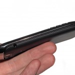
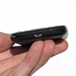
Hardware

When it's turned off, the new iPad isn't dramatically different than last year's model except it's a little bit thicker and heavier (even more so if you get the 4G LTE version). That's fine with me though, as I felt the last iPad had a great design. There will now be thinner tablets on the market but it's a fair tradeoff in exchange for the great battery life and the amazing screen on Apple's latest tablet.

It may not seem like Apple made many advancements with the hardware but once you turn on the screen you realize what a leap forward this really is.
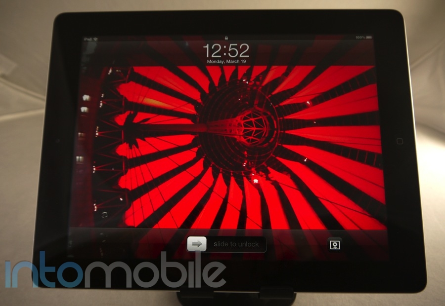
The Retina Display

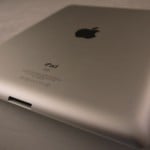
The iPad looks exactly like what most people think a tablet looks like: a large screen takes up the majority of the face, a home button on the front, some ports on the bottom and top and a camera on the back. Because it's such a minimalistic design, each of these elements take on a larger role in the overall experience and none more so than the display.

The Retina Display on the new iPad is one of the best displays I've ever seen and the only thing that even comes close to it is the prototype 4K screens I saw at CES 2012.  At 2048 x 1536 pixel resolution, the new iPad has a better resolution than my HDTV - even if that's not quite a useful comparison.

Basically, the new screen on the iPad is amazing and as cruddy as it is to say, it's something that's difficult to convey with words or video. You do have to check it out for yourself. Photos and videos look great, the lack of pixels when you're trying to read is a refreshing experience I didn't even know I needed. Along with the incredible clarity, Apple's tablet still has a responsiveness to touch which is still industry-leading.

The new iPad reviewThe beauty of the new iPad's Retina Display is that you soon forget it and think that this is just how computing should be. When I first saw the iPhone 4's Retina Display, I was also blown away but after using it for a while, it just became my norm - you just shouldn't be able to see individual pixels. Duh.

A 3.5-inch screen is one thing but it's a much bigger leap forward when it's a 9.7-inch screen.

It's been compared to the first time you've seen an HD television compared to a standard screen but I think the Retina Display on the new iPad goes even further than that because you're actively interacting with the screen. There are so many layers of abstraction when we're computing but a display this good, along with strong, intuitive touch controls  can really make you feel like you are interacting with the content on your tablet in a meaningful way.

I truly believe the new iPad's Retina Display has the potential to change the way we see computing but that doesn't mean it's there yet. Apps that aren't updated for the Retina Display look ok and iPhone apps that aren't ready and are scaled up look like crap. 1080p HD videos that Apple sells look pretty darn good on the screen but not all content you'll find on the web will automatically look great on this new screen.

I never thought the old iPad's screen looked bad but once you go Retina, you won't want to go back.

Build Quality

The new iPad reviewThe build quality on the new iPad is exactly what you'd expect from Apple: minimalistic design that's executed really well. The now iconic form factor will be familiar to anyone who's seen the previous version.

Apple seems to have nailed the tablet form factor with the original iPad and it has innovated on that. The competition is finally starting to catch up when it comes to form factor though, as devices like the Toshiba Excite arguably look better from afar. The Retina Display really pushes Apple back to the forefront in tablet design though.

Guts And Glory

The new iPad has the A5X processor inside and it sports a dual-core CPU and a quad-core GPU. In the era of a quad-core processors, Apple is claiming that the A5X can provide for a top-of-the-line experience and I'm finding that to be the case early on.

I set up the iPad as a new one and downloaded the apps I wanted from iCloud, so it has that new device snappiness. I will check in on the performance after a few months once it's clogged full of apps and content but it's been a great time so far. Those of you who have used an iPad 2 should expect a similar level of performance and those coming from the original iPad will be very happy with how fast this new tablet is.

The quad-core GPU and extra RAM are supposedly being used to pump out graphics to the screen and it will be interesting to see what happens as we get some more computationally complex apps down the road. So far, I have no complaints about the performance of the new iPad.

You can also look forward to a Bluetooth 4.0 chip inside, optional 4G LTE support for AT&T or Verizon and 1 GB of RAM. The Bluetooth 4.0 could be big down the road because of what it enables but it will take a while for the industry to properly make use of it (kind of like the Thunderbolt ports on Macs).

Software

The new iPad review
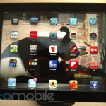
The new iPad comes with iOS 5.1 and it provides a nice, touch-friendly tablet experience that can be greatly augmented by the robust App Store ecosystem. It's everything you'd expect in a tablet experience including a swipe-tastic interface that's easy to pick up and play with.

Interestingly enough, the new iPad doesn't have Siri but instead has voice-powered dictation. This works well for the most part (it couldn't get my name right) but you have to wonder why we don't get the full deal because the new iPad is definitely powerful enough to handle it. I truly think that the service just isn't ready for the masses, as iPhone 4S owners can attest to the fact that the voice-controlled personal assistant service just doesn't work as well as it should. I think it could be quite a cool experience on a tablet too, so it's a shame we don't get it ... yet.

For all the talk of Apple products "just working," you have to remember that they're still computers. I've had some apps crash randomly and boot back to the home screen and this included third-party apps and even the Apple-produced Safari browser. This didn't happen often but it's just a reminder that no computing device is perfect.

With that said, the new iPad delivers the best tablet experience out there by a country mile for a variety of reasons but mainly due to the robust App Store support. Only a handful of these are actually ready for the Retina Display right now but I'd expect nearly every app maker to have their programs ready before too long. As I mentioned before, the real interesting thing will be seeing what these app makers can do with the new hardware in addition to the gorgeous display.

The new iPad reviewApple's iCloud can also play a significant role in the new iPad, as all of your content including some of your movies can be backed up and downloaded from the cloud. It's a neat way of keeping all your Apple products in sync without wires but be warned that you'll likely need to purchase additional storage if you're a heavy user. I love using iCloud with the App Store because I like to set up my iPad as a new one and then just cherry pick my previously-downloaded apps. I tend to not delete apps that often, so this gives me a fresh shot. For a primer on how iOS, Android and Windows Phone approach the cloud, check out this post: Cloud comparison: Apple iCloud vs. Google vs. Windows Live.

We're probably going to have to wait until the next iPhone until we get a significant update to the new iPad and I could really go for an improved notification bar and a better way to switch between apps. For example, Windows 8 does a much better job of quickly and easily switching between apps and transitioning between programs.

Still, the software experience on the new iPad is the best in the tablet market and it will only steadily improve as time marches on.

Web Browser, Multimedia And Camera

Web Browser

The new iPad reviewSafari is your default browser on the iPad (although there are alternatives) and it's pretty darn good. Apple's big bet on HTML5 is paying off on the new iPad, as much of the content viewed on this tablet can scale up to the Retina resolution. Text is incredibly crisp and if you go to visually-stimulating sites like Pinterest or Boston's The Big Picture, you'll be very happy with your experience on the new iPad.

There are still a few things which annoy me about Safari, as I think it's silly to have a URL bar and a separate search bar - just combine them please. Other than that, the Safari browser does a great job on intelligently zooming on text and the extra RAM inside of it makes switching between apps a much faster experience.

Multimedia

Android and Windows Phone have quickly been catching up to iOS in terms of multimedia content and capabilities but Apple still trumps both with the media juggernaut that is iTunes. The new iPad slides seamlessly into that ecosystem and when you combine the Retina Display with the newly-available 1080p HD content, you have an awesome media tablet. Throw in the audio content in iTunes and the excellent third-party options and your video and audio needs will easily be taken care with the new iPad.

Apple is still kind of a pain when it comes to what types of formats will play on the iPad but there are a few third-party apps in the store which will help you get those uh, legally-converted AVI or MKV files of your own DVDs on your tablet. Being able to sync and set up your tablet without having to plug into iTunes is also a great thing.

That Retina Display does come with a cost though and it's looking like storage will be an issue. I rented Young Adult in 1080p HD from the iTunes store and it was a whopping 3 GB. That will go away after I watched it but if you're on a 16 GB version, you may get squeezed for space very quickly. Additionally, we expect apps to get larger as they provide support for the Retina Display.

Camera

The new iPad reviewThe new iPad has a much-improved 5-megapixel camera that's essentially on par with the iPhone 4 but I'm still not convinced there's really much value in having a rear-facing camera on a 10-inch tablet. You look dumb taking pictures, if you hold it in landscape mode it's easy to block the camera with a finger and did I mention that you look dumb taking pictures with a tablet?

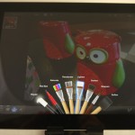
To be fair, the new iPhoto app ($4.99 from the App Store) is a great way to to look at and edit your photos. I've just come back from a long trip (Barcelona, Berlin and Austin) and I'm dreading having to go through so many photos to find the ones that worked. But being able to use your hands to do near-professional style editing of your photos has changed the way I will edit my leisure photos. It's especially great if you use an iDevice primarily to shoot because tying into Photo Stream is a breeze. As it is, I'll be buying a camera connecting kit and doing most of my photo editing from my new iPad from now on.

You can also record 1080p HD videos with the rear camera and the improved iMovie app makes it cool and simple to create good-looking movies with a few swipes. Sure, you're still a weirdo shooting lots of videos with a large tablet but if that's your thing, you'll be happy with the quality of the video recording on the new iPad.

The front-facing camera is good enough for FaceTime and I noticed some interesting facial-recognition software but the quality of these pictures aren't going to blow you away. It's nice that the new iPad has these cameras but I'm not going to be singing the praise of these cameras any time soon.


Call Quality And Battery Life

The new iPad reviewThe new iPad can be purchased with 4G LTE from AT&T and Verizon but I only have a 32 GB WiFi-only model, so I regret to say I can't be of much help on this one. Other reviews said both AT&T and Verizon 4G LTE provided lightning-fast speeds in various markets but I'd be wary of blowing through my data cap quickly with this tablet. I'm fine with a WiFi-only model because I mainly use it at home or on a plane where I don't care if it's connected or not. If you want this to truly replace your laptop and often travel, you may want to consider buying the 4G LTE version.

Other tablet makers have still yet to match the original iPad in terms of battery life. I recently flew from Houston to Berlin and pretty much used my original iPad the whole trip to watch movies, play games and read and was stunned to find that not only did it survive the trip, it still had juice to go. That's something that never happens with the Xoom, PlayBook or other device.

I'm happy to say that the new iPad continues that great tradition with a legitimate 10 hours of battery life on a full charge, even with that big, beautiful power-sucking screen. It does that by having a 70 percent larger and other reports also suggest that the 4G LTE version lives up to its 9 hours of battery life claim. That extra battery does come with a cost though, as the new iPad is ever-so-thicker than the iPad 2, it gets quite warm in your hands and it does seem to take a bit longer to charge than previous models.

I'll take those negatives any day to get such long-lasting battery life.

The Final Take

The new iPad review

With its gorgeous display and incredible battery life, the new iPad really raises the bar for what we should expect from tablets. It's a great marriage of cutting-edge tech with well-thought out software. Some other tablets may have some technical advantages but I'd still recommend the iPad.

It's the ecosystem, stupid.

Pretty much all tablets are just electronic toys for people with disposable income but that changes once you have a robust app selection. As simple as the iPhoto app is, it is going to fundamentally change the way I edit travel photos.We're seeing all sorts of innovation in different markets with iPad apps, so that's a major reason why this tablet is clearly in the lead.

But ecosystem isn't just apps, as the vast majority of cool cases, stands and Kickstarter project around tablets will be iPad-specific. It's silly to choose a tablet just because it offers better cases but when you pile that on top of the much stronger app selection and the "cool factor" of this tablet, it's clearly a winner.

If you are even considering a tablet, get the new iPad. The iPad 2 or some of the competitors will do if you can't afford the $500 entry-level price but if you truly want to understand the tablet experience and why Apple talks so much about the "post-PC era," then you need to get a new iPad.

If you're still not convinced that a tablet has meaning, I'm not sure if the amazing screen, good video and excellent battery life on the iPad will be enough to make you replace your computer. Those on the iPad 2 may also see it as more iterative than innovative but I'm a huge believer that you'll want one once you see it.

Apple has again set the standard for a tablet with the new iPad. Do you think the competition will be able to catch up this year?


The new iPad review
The new iPad review
The new iPad review

The new iPad review
The new iPad review
The new iPad review

The new iPad review
The new iPad review
The new iPad review

The new iPad review
The new iPad review
The new iPad review

The new iPad review
The new iPad review
The new iPad review


Review: Playstation Vita – Long live play

February 28, 2012 by Daniel Perez - 3 Comments

Gaming on the go has been absolutely dominated by mobile devices, primarily iOS and Android devices. To carry around a dedicated handheld gaming device requires a bit of thought since it isn’t a necessity like our cell phones are. When Nintendo released its Nintendo 3DS last March, it didn’t create as big of a splash…

Read more
The Good
  • The combination of the Vita's 5" OLED screen and its A9 Core CPU & SGX543MP4+ GPU means Vita games will look absolutely gorgeous
  • As big of a device as it is, the Vita still feels comfortable when in use, especially all of its buttons and new and improved dual-thumbsticks
  • The Vita's 3G capabilities means you'll never have to rely on a WiFi hotspot to access online content or play online multiplayer matches
The Bad
  • For $250 or $299, gamers can buy a whole new console, which may scare away potential buyers
  • Not all of the Vita's new bells & whistles are good as the Vita's reach touchpad doesn't feel quite right and sometimes has users fumbling to use it
  • Battery life is quite poor for the Vita as players can expect to get 3-5 hours of gameplay out of their device before needing a charge

Hardware

It shouldn't be a surprise that the PS Vita is an impressive piece of gadgetry when you factor in all it's carrying in its portable package. Even though it's quite large when compared to the majority of mobile devices currently available, when you consider what the PS Vita is capable of, then you'll easily forget how big it is when it's performing some amazingly stunning visuals thanks to its 5" OLED touchscreen.

During my time with the Vita, I didn't notice any lag through any of the games, applications, or anything else, even when I had multiple applications open in the background. One thing I was most impressed with was how well the Vita handled downloading games in the background as I played graphic intensive games such as Uncharted in the foreground.

There have been times in the past that I've commented on an iOS or Android game's visuals looking close to console quality, but the Vita blows even the best looking iOS or Android game out of the water as the device delivers some jaw-dropping visuals. Lighting effects, character animations, and even soundtracks in games offer the closest resemblance to console quality that I've ever experienced on a non-console device.

Design

The PS Vita feels comfortable in the hands when in use with all of its buttons giving just the right amount of feedback when applying slight pressure to them. Both the PSP & PSP Go had a a single analog thumbstick, but the PS Vita finally brings what everyone has been begging Sony to deliver in an upcoming PSP: dual thumbsticks. The thumbstick on the PSP & PSP Go didn't feel quite right as it was way too attached to the device to feel comfortable using, but the PS Vita's thumbsticks stick out just enough to be very comfortable when in use as they offer full rotation. The thumbsticks also have a very comfortable rubber tip that allows your thumbs to move them around with minimal effort. If you're familiar with the PS3's thumbsticks, then you'll feel right at home with the Vita's.

One selling point of the PS Vita I wasn't too fond of was its touchpad in the rear. I'm not sure if my brain isn't wired yet to take full advantage of it, but I felt every time I was required to use it in a game, I ended up fumbling with the Vita. Some games require you to use the middle of the touchpad, which for me, required a bit more effort which involved taking my hands away from all of the buttons and reaching to find the middle of the touch pad. Seeing as the 3G/WiFi version of the Vita is $299, the last thing Vita owners want to do is fumble with their device.

Forget Its Cameras

If you're planning on carrying around your PS Vita as an amateur shutterbug, allow me to save you a lot of headache: DON'T. Both the front and rear facing camera are 0.3 megapixel cameras that can capture a full 640x480 480p resolution in VGA mode. This is highly under par with what is currently available on our mobile phones. The sooner you forget the PS Vita has cameras, the happier you'll be. Trust me.

Software

Going from a XMB dominated platform on the PS3, PSP, and PSP Go to the PS Vita's platform is like night and day. Instead of fiddling around multiple categories through a XMB interface, the PS Vita installs applications and games through multiple pages on the homescreen. When you select an app, it'll launch its own dedicated window that offers some quick information regarding the app, a user manual, and even the ability to update it right from the splash screen for the app.

When you're running a game, the PS Vita makes it very easy to back out of it in order to access another application. As long as the new application, like the Friends or Group Chat app, doesn't require you to close your game, your progress will always be available right where you left off making it possible to pause your game when you get to work, and then picking up right where you left off on your commute home.
The PS Vita has its own music player, photo gallery viewer, and other applications you're probably familiar with if you played on a PS3 or PSP, but one new application that's been included in the Vita is called "Near." Near uses the Vita's GPS in order to find players within your area that may share the same games as you. If you're playing Ultimate Marvel vs. Capcom 3 and have no friends to play against, you can easily check your Near application for anyone in your area who is playing and challenge them to a game. And who knows, maybe you'll even make a friend in the process.

Games, Games, And More Games

What's the point of launching a new gaming device if there aren't any worthwhile games to play on it? Nintendo should have learned this lesson before the launch of its Nintendo 3DS as a new device won't sell like hotcakes unless you have worthwhile games. Thankfully, Sony wised up and made sure there was a large selection of launch titles, probably the largest of any gaming device launch with over 30. Sony delivered some fantastic first-party games such as Uncharted: Golden Abyss & Wipeout 2048, while third-party developers like Ubisoft, Capcom, and Namco Bandai just to name a few delivered some worthwhile games at launch such as Rayman: Origins, Ultimate Marvel vs. Capcom 3, and Touch My Katamari.

Battery Life

If you're planning on taking your Vita on a long road-trip, then you need to invest in a battery pack that is compatible with recharging the Vita while on the go as it only uses a 2200mAh battery. Sony has made it known early on the Vita's battery life would only deliver 3-5 hours of actual gameplay and that's with its WiFi and Bluetooth disabled. Experiencing how quickly 3 hours can go during a long-term play session is a real downer and I feel it defeats the purpose of a portable gaming device if I need to carry its charger around even if I make small trips.

What the Vita lacks in battery when actually in use, it more than makes up for it with its standby battery drain, which is nearly non-existent. I've left the Vita unplugged and left in standby mode overnight, and I didn't notice any significant drain on the battery, which is quite impressive when you consider I still had my game of Uncharted suspended as well as a bunch of other applications.

The Final Take

I've been carrying around the PS Vita for the past week and playing with it any chance I get. Originally it was for the purpose of writing this review, and now that I'm done with my review of the Vita, I can't imagine going anywhere without it. The games currently available for the Vita are absolutely amazing to play. When you consider launch games for most game systems are usually not good, this certainly speaks volumes of what the Vita is capable of.

Sony promised to supersede mobile gaming when the Vita released, but seeing as it's priced as much as a current generation console, I don't see that happening any time soon. The convenience and performance of an iOS or Android device will keep a lot of casual and hardcore gamers happy, while those who are looking for a near console experience will be very pleased with the Vita. I believe if gamers get a chance to play with the Vita, they may think twice about playing games on their iPhones.

Samsung Galaxy Note (AT&T) review: Is bigger better?

February 16, 2012 by Marin Perez - 22 Comments

The Samsung Galaxy Note for AT&T is a big phone in all senses: Samsung devoted Super Bowl ad time to it and the 5.3-inch display makes it the largest phone most people have ever seen. In this review we’ll see if the Samsung Galaxy Note on AT&T has struck upon a new hybrid phone, tablet…

Read more
The Good
  • While it's a large phone, it's very slim and well constructed.
  • The large screen is of a very high quality.
  • Some of you may love the S Pen and the capabilities it offers.
The Bad
  • It seemed too large to be a comfortable phone that you carry on a daily basis.
  • The camera is not as good as it should be.
  • I didn't see the value in the S Pen.

Hardware

There's no way around it: the Galaxy Note is a big phone. The 5.3-inch display means that the latest Galaxy handset dwarfs pretty much every other smartphone out there. How big is it? Well, in order to give you some perspective, we stacked it up against various smartphones and tablets. The Note is definitely a large phone and I couldn't help but be a bit overwhelmed when I first saw it. Luckily, this is packed full of power, so it has the horsepower to back up its large footprint.

Beyond the extra-large screen, the Galaxy Note is essentially a beefed up Galaxy S II and that's ok with us, as we loved that smartphone. You can't ignore that screen though, as I found that the size actually got in the way a few times.

Design

When I first saw the Galaxy Note, I wondered, "Why is the screen so large?" I've received many responses like "because it's 5.3-inches" or "What did you expect from a 5.3-inch screen" but I guess the real question is: Is there an advantage to having such a large screen or is Samsung just experimenting with form factor at the expense of experience? Sadly, I tend to think it's the latter.

Don't get me wrong, I'm pretty darn impressed that Samsung was able to make a smartphone with a 5.3-inch display with a 1280 x 800 resolution that is so slim and stylish, and I know that Samsung is trying to push the boundaries of what is a smartphone and tablet. Unfortunately, by trying to be this crossover device, I believe the Galaxy Note doesn't deliver on its promise of being a great smartphone or a great tablet. Instead, it's average in both categories.

Samsung Galaxy Note for ATTThe look and feel of the large Galaxy Note is going to be an extremely polarizing design because I know many of you are going to dig the big screen but others may think it's too large to be a comfortable phone. I fall into the second camp. The screen is nice but it makes the device a little unwieldy and very difficult to operate with one hand. While this may not seem like a big deal, it can be bothersome when you're trying to pull out your phone quickly to check on something and then put it back.

Forget about holding this up to your ear when making calls too because it just looks weird and it's not comfortable. If you have shallow pockets, it's not going to fit in there. I pulled it out on the bus the other day to check some stuff while I was commuting and people were gawking at it - also be prepared for many more people around you to be able to see what you're looking at. Overall, I'm just not in love with how the size makes it difficult to operate as a "normal" smartphone.

I handed the Note to a friend of mine and he said it was very cool but asked if you had to sign up for a data plan with this tablet. When told that this is a phone, he immediately laughed. Yes, it's anecdotal but most of the data suggests that tablets are mostly used in homes and most people want a little more screen size.

To be fair, this may be a large and big device but it's quite thin and Samsung did a great job with making it look and feel somewhat sleek. The display is quite gorgeous and I'm amazed at the sheer industrial design cojones to be able to make a screen this size with that resolution. Holding the device in landscape mode also makes for a great video viewing experience and including the S Pen holder doesn't detract from the design at all.

I believe that some demographics are going to love the Galaxy Note. I could easily see some older folks loving the screen size for readability, artistic folks digging the S Pen and hardcore Android fans who want bigger and better everything but I'm just not blown away by this. I came into this review with an open mind but ultimately could not dig the Galaxy Note.

In some ways, I'm reminded of the Droid Razr because I was also blown away by the innovation of the industrial design but felt like it was design over substance. I think the Samsung Galaxy Note's form factor detracts from a comfortable overall smartphone experience. It's not that you can't get used to the size but I never felt like it was worth the hassle to.

Build Quality

Samsung Galaxy Note for ATTJust because I'm not a huge fan of the design doesn't mean I can't appreciate what Samsung has done with the Note. This large handset looks and feels like a premium device and we'd expect nothing less from Samsung at this point.

The massive screen takes up the bulk of the face and it's quite a site to behold. It's crisp, beautiful, responsive and there's just so much of it. You also have capacitive Android buttons underneath it and a front-facing camera on top. The display is almost edge-to-edge but there's a slight bit of border on each side.

There's a nice, dark grey trimming around the device and the right spine features the power/unlock button. The top has a standard headphone jack and the left spine has a one-piece volume rocker. The bottom has the microUSB port and the spot for the S Pen, which fits in perfectly and looks pretty nice. The back plastic cover has some nice texture to it and I like how the "GALAXY Note" branding pops out. The 8-megapixel camera with flash are in the middle of the back cover and this looks nice even if it can makes things a little awkward when taking pictures (more on that later).

So, if you like the size and design of the Galaxy Note, you'll be happy to know that it's built with high-quality materials. Those who suggest that smartphones can only be high-quality if they're made of metal are wrong.

Guts And Glory

The Samsung Galaxy Note on AT&T differs a little bit from the international version in that it packs a 1.5 GHz dual-core processor and sports AT&T 4G LTE but it remains a powerhouse. Look for all the usual goodies you'd expect in a high-end smartphone (WiFi, GPS, Bluetooth, etc.). You'd think that the beefy processor would ensure a silky-smooth experience but I noticed a few troublesome hiccups here and there. We'll talk about how great the 4G LTE support is in a bit.

The Galaxy Note performs well for the most part but even with the 1.5 GHz processor, I noticed some lag while using the device. I'm not sure if it's the software, processor or even the size of the screen but some of it is just not as quick and precise as you would like.


Software

Samsung Galaxy Note for ATTThe Samsung Galaxy Note on AT&T uses the Android 2.3.6 Gingerbread operating system with the TouchWiz UI and there are some software tweaks for the S Pen, which we'll cover in a separate section below. As I've mentioned many times before, Android is a highly-capable platform for making calls and texts, browsing the web and adding new applications to improve your experience. I still think iOS is a bit more polished in its presentation but Android is every bit as powerful and it offers much more flexibility and customization than iOS or Windows Phone Mango.

As for the TouchWiz UI, it should be familiar for those who have ever seen nearly any other device in the Galaxy lineup - except for the Galaxy Nexus, of course. I like the way TouchWiz presents Android because I think it's a visually-attractive layer that looks and feels nice. Some of you may think TouchWiz looks too much like iOS (I know Apple does) but I'm a fan of it and some of the little touches. For example, being able to pull down the notification bar and having your quick-toggle options for the WiFi, Bluetooth and GPS is something that's very convenient and really adds to the experience.

You can also look forward to some preloaded apps on this like Amazon Kindle, some AT&T software like the QR scanner and the Family Map, Polaris Office, Samsung's Media Hub and the Samsung Apps app which features some curated programs specifically for the Note. It's still not as easy to delete apps as it should be (give me the option in the app tray please) but most of the preloaded software is fine and you can always download more apps from the Android Market, which is always getting better.

S Pen

Samsung Galaxy Note for ATT

One of the intriguing features of the Samsung Galaxy Note is that it comes with a digitizer called the S Pen and this aims to give you more control over how you interact with your device. While Apple has said that if you need a stylus, you've blown it, there is a cottage industry of styli out there because many people find this interaction method attractive. I am not one of those people. Like with the stylus on the HTC Flyer, I don't find much value in the S Pen but that doesn't mean that you won't.

The S Pen fits precisely in the bottom of the Note and even if you never use it, it doesn't detract from the design. The S Pen isn't just a capacitive stylus, as the Note can register up to 240 different levels of pressure, so you can have a much more granular experience. There's a button on the S Pen that you have to hold to interact with the screen and there's even an accessory which you can put the S Pen in which makes it look and feel like larger pen.

You can use the S Pen to interact with nearly any part of the Note but you're still going to have to use your fingers to hit the capacitive Android buttons below the screen. Luckily, there are a few gestures you can do to replicate the Home, Back and Menu experiences. Of course, that's probably not why you'd use the S Pen, so Samsung baked in a few quick ways to help you jump into S Pen-friendly software.

If you hold down the S Pen button and double tap on the screen, it will immediately pull up the S Memo software for you to jot down some notes. I found it's kind of tough to write naturally as you would with a pen, as you kind of have to exaggerate your motions to get legible text. I have chicken scratch handwriting as it is, so maybe I'm not the best one to judge that. You can also do a quick screenshot by holding the S Pen button and holding the tip on the screen. From there, you can annotate the page you just took a picture of or crop images from it, and then you can save it or share it through e-mail or other avenues.

You can also do a lot more with the S Pen including drawing pictures, setting up Power Points and we expect that developers will take a look at the S Pen SDK and do some interesting things. There's a preloaded game called Crayon Physics and it's a cool game where you get to draw items to interact with the game and I could easily see something like Scribblenauts eventually landing on the Note.

Why isn't this for me? I have no real interest in drawing or doodling, would rather have my notes typed out and believe that my finger can handle the annotation or cropping aspect well enough. We know that Samsung will likely bring the S Pen to other tablets, so there's definitely a draw to it but I just don't see it. Check out the video below to see the S Pen in action and you can decide for yourself.


Web Browser, Multimedia And Camera

Web Browser

The Samsung Galaxy Note essentially uses the standard Webkit browser that comes standard with Android but there are a few little tweaks that Samsung through in. For the most part, it's pretty darn good and can handle HTML5, JavaScript and nearly anything else you want to throw at it. That 5.3-inch screen does come in handy for reading sites most of the time but I'm still not in love with some of the intelligent zooming.

If you're on a properly optimized site for mobile (like ours or ESPN), the text looks great and is easily legible but some sites are optimized for a smaller screen and don't intelligently adapt to something like the Note. This can lead to text that is actually quite small and zooming in manually zooming doesn't fix it because the text won't properly format to the screen. This doesn't happen often but it happened enough times where I noticed it.

Other than that, it's a really nice browsing experience and having the blazing-fast AT&T 4G LTE really helps.

Multimedia

This is where the Galaxy Note really shines, as that large, beautiful screen makes watching movies and TV shows a blast. While iOS users may have a little easier multimedia store with iTunes, the Galaxy Note has multiple ways to get great content on it. Whether you're renting movies from the Samsung Media Hub, renting from the Android Market or just streaming from Netflix, you can get nearly anything you want on the Note and it looks great thanks to that large display. I'm not a huge fan of watching videos on my devices unless that's the only time I have access to it but the Note's size makes viewing videos an excellent experience.

Music is a similar story, as Android has a ton of third-party options for getting your tunes on the go. You can use Google Music, Pandora, Slacker Radio, Spotify, Stitcher and others to satisfy nearly all of your audible needs and the Note's external speaker is pretty good, even if it lacks some bass. The headphone jack is on top (the right place, in my opinion) so you can just plug in some quality headphones and you'll be good to go.

Camera

The Galaxy Note has an 8-megapizel camera with a flash and it's a solid way to capture pictures but it's not close to being the best on the market (or even the best Samsung has done) and the large screen can make taking pictures awkward.

Samsung's software is pretty nice for taking photos, as it's clear how you can change the settings and the Note gives you a plethora of shooting options. Unfortunately, speeding up the shot-to-shot time isn't one of them. After every picture, there's an animation which "drops" the picture into a gallery on the bottom right but this takes far too long to do and if you're trying to shoot rapidly with the standard settings, you'll likely miss something.

The sheer size of the Note also makes it awkward to hold when you're taking pictures. In landscape mode, it's relatively easy to snap quick pictures with one hand but holding the device in landscape mode is weird. If you hold it with two hands and have the volume rocker (also the zoom buttons) on top, it's easy to tap the power/unlock button or get your fingers in the way of the camera. Much like it's weird to see people taking photos with an iPad, it's kind of uncomfortable to take pictures with the Note.

The results are pretty good though, as you can see below that there's a nice sharpness to pictures and the color reproduction is above average. The tap-to-focus feature actually makes a difference too, and it is kind of fun to check out pictures on the massive screen.

standard settings


Standard settings, flash, low lighting


Standard settings, medium lighting


Call Quality And Battery Life

Samsung Galaxy Note for ATTCalls on the Samsung Galaxy Note sounded great in the San Francisco Bay Area. I was on a conference call with this device and asked others how I sounded and they said they thought I was on a landline phone. You can't get much better than that. The speaker phone is also pretty good.

This handset is capable of using the AT&T 4G LTE network and I found it to be crazy fast. I averaged over 12 Mbps on the down stream and hit over 30 Mbps a few times. Sure, the network isn't very crowded right now and I'm sure it will slow down a bit once more users get 4G LTE handsets but for now, the Galaxy Note on AT&T gets one of the fastest data connections I've seen.

That 4G LTE and giant screen come with a price though, as the battery life is just okay. You can get through a work day with the Galaxy Note with light usage but if you're going to do anything more (particularly location-based stuff or streaming), look for the Note to die relatively quickly. The default options do everything they can to save battery life (30 second screen shutdown) but you do have to be pretty diligent. I did find it to charge pretty quickly, though.

The Final Take


You're going to love or hate the Galaxy Note for AT&T. It's either going to be the perfect combination of a smartphone and tablet or it's going to be a gaudy novelty that will be a footnote in the history of smartphones. I appreciate the know-how needed to create such a wonderfully-slim device with a beautiful 5.3-inch screen but I ultimately cannot endorse this product. I don't believe it's large for a reason that really benefits the user, I think it's just large for the sake of being large.

I understand that reasonable people can differ and I'm sure the Galaxy Note's large beautiful screen, blazing fast 4G LTE support and S Pen will be appealing for many of you out there but I just don't see it. The screen is too large to be used comfortably in most cases, and I find very little value with the S Pen.

I think the Galaxy Note will wind up a highly-loved oddity.

The Samsung Galaxy Note for AT&T will be available Feb. 19 for about $300 on a new, two-year eligible contract

Vonage Mobile app review – The new best way to call?

February 14, 2012 by Marin Perez - 2 Comments

Vonage is a well-known pioneer in the VoIP space but it’s been primarily known as a landline replacement service. The company is trying to change that perception with its new Vonage Mobile apps for iOS and Android and these offer the ability to make free international and domestic calls, as well as enable you to…

Read more
The Good
  • The call quality is great whether you're on WiFi or mobile data.
  • The calling rates are generally cheaper than the competition.
  • Good deep integration with your address book and it asks for your permission to use it.
The Bad
  • No video calling in it and the competition does it.
  • The design works well but I still think there's room for improvement.

Features & Functionality

The Vonage Mobile app allows you to make calls and sends texts over WiFi, 3G or 4G. If the recipient also has the Vonage Mobile app or the Vonage home service, the calls or text are free. If you're calling a landline or cell phone without the service, you'll have to pay some money but Vonage is pushing the fact that it's prices are cheaper than something like Skype - Vonage says its prices are roughly 30 percent lower than Skype. You can purchase blocks of Vonage credit though in-app purchases, so buying more calling time is just a few clicks away.

One thing I like is that the Vonage Mobile app can easily sync with your address book to find contacts and unlike some high-profile apps out there, it actually asks for your permission to do it. Another cool feature is that you can set up your actual mobile number as your Vonage Mobile number, so when you're calling friends and family, they can immediately notice that it's you. There are different tabs on your contact page within the app so it's easy to invite people to use it and to identify which of your friends use the app and are eligible for free calls and texts.

Vonage is also touting its high-definition Codecs that it uses to provide some super-clear calls and I've heard this first-hand multiple times. I called a friend of mine in Korea who downloaded the app and he sounded quite clear even though I was using Verizon's 3G. When IntoMobile's Blake Stimac and I talked with the Vonage Mobile app, he said it was "probably the clearest call [he's] ever head." We were both on WiFi.

So the Vonage Mobile app strongly delivers on its promises of allowing you to make free or cheap calls and texts, and we found the call quality to be superb. That doesn't mean it's a perfect app though. Competitors Skype and Tango offer video calling from your phone and I missed this feature in the Vonage Mobile app. I don't do video calls all the time but I love having the option. I wouldn't be surprised to see Vonage implement this down the road, too.

As for the design of the app, it's straight forward and gets the job done but I wouldn't have minded a bit more flair in it. I guess it's tough to really jazz up a calling app that much but a few neat flourishes here and there could help it stand out more.

Conclusion

The Vonage Mobile app produces some of the best VoIP calling clarity that we've heard from an app and being able to use it on Android, iOS and multiple tablets is great. The call quality is really something to brag about too. On the downside, I wish there was the ability to make video calls. Still, the Vonage Mobile app is free and provides an excellent service if you make lots of international calls. Heck, there's even a promotion where you can get 3,000 free minutes to almost any line in the United States, Canada and Puerto Rico, so it's worth a download just to hear how good it sounds.

Check out the video below to see Vonage Mobile in action.


Recommend

This post is sponsored by Vonage, and you can download the apps here. For more information about Vonage Mobile, please visit Vonage’s site and you can see it in action on YouTube. Please note that sponsorship will not impact the review.

Motorola Droid Razr Maxx Review: 4G and good battery life finally mix

February 6, 2012 by Marin Perez - 7 Comments

Verizon Droid Razr Maxx review

The Droid Razr Maxx brings you all the power you’d expect from the Droid Razr but it ditches the “impossibly thin” form factor for an extra-large battery. In this review, we’ll see if the Droid Razr Maxx really has as good of a battery as Motorola and Verizon are claiming and how this 4G LTE…

Read more
The Good
  • Motorola delivers on its promise of all-day battery life.
  • Even with the bigger battery, the handset is still sleek and good looking.
  • Motorola has dropped in a few software improvements from the Droid Razr.
The Bad
  • I still don't like the aesthetic of Motorola's Android layer.
  • The camera is better but still not as good as other high-end smartphones.

Hardware

I felt like the Droid Razr was a marvel in hardware design because Motorola was able to fit an incredible amount of power into an incredibly-thin form factor. The Droid Razr Maxx isn't quite as jaw-dropping but it is still packed full of power, is stylish and it fits really well in your hand.

Design

The Droid Razr Maxx looks like the Droid Razr but a bit more bloated. Because the Droid Razr was so thin, that's not necessarily a bad thing. In fact, I felt like the Droid Razr was almost more style over substance, as it was kind of a pain to hold with one hand but that's not the case for the Droid Maxx, as it feels great in your hand, is easy to use with one hand and the weight gives it just the right heft when you're using it.

The 4.3-inch qHD display takes up the bulk of the face and while it's not as beautiful as the 720p HD screens we've seen on devices like the Galaxy Nexus, it's still bright and responsive. Some of the most pickiest of you out there may notice some issues with the screen but for the most part, I found that pictures, videos and text looked great on the Droid Razr Maxx. The face of the device also has the four standard Android buttons (capacitive buttons), a front-facing camera, notification light and branding from Motorola and Verizon.

The right spine of the Droid Razr Maxx has the power/unlock button and a one-piece volume rocker, and both work well. The top of the device has a standard headphone jack, microUSB and mini HDMI ports in an exposed manner. The left spine is relatively clean except for a pop-down door for the microSD slot and the 4G LTE SIM card. I'm not a big fan of this, as it can sometimes be difficult to get down. All of the edges are mostly squared but Motorola put in a few little curves to make it more comfortable to hold.

With a 3,300 mAh battery inside it, you have to be concerned about the heft and weight of the Droid Razr Maxx and I'm happy to report that it still looks pretty darn sleek. Sure, it is still a relatively big phone - especially compared to an iPhone - but it's not too big or too heavy. The back cover is made of a soft-finished Kelvar and this feels incredibly nice on your fingers and on the palms of your hands. You can also look for an 8-megapixel camera with a flash on the back, as well as the speaker.

Motorola took the same design ethos with the Droid Razr Maxx that it did with the Razr but it filled it out a bit more. While it's not quite the eye-candy that the Droid Razr is, the Droid Razr Maxx is still a good-looking device that packs in the power.

Build Quality

The Motorola Droid Maxx packs a lot of power inside a chic and functional form factor. While I really thought the Droid Razr was gorgeous to look at, it wasn't as functional as it could have been. For example, it was so thin that when you typed on the virtual keyboard, you could feel it from the back on the palm of your hand. It just felt weird. That's not the case with the Droid Razr Maxx.

Inside the Droid Razr Maxx you'll find a 1.2 GHz dual-core processor, 4G LTE with fallback to CDMA 3G, GPS, Bluetooth, 32 GB of combined memory and 1 GB of RAM. Basically, the Droid Razr Maxx gives you top-of-the-line specs in a nice package. There's also the aforementioned 3,300 mAh battery and we'll cover that in a section below.

Software

Verizon Droid Razr Maxx reviewThe Motorola Droid Razr Maxx runs Android 2.3.5 with Motorola's custom user interface and it's a good way to get your e-mails, texts, download new apps and search the web. Motorola has done some excellent additions to the core platform with Smart Actions but I still can't get into the visual aesthetic of its custom user interface.

For those of you who are new to Android, you should know that it's a powerful and complex platform that performs really well when you're connecting Google accounts to it. Even without Google services, it's a thoroughly modern smartphone OS that utilizes touch well and gives you nearly everything you'd want from a smartphone. While the app selection is still a bit behind the iOS App Store, the quality of Android apps has improved dramatically over the last few years but there are still a few programs that you can only get on the iPhone (things like Instagram come to mind).

Motorola said it will invest heavily in its Smart Actions software on top of Android and I believe this is a great idea. This lets your phone set up automatic actions or parameters depending on what you're doing. For example, you could have your Droid Razr Maxx automatically turn to silent mode when you arrive at certain locations. It's still a little rudimentary right now but the potential for this is off the charts.

The device comes with some other preloaded apps and these run the gamut from useful to bloatware. Look for Amazon Kindle, Blockbuster, GoToMeeting, NFL Mobile, QuickOffice, Verizon Video, VideoSurf and more when you boot up your Droid Razr Maxx for the first time. Many of these can be uninstalled with a few clicks, so if you don't like it, just go ahead and delete it. The virtual keyboard is pretty good but

Unfortunately, I still don't like what Motorola does to the look of Android. There's too much of a robotic feel to it and there are a ton of little things which drive me crazy. For example, when the screen rotates between landscape and portrait mode, the screen flashes blank for a fraction of a second. Why does it do this? I have no idea but it's infuriating because it takes you away from the experience and draws you out of the action you're trying to do. Another thing that drives me mad is when you hold the home button to bring up the multitasking window, it goes to a separate screen instead of overlaying the apps on the screen you're already on.

I know these are relatively minor complaints and many of you may not even care about this but if the Droid Razr Maxx is truly trying to outclass devices like the iPhone 4S and Galaxy S II, these little things should be noted.

I wonder what will happen when this device gets Android 4.0 Ice Cream Sandwich, as this could fix many of the little bugaboos I have with the Motorola UI. Maybe Motorola's vision of what Android should look like could change as it becomes part of Google. As it is now, the Droid Razr Maxx software is still above average but a few minor things really stick in my craw.

Web Browser, Multimedia And Camera

Web Browser

Verizon Droid Razr Maxx reviewThe Motorola Droid Razr Maxx has the standard above-average browser you'd expect from an Android device and the 4G LTE makes browsing the web and downloading files an absolute blast. While many might think that streaming HD video very quickly and easily to your phone is the real highlight of 4G LTE, I'd argue that the best thing about it is the speeding up of every day processes. Even if you save just a half second waiting for pages to load, that time quickly adds up and you don't really notice it until you have to go back to a 3G device.

The Webkit browser on the Razr Maxx works well with most sites, the intelligent zooming works fine and I'm still annoyed that rotating the orientation makes the screen black out for a fraction of a second. The Droid Razr Maxx is a good way to use the web on the go.

Multimedia

The Motorola Droid Razr Maxx benefits from the improvements in the multimedia capabilities of Android over the last few years and it is a good way to get your music, movies and gaming on the go. While I still have to give the iPhone 4S the advantage because of iTunes and the quality of the games in the App Store, the Droid Razr Maxx is an entertainment powerhouse.

Videos looks pretty good on the 4.3-inch screen and you can watch new ones by renting directly from Google or through a variety of third-party apps like Hulu Plus, Netflix or Bitbop. If you're looking for music, you have Google Music, Rdio, Spotify and many, many more. I found the speaker to be pretty good but it lacked bass and tended to get distorted at higher levels. Plugging in headphones led to a much more pleasing experience. The app and game story on Android is getting better by the minute but we're still seeing high-profile games like Infinity Blade land on iOS first.

Camera

The Motorola Droid Razr Maxx has an 8-megapixel camera that can record 1080p HD videos and it's a nice way to ditch your digital camera, even if it's not at the top tier of smartphone cameras. That doesn't mean that the latest Verizon smartphone has a bad camera though, as I found this was perfectly good for taking shots that you want to share online. Blowing up most of the pictures also looked pretty nice.

Ultimately, I think I'm just not a huge fan of the Motorola camera software, as it doesn't feel as intuitive as other devices. It does have excellent shot-to-shot time and a variety of modes but it's just missing the intuitiveness and beauty that some other phones have. Luckily, color and light capture were really good and I found that it was pretty smart automatically choosing the depth of focus. The front-facing camera was also adequate for self portraits and video calling but it's not going to blow you away.

Click on any of the pictures below for the full version.

Standard settings, good lighting


Standard settings, notice the focus


Standard settings with flash, low lighting

Front-facing camera

Panorama mode

The Motorola Droid Razr Maxx can record some nice-looking 1080p HD video and you'll see from the video below that colors are reproduced well. I would have liked some image stabilization software built in (sorry for that) but I did appreciate the multiple options for recording sounds. There are still other options I would have liked to see but I'm pretty happy with what the Droid Razr Maxx can do on the video front.


Call Quality And Battery Life

Verizon Droid Razr Maxx reviewVerizon is known for providing a high-quality cellular network and the Droid Razr Maxx proved that to me. Calls were crystal clear from both sides of the conversation although speaker phone calls sometimes sounded a tad garbled. The 4G LTE performed like a champ on this thing, as I broke 30 Mbps download speeds multiple times while I average above 8 Mbps during my whole time with it. As I said before, once you go 4G LTE, you don't want to go back.

It should be noted that those speeds also make it easier to blow past your data limit, so I'd advice switching to WiFi if you're at home or in the office.

The Droid Razr Maxx is being pushed as having great battery life and I'm happy to report that it does. This is the first 4G LTE smartphone I've used that provides an all-day experience off a single charge. I'm not talking about a 9-to-5 "day," I'm talking about a full 24 hours. If you're constantly hammering the device with streaming videos and music, it's not going to last 20+ hours but the Droid Maxx stood up to my above-average usage and lived for about 28 hours on a single charge. Not bad.


The Final Take

Verizon Droid Razr Maxx review
The Droid Razr Maxx is a Droid Razr but with a much better battery, improved software and a more comfortable in-hand feel. The battery life really does stand out and it makes 4G LTE a better experience because you don't have to worry about your phone dying in the middle of the day.

Unfortunately, I'm still very put off by some of Motorola's Android customization even if some of its software is innovative. I just don't dig the look. That's definitely a personal opinion and I still don't think that it detracts from all the good things the Droid Razr Maxx does. Verizon has a winner on its hands with the latest Motorola smartphone.

Standard settings, good lighting
Front-facing camera
Standard settings, notice the focus

Panorama mode
Standard settings with flash, low lighting
Verizon Droid Razr Maxx review

Verizon Droid Razr Maxx review

Verizon Droid Razr Maxx review

Verizon Droid Razr Maxx review

Verizon Droid Razr Maxx review

Verizon Droid Razr Maxx review

LG Spectrum Review : The Nitro for Verizon or something better?

February 2, 2012 by Blake Stimac - 3 Comments

Verizon Wireless is setting the LTE landscape of fire by releasing one handset after another that supports the network, with the LG Spectrum being one of the latest entries. As you’d expect with any high-end LTE phone offered by the carrier, the Spectrum is dripping with a ridiculous amount of nice specs but is this…

Read more
The Good
  • The True HD IPS display is one of the best displays we've ever had our eyes on.
  • The dual-core Snapdragon S3 is powerful and handles most tasks with ease
  • We were pretty impressed with the camera's quality.
The Bad
  • You'd probably pass over this phone because of it's boring design and never know the power it has under the hood.
  • LG's custom UI doesn't seem to utilize the powerful processor living inside, as it can become noticeably laggy.
  • No surprise here: This LTE phone has bad battery life.

Hardware

The Spectrum ships with just about every piece of technology you'd expect to see in a high-end Android phone these days, save for a few specs here and there, like a dedicated micro-HDMI port (we're not counting off for that). The handset is on the bigger side but we're glad to see that Verizon LTE phones are no longer as fat and thick as they used to be.

The Spectrum rocks a 4.5 inch True HD IPS display panel, making it one of the best HD displays we've ever seen on a smartphone before. Colors pop, maybe slightly less than Samsung's HD Super AMOLED but the clarity and contrast are pretty perfect and crisp through and through. With a screen this large, one shouldn't be too surprised that the Spectrum feels like a monster in your hands. This is something you'll get used to quickly, as you'll likely be lost in this screen.

Above the large display, you'll find Verizon's logo next to the 1.3 megapixel front-facing camera, ambient light, and proximity sensors. Below, there are three capacitive navigation buttons for menu, home, and back. LG has a tendency for leaving out the dedicated search key, which is something we hope the company will wise up to one day. Still, the lack of the search key allows the home button to be smack dab in the center, which some will appreciate.

The sides of the Spectrum are kept rather clean, with only the volume rocker on the left side and the 3.5mm headphone jack, charging port, and power/lock button found on the top. Again, like the lack of a search button, LG puts the charging port on the top of its phone, which we're definitely not fans of. The right side of the device is clean, and the bottom only has a tab to remove the battery cover. Speaking of which..

The back of the Spectrum is covered in a high-gloss plastic with a checkered pattern found throughout. The ending result is aesthetically pleasing but the use of such plastic attracts fingerprints on a large scale (about as bad as the HP TouchPad). Up top, you'll get the 8 megapixel camera with LED flash, with LG logo right in the center. Towards the bottom of the battery cover is where you'll find Verizon's 4G LTE logo and the speaker grill.

With the Spectrum being so similar to the Nitro HD, we wish LG would have just kept the textured grip backing for the Verizon's offering. Even if you don't mind fingerprints on the back of the handset since you'll be focused on the screen, the rear side of the device is slick enough of to slip out of your hand.

Design

It shouldn't come as a surprise that the Spectrum's design is rather boring. LG seems to go for understated and simple, which come off as boring and bland to the consumer. In fact, the best looking LG phone we've seen in a while was designed by Prada from the inside out, so don't expect much on the design front for the Spectrum.

Complaints aside, while we're not in love with the design aesthetic of the Spectrum, in no means does it make it an ugly phone. Boring does not equal ugly and there will likely be plenty of people who don't mind or even like the design of the handset just fine. If design aesthetics were that important, we'd probably be waiting for ridiculous concept designs to emerge before we finally picked up a new phone.

Build Quality

While essentially made of all plastics, once you get the Spectrum in your hands you'll feel a sense of sturdiness to it. Sure, dropping it would result in blemishes and scuffs but it likely wouldn't break on you. That said, we haven't put those claims to the test.

While trying to get a feel for its strength, I pinched the screen and battery cover inwards and was surprised to see how much give it had. Then again, what else would one expect a plastic phone to do when put under pressure?

Overall, the Spectrum's build quality is pretty solid, even if it is made of plastic. The slick plastic backing makes the handset feel cheaper than it really is but that's pretty much the only complaint we have with the Spectrum's build quality.

Guts And Glory

Just like the Nitro HD, the Spectrum packs a punch in its internal guts. Rocking the 1.5GHz dual-core Snapdragon S3 processor and 1GB of RAM, the Spectrum is a force to be reckoned with and can easily take on just about anything you throw at it. A 16GB micro SD card is preinstalled in the handset, which can be expanded to 32GB if you need more movies to watch on the crisp HD display.

You can expect to see the standard WiFi (2.4 GHz only), GPS, and Bluetooth 3.0 in the handset, all of which performed admirably in testing.

Software

Like most Android phones today, the LG Spectrum ships with a custom UI layer on top of Android 2.3.5 Gingerbread. LG's efforts to make an easy to use user interface for the phone succeeds but in ways that were already pretty easy to use in stock Android.

The custom user interface on LG phones is probably one of the least "in your face" layers we've seen on an Android phone, which is a good and a bad thing. It's good because it's easy enough to use with not much of a learning curve. It's bad because there's not much makes it stand out in the aesthetics or functionality department. Still, we're just glad to see that its not so heavily skinned that you might forget you're using and Android phone in the first place but that might be a good thing for some people.

Filled with custom widgets and a select few bloatware apps Verizon was so nice to preinstall, there's not much to say about the custom UI. The application drawer has been customized in a way that applications are broken up into a category view, which can make it look too busy. You can also change this view into a list but not the standard layout seen on most Android devices today.

A feature that LG has been implementing into its Android phones for some time now, native screenshots, remains intact and it's as easy as pressing Home and Power at the same time. While the feature is now native in Android 4.0 Ice Cream Sandwich, LG has at least done something right in its software, even if it's as simple as this.

One of the better widgets on the handset is called In Touch. It's a full screen widget that gives you quick access to your movies, photos, music, and music playlists from the same place. Better yet, this scrollable widget works in a way that when you scroll down or up, the large icons look as if they are coming from the edge of the display. It's simple but it's a nice touch.

With such a processor that resides in the Spectrum, one could easily assume that the software would glide across the screen like butter. This is definitely not the case. Too many times has scrolling between the home screens shown considerable lag, with other software quirks found throughout the phone. It's unfortunate enough that LG spent enough time to make a custom software that doesn't look like anything special and it's worse when said software doesn't even perform well on a very powerful phone. Luckily, this will probably change in the future with updates.


Web Browser, Multimedia And Camera

Web Browser

The web browser for the Spectrum is essentially a slightly themed version of the stock Android Gingerbread browser but LG has added a few more options.

If you're on a main page of a website, hitting menu and then the "more" option will allow you to add the webpage to your RSS feed reader automatically. These options change depending on the page you're on. If you're reading an article from a site, performing the same button selection of Menu>More will give you the option to read the page later. This feature has also been implemented into Android Ice Cream Sandwich but it's a good thing that some Gingerbread users don't have to wait for it.

Surfing the web on the Spectrum is an enjoyable experience and the HD screen can really produce some ooh and awe moments.

Multimedia

While the multimedia experience on Android isn't as cohesive as what you'll find for iOS, worry not, as there are still a ton of options available to you. If you want to get the most out of that 16GB microSD card that comes with the Spectrum, then you may want to sign up for Google Music, upload your tunes to the cloud, and free up a few GBs from the phone. Of course, there are many other music streaming applications like Slacker Radio and Pandora available to you as well.

The Spectrum also supports DLNA and comes with the SmartShare app to make things easy as can be. This application, like most of its kind allows you to easily watch content from a network media server. It works with the PS3 Media Server as well as TVersity (and more), and you can stream content to your phone from one of these servers or serve up your phone's pictures and videos onto other DLNA compatible devices.


Camera

The Spectrum's camera pretty impressive, even if we've been seeing 8 megapixel cameras around for a while now. For the most part, the camera performs admirably but we did see some white balance issues in certain pictures and video.

The camera software brings everything you'd expect for a smartphone these days, including face tracking, scene mode, ISO, white balance, color effects, timer, and touch to focus. The software lays out your options in an easy to use way but we still haven't seen camera software that has bested Samsung's with its customizable settings options. Either way, we've seen much worse camera software on smartphones before (basically anything from Motorola), so this shouldn't be much of an issue if you're rocking the Spectrum.

Pictures were taken on an overcast (normal) day in San Francisco, so that washed out look is to be expected to some extent.

Call Quality And Battery Life

Call quality on the Spectrum was solid through and through, which is something we've come to expect from Verizon's network. Calls came through clear on both ends, with no interference whatsoever.

Also something we've come to expect from Verizon's LTE phones? Yep, you guessed it, the Spectrum has pretty awful battery life. Like most LTE handsets from the carrier, the Spectrum will die on standby without having to touch the thing. 4G LTE is fast but I still can't say that it's worth this sort of hit the battery life on any phone. If you really want to keep this phone alive through the day, we'd suggest finding a way to turn of the LTE radio. That and have a spare battery in your pocket at all times.

The battery drain issue is hardly limited to the Spectrum, as most LTE devices yield the same crappy battery life. This is why you'll find extended batteries for almost every LTE device Verizon carries - because an extra battery is pretty much required.

The Final Take

The LG Spectrum has a lot going for it but at the end of the day it's just another Verizon Android phone that does little to stand out. This doesn't mean it's a bad phone in any way, shape, or form but it doesn't offer up anything that isn't already found on Verizon's existing portfolio. The HTC Rezound has better software all the way through, an impressive camera, as well as an HD display, where the Galaxy Nexus sports the latest version of the Android OS without any sort of OEM customizations (almost) and a much nicer design.

The one thing that the Spectrum has over the Rezound and the Galaxy Nexus is price point and this is what will matter to a majority of customers who want a LTE phone but aren't dead set on a particular brand. At $199 on a two-year contract, the Spectrum hits the sweet spot, and while you can grab the Rezound and the Galaxy Nexus outside of Verizon stores for much cheaper, the Spectrum may be all the phone one needs without paying the the premium or having to go somewhere that's not a Verizon Wireless store.

At the end of the day, the LG Spectrum is just a repackaged Nitro HD and while there's nothing wrong with that, you're not going to find either of these phones on a top phone list anytime soon. The Spectrum is "good enough" for the average consumer and that's what is really going to count at the end of the day. It's powerful, it's cheaper than your average bear LTE phone, and it's on Verizon. Need I say more?

Asus Transformer Prime Review: Will this quad-core beast transform the way you look at tablets?

January 18, 2012 by Blake Stimac - 20 Comments

With a new Android tablet being released virtually every single week and many more announced during CES 2012, one must be on the fence with their choice. Most Android tablets are a mixed bag and this is mainly due to Android 3.0 and not necessarily the hardware put into these tablets. Still, if you’re looking…

Read more
The Good
  • The Transformer Prime screams quality and has a beautiful design with the brushed metal back piece and
  • With four CPU cores, one "Ninja core", and a 12 core GPU, the Tegra 3 makes everything on this tablet smooth as butter.
  • The new Android 4.0 Ice Cream Sandwich update brings a nice polish to the software on the tablet
The Bad
  • While one could easily be happy with just the tablet, the keyboard dock will run you an extra $150
  • It's hard to say anything bad about the sound quality of the Transformer Prime, we just wish there were two speakers on the tablet.
  • This premium tablet screams quality but feels fragile at the same time.

Hardware

The Transformer Prime is both powerful and easy on the eyes; a combination not all Android tablets get to enjoy. The Tegra 3 and other high end specs on the Prime make this the most powerful tablet we've ever seen and it doesn't skip a beat when it comes to design.

The front of the Prime is very simplistic. As with most 10.1 inch tablets, the display dominates the front of the Prime. The 10.1 inch display sports a resolution of 1280 x 800, rocks Super IPS+ for extra clarity (and is adjustable to save battery life), and covered with Corning Gorilla Glass. While we do wish there was a little less bezel to the Prime, it's still kept very light through and through. This is where you will find the 1.2 megapixel camera. Tucked away within the bezel is where you'll find the ambient light sensor as well.

The top edge of the Prime sports the power lock switch, with everything else on either the sides or the bottom of the tablet. The left spine holds the volume rocker, micro HDMI port, as well as the micro SD card slot, where the right spine only houses the 3.5 mm headphone hack. Placement of a headphone jack on a tablet seems to be a bit tricky, so you may or may not like the placement on the Prime. The bottom of the Transformer Prime is where you'll find the  40-pin connector for charging and syncing.

The back side of the Prime is really something to behold. Decked out in a metallic finish that has a circular pattern, the rear side's design draws you to look at the center, which is where you'll surprisingly find Asus' logo. The back is where you'll also find the 8 megapixel camera, which sports a f2.4 aperture and LED flash. It's a rarity to find such a decent camera on a tablet today, as most people will likely still reach for their smartphone or point and shoot camera to take a picture but it's still a nice addition.

The tablet itself feels lighter than it really is. Coming in at 1.29 pounds, the Prime is in line with a lot of other newer 10 inch tablets we're seeing today but you'd imagine it would be heavier.

One of the few gripes I have with this tablet is the speaker. There's only one speaker on the entire tablet and while very crisp and clear, we would have preferred to see one on each side. The experience, especially when watching movies or things of that sort is not as immersive without using headphones.


Design

The Transformer Prime's design is simple to describe: Beautiful. The brushed aluminum backing and elegant color choices make the Prime something that you want to have in your hands.

The tablet comes in two colors, Amethyst Gray and Champagne Gold. Both color choices definitely have a high-class look to them and will definitely get some looks if taken out in public. Even with the keyboard dock attached, the Prime looks just as classy.

Build Quality

The Transformer Prime is made of some high-quality materials and you'll notice just that the second you pick it up. That said, although the tablet is made of high-quality materials, it does feel a bit fragile. Much like the iPhone 4/S, dropping the Prime would result in some very noticeable blemishes, if not just break completely. Gorilla Glass or not, the Transformer Prime isn't something you want to be rough with.


Guts And Glory

Despite is gorgeous looks, the Transformer Prime has one thing that sets it apart from the rest. The biggest difference is the NVIDIA Tegra 3, formerly known as Kal-El. The quad-core SoC ensures a very fluid experience on the Prime and in our testing, we found everything to be butter smooth.

The Transformer Prime is offered in 32GB and 64GB variants but is expandable with the microSD card slot and Asus also provides 8GB of WebStorage. If you still need more space, the keyboard dock can offer up an SD card slot and another battery built right in.


Software

When we first got the unit, the Transformer Prime shipped with Android 3.x Honeycomb but has since received the Android 4.0 Ice Cream Sandwich update. It's definitely a nice update but it's hardly the dramatic update for tablets as it is for phones.

Ice Cream Sandwich brings a nice level of polish to the OS, with nice animations and features found throughout. Like the Galaxy Nexus, swiping through applications will produce a 3D animation and you'll now find widgets in the same place as apps. Other nifty features like screenshots can now be achieved with the same button combination on the latest Nexus handset as well.

Overall, Ice Cream Sandwich on a tablet is very nice but it still seems to lack what it needs to be a truly immersive experience. I'm not really sure what Android tablets need but I can't say that I'd buy a tablet solely on the fact that it has Ice Cream Sandwich on it. Luckily, the Transformer Prime sports some killer specs, making Android 4.0 the cherry on top.

Under the hood, Ice Cream Sandwich only compliments the blazing-fast Tegra 3 on the Transformer Prime, making for a smoother experience. That said, probably one of the best benefits of Ice Cream Sandwich on tablets is the availability of applications. Honeycomb stood alone with its own API level, which forced developers to create applications specifically for Google's tablet version of Android. Android 4.0 changes that and an applications built using the Ice Cream Sandwich API level will run on phones and other tablets alike.

Web Browser, Multimedia And Camera

Web Browser

The Ice Cream Sandwich browser offers up quite a few new features within the web browser. New settings like being able to request the desktop version of a website right from the menu button are nice, so you no longer need to scroll to the bottom of the page to tap on the "full site" link. Another notable feature is the option to save a web page for offline reading.

The web browser for Android has always been pretty top notch but Ice Cream Sandwich makes it a bit snappier. You'll still get tabbed browsing, quick controls in the Labs settings, and incognito options, so the facelift isn't anything dramatic. Still, it's nothing to scoff at, either.

Multimedia

You can purchase music, movies, and much more from the Android Market these days, but the Transformer Prime offers up some more multimedia options for you to enjoy your media. Since this is a DLNA supported device, you can easily stream your content from your device to another compatible device or play back music and movies from a media server like TVersity right to the tablet.

Camera

While most will still grab their phone or actual point-and-shoot camera when wanting to take a photo, the Transformer Prime performs admirably. The 8 megapixel camera is somewhat of a novelty with tablets today but that will likely change going forward.

The camera UI in Ice Cream Sandwich has been tweaked for tablets, and for the better. The over all look and feel remains familiar but new features like time lapsed video and panorama mode. You won't find the cool live video effects that are on the Galaxy Nexus and while they are fun to play with, it shouldn't be a deal breaker because you can't make someone's nose huge when recording a video.


Call Quality And Battery Life

Battery life with the Transformer Prime seems to be a mixed bag due to its many settings for power consumption. In Super IPS+ mode (high performance), you're going to deal with a much shorter battery life. Luckily, you'll find a power saving mode, which lowers the screen brightness and other tweaks that will help the Prime keep chugging along.

That said, the Galaxy Tab would last forever on standby mode, and I've grabbed the thing almost a month without touching it and it still had juice to spare. I haven't really experienced this with the Transformer Prime, and have woken up to it dead the next morning with minimal use. Then again, every time I pick the Prime up I usually get lost in a graphics-heavy game of some sort.

Battery life will vary for most people but if you find yourself losing a nice chunk of battery every day, you just may want to consider the keyboard attachment, which comes with another battery for your Prime.

[UPDATE:] Since I reviewed the tablet, the battery life on the Prime has significantly improved. I'm not sure what the issue itself was but after the Ice Cream Sandwich update, the battery life has been stellar. With light to moderate use, the Prime has been alive and kicking on the same charge for about 4 days with 40% juice left in it.

The Final Take

In a nutshell, the Asus Transformer Prime is the best Android tablet we've ever touched. The Tegra 3 is fast, the hardware is top-notch and we can't keep our hands off of it. With the high-class purple and gold color options, the Prime looks more attractive than the iPad in many ways.

What we would really like to see is a 7 inch version of the tablet launch at the same time as the Prime. I know I personally won't be in the market for a ten inch tablet any time soon but a 7 inch device is definitely on the list, and that's in the works. That said, if I were in the market for a ten inch tablet, the Transformer Prime would unquestionably be on my list to shell out $500 for.

Overall, Asus has made a solid tablet that should turn the heads of some average consumers with its design but may not be wooed as easily as the Android geeks when it comes to hard specifications. Still, it's a shiny and gorgeous tablet that could be running Android 1.6 Donut and some people still wouldn't care.

We've got to hand it to Asus for this one. The Transformer Prime is the Android tablet taken seriously, with minimal software optimizations and beautiful hardware to back it up. If you're in the market for an Android tablet today and don't mind paying the $100 premium over the original, what are you waiting for? If you can find one in stock, then jump on it!

T-Mobile Lumia 710 Review: Is this the start of a Nokia comeback?

January 4, 2012 by Marin Perez - Leave a Comment

The Lumia 710 on T-Mobile is the first Nokia Windows Phone to hit the United States and Nokia hopes that it is just the first of many successful devices to land with Microsoft’s mobile operating system. While it’s not as high-end as the Lumia 800 or some of the leaked devices we’ve seen, it comes…

Read more
The Good
  • At $50, the Lumia 710 is a very nice smartphone for the price. Great bang for your buck.
  • The screen is pretty nice with deep blacks.
  • I thoroughly enjoy the Windows Phone Mango experience.
The Bad
  • The 5-megapixel camera is not up to the standard we hold Nokia to.
  • The design is kind of boring and chunky.
  • While the platform is nice, it's still lacking in some areas like the app selection.

Hardware

The Lumia 710 continues Nokia's tradition of pumping out high-quality hardware but I just couldn't get that excited about this handset. It's packed full of power, has a nice screen and feels good in the hand but I was still underwhelmed by the overall experience. It's not bad at all but a few design choices bother me and it's not quite as sweet as the Lumia 800.

Design

The 3.7-inch Clear Black display takes up the bulk of the face of the Lumia 710 and it's quite nice. As the name implies, the blacks are really deep and pictures and videos really look good. I missed the whole content-floating-to-the-top-feel that the Lumia 800 had but it's still a nice, responsive display. Underneath the screen are the three standard Windows Phone buttons: back, Windows and search. These buttons are on a raised single piece of plastic and I'm not sure I agree with this design decision - I would have preferred individual hard buttons or just three capacitive buttons.

On top, you'll find an exposed microUSB port, a standard headphone jack and the power/unlock button and all of these work as you would expect. There's a single-piece volume rocker and camera button on the right spine and I had a heck of a time pressing the camera button halfway down for autofocusing. The bottom and left spine are clean and smooth.

The backing is a smooth and curved so it fits really nicely in your hand but the phone is rather chunky. It's not heavy but just chunky. When you take off the back cover, there's some additional padding between the back cover and the battery and that may account for a little bit of the chunkiness. The back also sports a nice speaker at the bottom, as well as the 5-megapixel camera with a flash.

Other than the single piece, plastic Windows Phone buttons and the overall chunkiness of the device, I can't really point to things I don't like about the design of the Lumia 710 but it's also difficult to single out elements which really seem innovative or exciting.

Guts And Glory

Even though the Lumia 710 has an entry-level price, it has high-end specs. We're looking at a 1.4 GHz Snapdragon processor, a 5-megapixel camera, T-Mobile 4G up to 14.4 Mbps, Bluetooth and more. While it's not a dual-core processor, the Windows Phone software has been optimized for this chipset, so the performance can actually be comparable to dual-core chips in competing devices. Switching between apps, launching programs and other things were smooth but I did ding the device in the performance category for things like the camera and the browser. Otherwise, the Lumia 710 is packed full of power and it should be performing well by the time your T-Mobile contract is up.

Software

The Lumia 710 runs Windows Phone Mango with a few Nokia-specific apps and if you don't already know about Windows Phone, you should know that Microsoft has created a fresh, new take on mobile computing. Unlike iOS or Android, Windows Phone Mango isn't hitting you with multiple icons in a grid but it instead relies on live tiles that are constantly updating information. It's fresh and kind of looks like a high-gloss magazine but it may be a bit too different for those familiar with other platforms.

Still, it's a good way to download new apps, surf the web, send and receive e-mails, message your friends through various means and hook into a variety of online services (particularly Microsoft's services). Additionally, it is a great platform for integrating with work services because Microsoft pretty much owns enterprise software. Services from Google and Apple tend to work better on those company's respective platforms (as you would expect) but Google's services work reasonably well on Windows Phone and Microsoft offers its own credible versions of these or Apple's services.

While there are now more than 50,000 apps for Windows Phone, there are still a few key missing apps and we're not just talking about niche apps. As of publishing time, you can't get major apps like Skype or Pandora. That should change soon and there are alternatives available but we're still seeing the innovative apps come to iOS first, then Android and then Windows Phone.

As we've covered in the Lumia 800 review, the T-Mobile Lumia 700 comes with some Nokia-specific apps including one for navigation, sports and music. The Nokia Drive app gives you turn-by-turn navigation in multiple countries and unlike something like Google Maps, you can get this even if you don't have a continual connection. The downside of this is that you'll have to download a large file to your phone (1.8 GB for U.S. maps) but that's a small price to pay for some excellent navigation capabilities.

The ESPN app does what you'd expect, as it brings you scores, news and videos of your favorite sports to your fingertips but the problem is that it's geared toward non-U.S. sports. For example, you can do a deep dive into football (soccer), rugby and more but if you want to know the latest on the Lakers, it will kick you into the browser for the mobile version of ESPN. There's also Nokia new music service but I didn't get a chance to really dive into it properly before this review - I'll update this once I do.

Basically, this phone runs Windows Phone Mango well and I like Windows Phone, so I like this phone. The addition of free turn-by-turn navigation is great and the look and feel of Microsoft's platform is fresh, even if it takes some time to get used to if you're coming from another platform. Overall, you should like most of the software on the Lumia 710.

Web Browser, Multimedia And Camera

Web Browser

The Lumia 710 comes with Internet Explorer 9 and it provides a great mobile browsing experience ... for the most part. While there's no support for Flash or Silverlight, most sites work well, it can handle HTML5 like a champ and JavaScript is handled easily. The problem occurred with a website I use often to check on public transportation (nextmuni.com) and I was hit with an odd error message about it not being able to download a file.

On an iPhone or any other Android phone, this has never been a problem, so it's kind of a pain for me. Pretty much every other site I wanted to visit worked well though, so I'm not expecting this to be  a widespread problem. There were a few other issues with sites not recognizing this as a smartphone and defaulting to the mobile version but the browser works well enough that it can handle a desktop site with no problems.

Multimedia

The Lumia 710 is quite a good multimedia machine, as you have Microsoft's Zune service and software for buying and finding new music and videos. There are also a bunch of third-party apps to augment your multimedia experience like Netflix, Slacker, T-Mobile TV, Rdio and more but there are still a few missing apps like Pandora. Still, I found the speaker to be great: it was loud but retained nice levels of bass.

It's a very competitive multimedia environment compared to Android and iTunes, although some of you may be more familiar and comfortable with iTunes. Microsoft's Zune operates in a similar manner - as a hub of your content and syncing - but you can choose to to just focus on streaming services if you never want to plug your device into a computer.

Camera

The Nokia Lumia 710 has a solid 5-megapixel camera but I couldn't help but be underwhelmed, particularly with the class of cameras available now. The camera software is as good as ever with Windows Phone but I wasn't in love with how the pictures came out: color reproduction was hit or miss, it was difficult for it to focus on what I wanted (even with tap to focus) and it was hard to hold down the camera button half way for the auto-focus. The flash is a bit overpowering as well but you can't really expect that much from a smartphone in low-light conditions.

I don't want to be too harsh on the camera because it can still do some solid shots and it's a snap to share it with Facebook, e-mails or other online repositories. I just expect more out of Nokia when it comes to camera optics and I was also disappointed with the Lumia 800's camera, so please step up your game with this Nokia.

Good lighting, standard settings


Good lighting, flash


fine lighting, standard settings

Call Quality And Battery Life

Say what you will about Nokia over the last few years but the company knows how to make a phone, so the call quality on the Lumia 710 was pretty good. The only voice issues I had were with Google Voice calls but I blame that on Google's service because calls made directly with the phone were crystal clear. Battery life was also quite stellar, as I could easily get through a full day on a single charge and it doesn't even draw that much juice when idle and not in use. These are two well-executed aspects of the Lumia 710.

The Final Take

The Nokia Lumia 710 is a very solid smartphone with a pleasing operating system and it represents incredible value for the price. I'm not fully in love with some of the design choices, the camera or the lack of some key apps but if you're willing to give Windows Phone a chance, the Lumia 710 is a great device for first-time smartphone buyers. If you're a high-end user waiting to dive into Windows Phone, you may want to see what Nokia has up its sleeves over the next few weeks.


Good lighting, flash
fine lighting, standard settings

Good lighting, standard settings

BlackBerry Bold 9790 review – smaller, cheaper, and longer-lasting than the 9900

December 22, 2011 by Simon Sage - 42 Comments

The BlackBerry Bold 9790 had what you might call an enthusiastic reception in Indonesia, and now that RIM’s latest entry-level smartphone has spread to Canada, we’ve had a chance to review it. At first glance, the 9790 looks like yet another buttoned-down BlackBerry, and in a lot of ways, it is. As far as its…

Read more
The Good
  • Solid battery life
  • Reasonable pricetag
  • Speedy and responsive
The Bad
  • Dated operating system
  • Less-than-premium construction
  • Cramped keyboard compared to 9900

Hardware

The BlackBerry Bold 9790 borrows most of its design queues from the other OS 7 devices, while roughly keeping to the same size as the old 9780 and 9700 chassis. It's slim enough to be pocketable, and though the keyboard is a bit smaller than the 9900 / 9930, it's still very usable. Under the hood, the BlackBerry Bold 9790 differs little from its big brother. It has a slightly slower 1 GHz processor, but in practice, you barely notice the 200 MHz speed difference. Similarly, the 480 x 360 screen resolution might seem like a big drop down from 640 x 480 on the 9900, but it's still plenty sharp.

Design

Although the QWERTY keyboard and size of the BlackBerry Bold 9790 liken it to the previous Bold models, there are a lot of style queues taken from Torch 9850 / 9860, like the excellent sliver-style media controls, the slight bump to accommodate the camera, and raised physical navigation keys. The reduced size compared to the Bold 9900 is a big selling point in some markets according to RIM. Though I'm inclined to agree that some might find the 9900 monstrously big, I'm not one of those people; the big keyboard on the 9900 is altogether luxurious to type on, and by comparison, the 9790 feels just a little cramped. If you made the switch from the Bold 9000 to the 9700 awhile back, you'll be familiar with the differences. I actually stuck with the 9000 through both the 9700 and 9780 launches because of keyboard size alone, and with the 9900 available, others may find themselves in a similar situation.

I would much prefer to see the navigation keys seamlessly integrated into the front face like the old Curve 9300, but overall, the slim design is highly pocketable and feels good in the hand. The smooth, matte soft finish of the battery door is a nice change of pace, though I tend to prefer something with a bit more grip. I'm still not sold on the bottom microUSB placement, since it means that I'll have a wire dangling in front of me at the desk, or I'll have to leave the phone upside-down. The placement makes sense if you use a dock, but it's not something I usually use.

Build Quality

The BlackBerry Bold 9790 stood up to over a week of wear and tear, but I didn't have a lot of faith that the plastic screen would be able to go long on its own without accumulating some scratches. The clicking action on the keyboard is a little soft, which isn't a bad thing at all. The tapering of the outside keys is a nice touch, since it reduces the risk of catching and lifting the keys from the outside. The lightness and slimness of the phone didn't give me the same amount of confidence as something like the Curve 9300, which had a bit more thickness to it. Build quality is definitely one of the areas that the 9790 is beat by the 9900, but I wouldn't place it that far behind other smartphones at this tier.

Camera

The one shining grace of the 5 megapixel camera on the BlackBerry Bold 9790 is that it has auto-focus. Now, most of you will think that this is a given on any decent smartphone, but not so; the 9900 had cut out auto-focus, supposedly to keep the slim profile, which mean RIM's flagship device sucked eggs when it came to taking close-ups. As a phone that's supposedly lower on the value chain, it's significant that the 9790 has the feature.

While I still wouldn't quite put the BlackBerry Bold 9790's macro lens in the same league as Sony Ericsson's, it's still very good, and the LED flash performs well in low-light to boot. There are a multitude of interesting scene modes, including snow, text, beach, party, and the standard ones like close-up, landscape, and portrait. There's a degree of image stabilization available plus face detection to keep everything in focus. Beyond that, there's not much fine tuning, like contrast control, that you might see on an Android handset.

Here are some sample shots. Feel free to compare them to the Bold 9900's shots.


Software

The BlackBerry Bold 9790 runs OS 7, which launched this summer mostly to take advantage of RIM's new, speedier processors. There is the addition of voice-activated universal search, as well as support for augmented reality apps and 3D games, but aside from that there isn't a lot new (let alone groundbreaking) in the BlackBerry software experience.

It continues to excel in messaging by tying into all of the major social networks and instant messaging clients, along with the usual stuff like e-mail and SMS. The notification bar at the top helps you jump quickly into incoming messages and other app alerts. Universal search continues to be a great way to find locally-stored and web content, but I'd love to see RIM continue where webOS left off, by turning the mechanism into an easy way to launch into actions. For example, typing from a dead stop at the home screen and having an option to post that text in a tweet. That would be a significant upgrade, but before it even has a chance of happening, the 9790 is more likely to see mobile hotspot with an OS 7.1 update.

As far as apps go, RIM has been giving away a bunch of good ones as an apology for their big service outage. You aren't going to find a lot of mind-blowing titles in BlackBerry App World, as most developers have their hands full with Android and iPhone apps, but the important stuff, like Foursquare, Facebook, and Google Maps all work great. RIM makes a bunch of good ones themselves, like BlackBerry Protect to help you lock down your phone if you lose it, and BlackBerry Travel, which automatically populates your calendar with travel itineraries that are sent to your e-mail. Steer clear of BBM Music, though; it's a subscription music service that sucks for a variety of reasons. By all means, check out the trial if you insist, but unless you have a bunch of BlackBerry-toting friends, it'll be a lost cause.

Of course, BBM sees a lot of usage among fully-berried groups. BlackBerry Messenger supports group chatting, file sharing, calendar sharing, location sharing, and both delivery and read receipts for individual messages. Of course, if your friends are a little more varied in their choice of smartphones, Google Talk works pretty well (though not as well as its Android counterpart).

Multimedia

The BlackBerry Bold 9790 sports all the usual music and video playback capabilities of the latest OS 7 devices. I managed to get 720p videos playing smooth as butter, though there's still no love for .mov files. While the 2.4-inch screen size doesn't make it ideal for long-term watching, I've found the display amply sharp, and the processor fast enough to keep up with larger files stored on your microSD memory card or 8 GB of local storage.

As far as audio goes, I'm a huge fan of the new media control keys on the side. The volume control/track skipping keys are but a slim sliver, but they're sharp and curved enough to be easy to feel in your pocket, while the pause/play/mute key mashed between them sticks out enough the you can activate it very easily without disturbing the other two. Getting something to listen to is easy enough, with plenty of apps like Slacker Radio, Rdio, and now Spotify being available (though not technically compatible with the 9790), or if you're not into subscriptions, there's the Podcasts app and the Amazon MP3 store to buy tracks a la carte. If you've already got a solid collection, the BlackBerry Desktop software offers tools for hauling in your iTunes or Windows Media Player collections.

Browser

The BlackBerry Bold 9790's browser is based on WebKit, like that on the iPhone and on Android devices - a core RIM has been using since the summer of 2010 and the launch of OS 6.  Although there's no Flash support, the BlackBerry browser handles Javascript, CSS, and HTML5 rendering relatively well. The 1 GHz processor keeps up with panning and pinching to zoom on the touchscreen. As far as benchmarks go, the Bold 9790 scored 260 + 3 / 450 on the HTML5 test, 100/100 on Acid3 (though there was a significant slowdown plus a small artifact), and 25,219 on Browsermark.

Call Quality And Battery Life

The BlackBerry Bold 9790 wins big points for battery life. Of the OS 7 devices I've played with, it's fared the best. I was able to stream music nonstop from around 9 AM until around 4 in the afternoon. With just day-to-day usage, I could right up until 10 PM or so on a single charge. For me, this is the sweet spot; the processor is fast enough and display sharp enough to be a joy to use, but doesn't go overboard at the expense of battery life, or worse still, increased size to accommodate a bigger battery.

Call quality on Rogers was same ol' same ol'. As always, the BlackBerry contacts system has a bunch of fields for different phone numbers, as well as plugging into third party apps, so you can see their latest instant messages or Facebook updates from the native contacts app.

The Final Take

The main question with the Bold 9790 is "why would I want one with the 9900 available?" Well, the only thing that the 9900 practically boasts over the 9790 is the larger, sharper screen, but as far as I'm concerned, the gains in battery life more than make up for the difference. Beyond that, the 9790's camera has autofocus, and it's not missing any of the other tricks on big brother Bold, like support for augmented reality, 3D graphics, and near-field communications. Beyond that, the 9790 is $100 cheaper off-contract.

Of course, this is limiting the 9790 within the world of BlackBerry devices alone. In the grand scheme of smartphones, it's really hard to even consider RIM phones unless your needs are basic or a killer keyboard is high on your list. Don't get me wrong, all of the important functions are there, but if you're going to be signing up for a new contract and getting a fresh device anyway, you might as well feel more like you're living in the future and pick up an Android or iPhone. As practical as BlackBerry may be, the experience is still more or less what it was several years ago, which will only compound feeling old and dated by the time your contract runs out.

If you're already married to the Way of the BlackBerry and at least some of your friends are too, I would definitely recommend the 9790 over the Bold 9900 for battery life alone. If you're digging the form factor, but want access to higher-quality apps, I'd suggest checking out the Motorola Admiral, or its less-sturdy cousin, the Droid Pro+.


Verizon Galaxy Nexus review: The next generation of Android

December 19, 2011 by Marin Perez - 12 Comments

The Verizon Galaxy Nexus finally landed on Verizon with 4G LTE and the world’s first Android Ice Cream Sandwich phone brings a lot of heavy expectations with it. In this review, we’ll see if the latest Nexus phone can head to the top of the class in the smartphone market and how much Ice Cream…

Read more
The Good
  • Android 4.0 Ice Cream Sandwich is a wonderful evolution of the platform.
  • The design is well thought out and the display is pretty nice.
  • Verizon's 4G LTE has been providing extremely fast mobile data speeds.
The Bad
  • The 5-megapixel camera could produce better shots.
  • That 4G LTE can be a major drain on the battery, as I found it to be quite iffy.
  • As much as I like the design, some may find the 4.65-inch display too large.

Hardware

The Verizon Galaxy Nexus is packed full of the latest hardware, software and mobile data connectivity unless you count the camera. While it's not necessarily on the bleeding edge in terms of processor, it has more than enough power to satisfy most users and it has a top-of-the-line display. Just as important, the software has been optimized to run fantastically on this device, so you can be assured of great performance.

Design

The Galaxy Nexus on Verizon is a large phone and those who have never used a 4.3-inch smartphone or larger may be thrown for a loop. I've heard the device described as "massive" and "a monolith" by two people I know who aren't elbow-deep in the mobile world and I suppose a 4.65-inch screen is quite large if you're coming from an iPhone or a feature phone. I dig the size and design, though.

The 4.65-inch 1280 x 720 resolution screen takes up the bulk of the face and you'll notice that there are no hard buttons for back, menu, search or home because Android Ice Cream Sandwich turns these into software buttons. This is nice because it means you'll have more space for just the display and these buttons will disappear during things like media playback. That large screen does come with its own negatives though, as some have mentioned that it's difficult to operate one-handed. I have average-sized hands and am used to these larger devices, so I didn't experience any issues but I could see this issue popping up for some.

It's essentially the same design as the international version but the Verizon Galaxy Nexus is a tad bit thicker thanks to the 4G LTE modem. It's still quite a thin phone when you consider all that's inside of it but don't be expecting something that's impossibly thin like the Droid Razr. Samsung did a nice job of making the front slightly curved and making the back and edges smoothly contoured so that it fits nicely in you hand.

On the right spine, there's the power/unlock button and the docking connectors. The top is completely clean and there's a one-piece volume rocker on the left spine which is quite responsive. The microUSB port is on the bottom with the standard headphone jack and I absolutely hate that I have to plug my headphones at the bottom. I know this can be a personal issue but I mostly use my headphones with my phone when it's in my pocket, so I much prefer the jack on top so I can listen to music and then pull the phone out to look at the screen without flipping it. Not a big deal but it's a minor annoyance to me.

Another pain is the back cover, which is difficult to take off and even worse to snap back on. You kind of have to peel it off and it's a very non-premium experience. The textured plastic or "hyper skin" on the back cover does look and feel really cool, though. You'll also find the 5-megapixel camera on the back to go along with the flash and the brandings for Samsung and Verizon.

Overall, the Verizon Samsung Galaxy Nexus has a nice, modern design which should appeal to hardcore Android fans and newbies alike.

Build Quality

The Verizon Galaxy Nexus has the traditional build quality you'd expect from a Samsung device: high-quality plastics. This is where we enter into that debate where some say that a full metal phone feels more "premium." As I've said in previous Samsung reviews, your design preferences will play into whether you think this is a premium device or not. I personally understand and dig the design philosophies Samsung adheres to with the Galaxy Nexus, as it is light, durable and you won't have to worry about the back cover cracking like you do with a certain Apple product.

Still, if you don't like phones made from plastic, you probably won't like the Verizon Galaxy Nexus that much.

As for the 720p display itself, it's definitely good but I noticed some issues with the Pentile display, particularly with all-white screens. It's still an amazing screen, particularly if you're coming from a feature phone but I still think the Nitro HD has the best and brightest 720p screen out there. Still, you get a high-quality 720p experience in your pocket with the Verizon Galaxy Nexus, so I won't complain too much.

Guts And Glory

The Verizon Galaxy Nexus is pretty similar to the international version in terms of internals but there are a few differences beyond the extra girth and weight. Both sport a 1.2 GHz dual-core TI OMAP 4460 processor, NFC chip, gyro and Bluetooth but the Verizon version has 32 GB of memory (not expandable though), a slightly larger battery and support for Big Red's 4G LTE network. It's pretty much what you'd expect from a high-end handset at the end of 2011 and the inclusion of NFC means that it should be able to utilize future mobile payment solutions, even if it doesn't have Google Wallet at launch.

We were slightly underwhelmed by the specs in last year's Nexus device (the Nexus S), so it's nice to see that the Verizon Galaxy Nexus brings the goods. This smartphone packs enough powerful hardware to make you confident that it will still be relevant by the time your contract runs out.

Software

Blake has already done an extremely thorough review of Ice Cream Sandwich, so I'm going to reprint that below (send all your love/hate mail to him). I will say that using Ice Cream Sandwich has been a delight because it shows me that Android has really grown up.

The major knock on Android has been that it is a less-polished version of iOS and while I believe that's an unfair simplification, there is a kernel of truth to it. That is not the case with Ice Cream Sandwich, as Android differentiates itself from iOS in multiple, wonderful ways. Whether it's the unified and cohesive look, system-wide gestures or the enhanced functionality, Ice Cream Sandwich is a confident display of what Google wants Android to be and it's pretty awesome.

Yes, there are still some issues, apps still lack the overall visual panache of its iOS counterparts and you may not like your phone looking like Tron but the functionality, user interface and outright "wow" factor of Ice Cream Sandwich is second to none. The Verizon Galaxy Nexus comes with a few Verizon-specific apps to backup your data and monitor your account and these can be useful and don't detract from the "pure Google" experience. Additionally, I was required to update to 4.0.2 when I first turned on the device.


Ice Cream Sandwich - Sweet, Sweet Android

Editor's note: This originally appeared here.

By now, hopefully you've taken the liberty of reading our Samsung Galaxy Nexus review, which covers a chunk of Android 4.0 Ice Cream Sandwich. We also told you that we just skimmed the top in favor of a more in-depth review of the latest version of the OS. *I'm running a custom ROM on this phone at the moment, so disregard any inconsistency you've seen on the stock Galaxy Nexus. There is no dedicated search option on the soft keys but is just an option for this ROM*

Obviously, the Galaxy Nexus has Android 4.0 Ice Cream Sandwich as its main weapon and the latest version of Android is definitely enough to choose Samsung's latest offering over the competition. Ice Cream Sandwich is a dramatic departure from any other version of the OS found on a phone today and will forever change the way you use and see Android. In a good way.

Goodbye Buttons

One thing that will immediately change the way you use Android on the Galaxy Nexus is that fact that there are now on-screen keys for navigation instead of physical or capacitive buttons. Ice Cream Sandwich also does away with dedicated search and menu buttons in favor for in-app options, which can take a bit of getting used to. The three buttons that made the cut for Ice Cream Sandwich are back, home, and multitasking. The multitasking option will display your most recent applications via thumbnail and you can simply swipe apps away if you're done with them. This doesn't actually kill the task but it allows you to get at what's most important to you more quickly. You may find yourself ignoring the multitasking option in the beginning but once you get the hang of it, you'll wish it was always there for Android. More on multitasking later.

Lockscreen

The changes begin at the lockscreen and it now features the familiar look and feel of Honeycomb. A small ring is found at the bottom of the screen and you can drag it to the right to unlock the device or slide it to the left to immediately open the camera application. Unfortunately, Google has removed the option of silencing the device from the lockscreen. Additionally, jumping directly into the camera isn't as quick as it should be or as fast as it is on the iPhone 4S or on Windows Phone handsets.

A nifty feature for unlocking the device is Face Unlock. It's there for novelty more than security but it's certainly an interesting feature. Face Unlock allows you to take a picture of yourself and will scan your face when you turn on the phone to unlock it. If you have a very good picture of the person, it can be tricked, but it's definitely a feature to show off to some friends rather than securing your device. Ice Cream Sandwich now allows you to drag down the notification bar while your screen is locked and dismiss them if you so choose. Last but not least, if you're listening to music, the lockscreen will have music controls, along with the album cover art for easy access.

An interesting new security wrinkle thrown on the Verizon Galaxy Nexus is that users wanting to get a Google Apps e-mail account on the device will have to download the Google mobile device policy manager app. Depending on your Google Apps' security settings, this may require a pincode password (like it does for me), so you're going to miss out on the quick swipe to camera motion and the face unlock. It's a small price to pay though.

Homescreen

The Android Homescreen is familiar enough but it's full of new features. You're still given the same five screens to customize with applications and widgets but there's definitely enough differences to get excited for. Similar to Honeycomb, the you'll find the static Google Search bar up at the top of the screen at all times. For some reason, even though you can't remove the Google search from the top of the screen, there's still a Google search widget available. Moving to the bottom of the screen, the favorites tray now has two more slots to place applications or folders and is completely customizable.

The only option in the favorites tray that is non removable is the all-apps soft key. Folders have also been revamped for ICS and the new method takes heavily from iOS, as you simply need to drag one application over another to create a folder. From there you can customize the icons where you want them and rename the folder. Even better, after you have your brand new folder created, you can now put it into your favorites tray.

Multitasking

The way you switch between applications is unlike anything you've probably seen on a phone before. Similar to Honeycomb, Ice Cream Sandwich shows you thumbnails of the application to give you a quick glimpse of what screen you left off on in the app. Unlike Honeycomb, however, dismissing applications can be done with a simple swipe gesture, just like dismissing emails, texts, etc. in the notification panel. This gesture is universal throughout Ice Cream Sandwich and you can also dismiss browser tabs in the same way.

Keyboard

If you thought the updated keyboard in Gingerbread was nifty, you haven't seen anything yet. It seems that Google has actually implemented the BlindType tech this time around, as the keyboard is a joy to use. The mix of the large screen and the updated keyboard make typing on the Galaxy Nexus a pleasure. Luckily, because the updated keyboard software is that nice, phones with smaller displays will likely be able to enjoy it just as much as larger phones. Just like previous versions of the OS, Ice Cream Sandwich features voice-to-text right from the keyboard but Google has taken it to the next level. Voice dictation is not only more accurate but it's also nearly instant. As a lover of physical keyboards, for the first time ever I think I'm done with them for good.

Apps And Widgets

Accessing all of your applications hasn't changed in Ice Cream Sandwich but the way you navigate through them has been tweaked quite a bit. With Android 4.0, you scroll through applications horizontally now and swiping to another page will produce a nice animation. Adding an application is done in the same way as previous versions of Android but when you long-press an app you're presented with an option to uninstall said app on the top of the screen.

Another Honeycomb feature that made its way to Ice Cream Sandwich is that Apps and widgets now live in the same place and widgets now have their own dedicated tab at the top. You can also get to your widgets by swiping past your last page of apps. You're now given a preview of how your widget will look on the homescreen, which is pretty nice. That said, it can be a bit overwhelming if you have a lot of widgets. The new way of moving through apps and widgets may take some getting used to but it's cleaner and much easier on the eyes.

Google Apps

Maps

Google Maps is just one of the many applications Google has revamped for Ice Cream Sandwich. Since a physical or capacitive menu button is no longer needed, most of your options are displayed on the screen. Most of these revamped Google apps all share the same dark grey bars lining the top and bottom of the apps, which is where you'll find the action bars. The bottom gives you the option to search, immediately jump into directions, go to the built-in Places app, layers, and the new on-screen menu option, which reveals options for My Places, Clear Map, Latitude, and settings. The latest update of Google Maps adds more options to the top action bar for quick access to other Maps features.

Gmail


Probably my most-frequented application on any Android phone, Gmail has received a great facelift with Ice Cream Sandwich. If you haven't noticed the trend, these newer Google apps have most options found in the action bars on the top and bottom of the application. Gmail's bottom action bar allows you to quickly compose a new email, search, change labels, refresh Gmail, and the menu option to show more settings. The top bar will allow you to quickly switch accounts.

When one or more emails are selected, the options on the action bar change. Once selected, an email can be archived, deleted, have its label changed, be marked as unread, or starred. The on-screen menu found on the bottom right of the action bar will allow you to mark the selected emails as important, mute, or report spam. Navigating through emails is now easier than ever, as all you need to do is swipe to the left or right to get to your next email in your inbox. Sadly, Gmail still doesn't support multitouch.

Calendar


Google Calendar has been tweaked a bit but not as dramatically as some of the other Google applications. Probably the nicest tweak found in the calendar app is that when you're in the week view, you can pinch to zoom on the screen to show more or less information on your appointments. So if you have many appointments on your plate for the week, you can expand the view easily to get just the right amount of information displayed for you at one time.

However, the new zoom feature can not be used when the calendar is in the month view. Only one action bar is used in the calendar application, which is found on top. The action bar allows you to easily jump into day, week, month, or agenda views, and the menu soft key found on the right allows for search, adding a new event, refresh, calendars to display, and settings.

Movie Studio


The Movie Studio application from Honeycomb has made its way to Ice Cream Sandwich and offers up all the features you'd expect. Once a video or picture is added to the current project, you can trim and edit the video, as well as add a music track on top of it. Movie Studio isn't the all in one video editing software but it's a great start and coupling it with the decent photo editing in the gallery as well as video recording options in the camera app makes for a powerful set up.

YouTube


If you're someone who used YouTube frequently, you'll love the changes made in the Ice Cream Sandwich version of the application. The changes aren't as dramatic as other Google applications, as one could tell YouTube was leaning in this direction when it was updated late last year. The main screen on YouTube, like the previous versions, will show trending videos but if you've set up your account on the application, it will display suggested videos that are more relevent to your YouTube viewing habits.

A quick swipe to the left will show you a new Browse option, which breaks down videos into the standard YouTube categories.Another swipe will bring you to your account page, which shows your uploads, favorite videos, playlists, and subscriptions. You're also given the option to upload a video right from the gallery on this screen. Selecting a video will bring you to a familiar screen, which displays the video on top and information of the video on the bottom. You can +1 the video, give it a thumbs up or a thumbs down, and  view the description. Related videos and comments for the video are just a few swipes away.

Data Usage

Ice Cream Sandwich not only sets out to make the user experience easier on the user but to keep them in control of their experience as well. This is where the new Data usage manager comes into play and if you consume a lot of data every month, you may have just met your new best friend. The Data usage manager will not only show you the amount of data you've used for the month, but it will break it down into what applications are using the most data.

Because we live in a world of tiered data plans, the data usage manager will allow you to set a mobile data limit on your phone, which will warn you when you've hit a certain amount of data for the month and completely turn off data once you top out. Better yet, if you notice a specific application that is sucking down data like oysters on a half shell, you can block the application from using data altogether.

Notifications

The notification bar has been revamped in many ways and we're loving what Ice Cream Sandwich brings to the table. If available, texts, emails and others will show a picture of the sender next to the notification. This adds a more personable touch to the notification panel and it simply looks nice. While you'll still be able to clear all of your notifications with the simple "X" symbol on the notification bar, Google has made it easier than ever to dismiss specific notifications by using a simple gesture. The gesture is found throughout the entire OS, which is a simple swipe.

The new way of dismissing individual notifications is definitely a nod to WebOS, and custom ROMs like CyanogenMod have had this method implemented for some time now. One small tweak that has been added to the notification bar is that there's now a dedicated settings option that's found right next to the date. This will alleviate the need to dig through your applications or even go to your homescreen to get at the settings menu and we're more than happy to see it.

People

The People application, which is Ice Cream Sandwich's new Contacts application and the first thing you'll notice is that it looks like it was taken right out of Windows Phone 7. The People app is broken into three sections: Groups, contacts, and favorites. You can sync your Twitter and Google+ contacts and when viewing a contact with either of these services, their latest updates will be shown.

The favorites page is displayed in a thumbnail view and allows for high-res pictures for your contacts. You'll probably need to manually update these photos, as the first time my contacts were synced, all photos looked rather distorted but you're good to go after that. This would be completely alleviated if Google still allowed your Facebook contacts to be synced but that likely won't happen anytime soon. Below your favorite contacts is a list of your most frequently contacted people, whether its text, email, or calling. It's pretty nice to find these contacts in the same place, no matter what way you communicate with them.

Beam

Android Beam is a nifty and novel way of sharing content from one phone to another. You can easily share YouTube videos, contacts, applications and more simply by putting two Galaxy Nexus phones together and tapping on the screen. Before we tested it out, it seemed as if Android Beam would fall into the same gimmick realm as Face Unlock but we walked away pretty impressed. Check out the video below to see Android Beam in action!

Screenshot

A feature that many have been requesting for some time in Android has finally arrived in Ice Cream Sandwich. Screenshots. While the feature isn't necessarily the most useful, it can be helpful and just plain fun. Previously, screenshots were a bit of a hassle to get working on most Android phones, as it required the Android SDK and connecting the device to a computer. Now screenshots can easily be taken by pressing the volume down button and power button at the same time for two seconds. To add a bit of visual flair to screenshots, a simple poloroid-esque animation is displayed on the handset when a screenshot is taken.

Gallery

The Gallery application has been significantly revamped and now offers a built-in photo editor. Also taking heavy cues from Windows Phone 7, photos are displayed in a magazine-style and doesn't offer much spacing in between photos. This is easy on the eyes but can also make the gallery app feel a bit noisy. Tapping on a photo will allow you to edit it and apply all sorts of filters and after-effects. The editing options are actually pretty decent for what you'd find built-in to any phone. HEre are just a few options you can choose from: highlights, Shadows, Auto-fix, Cross-process, Posterize, Lomo, Documentary,Vignette, Film Grain, Fisheye. There are also more color effects and other photo manipulation options, like straighten, sharpen, etc.

Web Browser, Multimedia And Camera

Web Browser

The web browser is a joy to use on the Galaxy Nexus and just makes one of the best experiences even better in Ice Cream Sandwich. The look and feel has been refined in the browser and since there's no dedicated menu button any longer, you'll find everything you need at your fingertips. As expected, you'll find the address bar along the top of the browser, as well as the soft key for showing all of your open tabs and the three dot menu soft key for settings options. Not only is the browser within Ice Cream Sandwich significantly faster, it also brings along some great features along the way.

One feature that many people have been waiting for is Chrome Sync, which will sync all of your bookmarks on the Chrome desktop browser to your phone. This feature is especially nice for those who flash custom ROMs and are used to manually backing up their bookmarks every time, as it's all done for you now. Another feature found in the browser is Incognito Mode, which doesn't save browsing history or cookies. This is a simple feature that has been available in CyanogenMod for some time now and it's just nice to see that the stock Android browser is sharing many of the same features found in the Chrome desktop browser. Another feature is the ability to request the desktop version of a website. This is very useful for websites that recognize you're on a mobile device and don't offer the option for accessing the desktop version of the site.

Multimedia

As I've been writing with nearly every Android phone recently, the platform is still lacking the breadth of content that iTunes has with iOS but the multimedia lead of the iPhone is almost completely gone thanks to Google's new initiatives and third-party apps. Google Music may not have as many songs to purchase as iTunes but it does offer a free way to stream or download most of your home collection to the device. Throw in apps like Spotify, Stitcher, Rdio, Slacker and Pandora and your ears will be pretty happy even if the speaker on this device isn't the greatest.

Videos look great on the 720p screen and you can rent these from the Android Market or just stream some from Netflix and other apps like Bitbop. Gaming is a breeze with apps from the Market and the OnLive service provides console-quality graphics and it works smoothly over Verizon's 4G LTE network (watch out for your data caps though). It may take a little more searching than it would on the iPhone but the Verizon Galaxy Nexus can provide a great multimedia experience.

Camera

I had high hopes for the Verizon Galaxy Nexus' camera and I came away disappointed because the 5-megapixel camera didn't consistently produce quality shots. It's a shame too because the Galaxy Nexus has the fastest shot-to-shot time I've ever seen - the iPhone 4S is also lighting fast with shot-to-shot times but the animations with the photos make it a tad bit slower than that of the latest Nexus. Still, I don't really care how quickly you can shoot pictures if you wind up having to take 10 shots for every moment to get one really good picture.

We're used to amazing cameras with the latest high-end smartphones and the Galaxy Nexus falls a little bit short. It's still an above-average camera but I wasn't blown away with the detail and auto-focusing. The worst part about this is that I know Samsung can do a better camera because there's one in the Galaxy S II, so you just have to wonder why this falls short. Low-light photos produce a lot of noise (expected) but at least the flash produces some reasonably-nice low-light shots.

On the positive side, you have a bunch of built-in editing options including neato filters and even a panorama mode. While we've seen these on other Android handsets, having these options at the base of the platform really opens the door for some innovative apps down the line.

low light, automatic settings


Standard settings, good lighting


Good lighting, standard settings


panorama (click for full image)

The Verizon Galaxy Nexus has a 5-megapixel camera (I misspeak in the video, sorry) that can do some nice 1080p HD video. I found the playback was smooth and that audio reproduction is excellent.

Call Quality And Battery Life

The Verizon Galaxy Nexus mostly provided super clear calls but callers reported that there was some random hissing coming from my end. I heard that complaint from a few people on different networks, so I'm still not sure if it's the phone to blame or the network. The speaker phone is loud enough but it gets a little distorted when you pump up the volume.

The 4G LTE speeds on the Galaxy Nexus can be amazing (I got over 32 Mbps down in San Antonio once!) but I found it needs a really strong signal compared to other 4G LTE devices. In general though, expect average speeds of at least 8 Mbps and bursts or up to 20 - that's pretty freaking awesome.

Of course, every 4G LTE phone we've used on Verizon has had poor battery life and the Galaxy Nexus stands out from that crowd by being pretty solid ... most of the time. I recently drove from Houston to San Antonio with the Galaxy Nexus in my pocket and had a Verizon iPhone 4 connected to the car via Bluetooth.

I streamed podcasts from the iPhone to the car for the 3 hour drive or so and when I arrived at my destination, the iPhone was at about 80 percent. The fully-charged Galaxy Nexus was at 40 percent just from sitting in my pocket receiving e-mails and with the occasional navigation request.

I think the culprit of this is that it was desperately searching for a signal in the middle of Texas, which is pretty much no man's land. We've been hearing reports of signal issues and I haven't experienced that in an extreme way but I can report that when it doesn't have a great signal, be prepared for a massive battery hit.

If you're in a strong Verizon 4G LTE coverage area and generally don't deviate from a few places (home, work, a few restaurants, etc.), it should get you through the day but I'd strongly advise going for the extended battery or carrying an extra charger.

The Final Take

The Verizon Galaxy Nexus is quite an impressive device, as it combines a super-fast data network with hardware and software that have been optimized for each other. The specs in this thing are nothing to ignore but in many ways, the real star of the show is Ice Cream Sandwich and how it elegantly brings Android into its own. Using this phone is a joy, even if experienced Android users have to adjust their way of doing things slightly.

On the downside, the camera could and should be better and I'm not comfortable with the battery lasting all day on a single charge. Still, those compromises may be worth it for the cool new version of Android and the super-fast 4G LTE network from Verizon.

Ok, you've heard what I've had to say, so now let your voice be heard in the comments.


Good lighting, standard settings

panorama (click for full image)
Standard settings, good lighting
low light, automatic settings


Add Content Here

« Previous Page
Next Page »

Back to top ▴

Follow IntoMobile

38k
36k
4k
13k
12k

Most Recent Posts

  • Galaxy Z Fold 7 receives two new Galaxy AI features in surprise update
  • Vivo X Fold6 gets world’s first MediaTek Dimensity 9500 Super Edition chip
  • Nothing Ear (3a) leak reveals €99 price tag and four color options for France
  • Motorola launches Moto G Max with 200 MP camera and IP69 protection
  • Galaxy S25 gets two Galaxy AI features that were missing from its One UI 8.5 update

Get Updates Via E-Mail

  • This field is for validation purposes and should be left unchanged.

About IntoMobile

  • About IntoMobile
  • Contact IntoMobile
  • Send us News Tips
  • Privacy Policy

Social Links

  • IntoMobile on Facebook
  • IntoMobile on Twitter
  • IntoMobile on Google+
  • IntoMobile on YouTube

Copyright © 2006-2021 IntoMobile. All rights reserved.